As the second day of the New York taxi strike begins over GPS and credit card technology, I’m left wondering what taxi drivers are making such a big fuss over. First, drivers are complaining that GPS is an invasion of privacy, and second, they argue that credit card transactions will cause a decrease in profits due to credit card fees.
Starting with the credit card transactions, I’m about 80% sure that drivers don’t have any actual data to back up their claims that they’re going to start making less money. Non-strikers say that the credit card capability will not only help business (by bringing in those with corporate credit cards), but also increase tips. This information comes from cabs that are already equipped with the proper gizmos.
What are taxi drivers trying to hide? What is this invasion of privacy talk? These drivers are working for a large company. I repeat, they’re working. I don’t demand a private office when I’m at work, and I don’t see much reason drivers should care a whole lot. If someone is slacking, taking shady routes, or just plain doing something they’re not supposed to do, then they should be held accountable. Unless I’m mistaken, I don’t recall a whole lot of whining when San Francisco cabs had similar equipment installed.
So stop the fuss, and just mondernize up to the proper century, New York cab drivers. I’m sure Stamen Design and Cabspotting
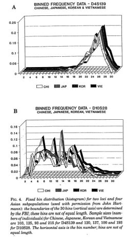 Karl Broman has an amusing list of the
 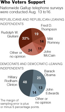 The first graphic changed form a few times. It began as a bubble chart to a stacked bar and then to the pies. An editor quickly pointed out that the bubble chart indicated that the percentages were separate, but they should be represented as a whole. Good point, so I toyed around with a stacked bar chart, but it just didn’t look right, given the alloted space. Hence, the pie charts. I’m not a big pie chart fan, but this one seems to work for me.
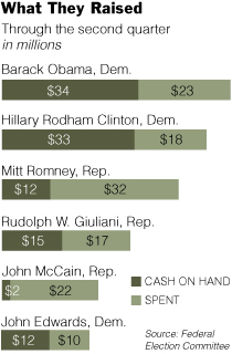 A graphic about the amount of money candidates have spent, have, and raised, this graphic’s stacked bar chart base was fairly straightforward. However, it’s the styling and organization that took the most time, as is often the case. I’ve come to learn that it’s very easy to make a graph, but it’s the styling and organization that really makes a graphic worthy of being in the paper.
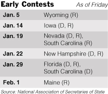 Other than the fact that the calendar is changing from day to day and the whole primary versus caucus stuff is kind of confusing, this graphic was pretty straightforward. I put in shades of gray to make things more readable.
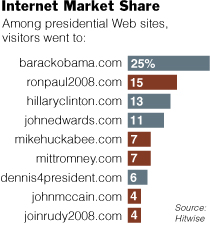 I thought this
 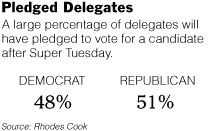 Clearly very straightforward, Pledged Delegates, on the contrary, took the most time out of all five graphics. The construction was simple, but finding the correct numbers took time. Schedules are changing, the definition of a pledged delegate is different by state, and the whole nomination process is fuzzy. Nevertheless, towards the end of Friday, some somewhat reliable numbers came in.
 With that being said, I came across
  On a somewhat related note: have you ever wondered what you look like as a Simpsons character? Well now you can
 Every now and then I indulge in a Big Mac meal from McDonald’s. I feel satisfied while I eat the burger and fries and suck down my diet soda, but afterwards I feel sleepy, sluggish, and fat. Today was one of those days.
 I began my path of higher education at Berkeley as an Electrical Engineering and Computer Science student. As a stat graduate student, it’s hard to remember sitting in all of those (boring) engineering classes.
 Visualize This: The FlowingData Guide to Design, Visualization, and Statistics (2nd Edition)