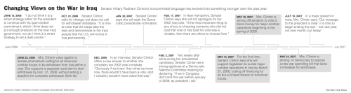
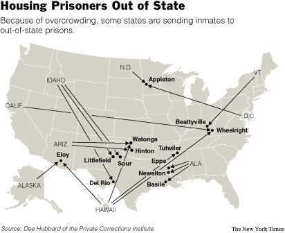
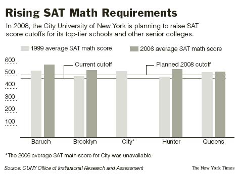
Unbelievably, I’m already in my sixth week, with this week practically over. I create graphics more efficiently (although I’m still constantly learning) than I did in my first week and have gotten a better idea of The Times style and the process of how a graphic gets put into the paper. Here’s my last three graphics that have run in the paper.
Convincing Data, sort of
This past Sunday, the Real Estate section had a story on the rising Manhattan apartment prices and the declining apartment inventory. The Manhattan trends were then compared to national housing inventory, which shows (somewhat) of an increase, opposite that of Manhattan.
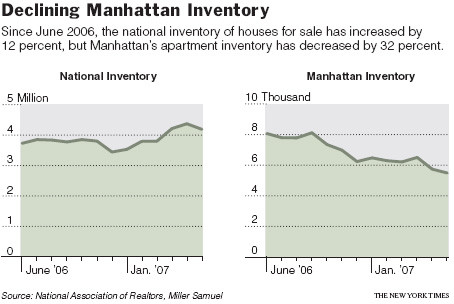
I wasn’t especially excited about graphing this data, because I wasn’t sure how confident I was in the national inventory estimates. Is national housing inventory really increasing? On the order of millions, a small move up or down in the order of thousands could drastically change how that line looks. I had Manhattan inventory data though, and it at least looks like something is going on there.
 Every now and then I indulge in a Big Mac meal from McDonald’s. I feel satisfied while I eat the burger and fries and suck down my diet soda, but afterwards I feel sleepy, sluggish, and fat. Today was one of those days.
 I began my path of higher education at Berkeley as an Electrical Engineering and Computer Science student. As a stat graduate student, it’s hard to remember sitting in all of those (boring) engineering classes.

 Visualize This: The FlowingData Guide to Design, Visualization, and Statistics (2nd Edition)


