• From the guys who brought you 6pli and other like-minded network visualization tools, Bestiario takes 6pli to the next level. 6pli lets users explore their del.icio.us bookmarks. This work, in collaboration with Harvard Berkaman, also lets users explore their del.icio.us bookmarks – as well as YouTube videos, Flickr photos, Twitter tweets, and content from Wikipedia, blogs, and other places. Items are clustered by content type and meta information. Yes, it’s a whole lot of stuff in one place.

    The main idea is to take a few steps away from the list and scroll paradigm – sort of like DoodleBuzz, but from a more analytical standpoint. Does it make all those personal streams easier to browse and explore than something like FriendFeed? You be the judge.

    [Thanks, Jose]

  • Memeorandum shows up-to-date posts from leading political bloggers, and it is well-known that political bloggers are often very partisan. It’s not always obvious to new readers though which side of the line a blogger sits on. You certainly can’t always tell just from a headline on Memeorandum. So Andy Baio, with the help of del.icio.us founder, Joshua Schachter, created a Greasemonkey script (and Firefox plugin) to do just that. Simply install the script and browse popular political articles by their bias.

    With the help of del.icio.us founder Joshua Schachter, we used a recommendation algorithm to score every blog on Memeorandum based on their linking activity in the last three months. Then I wrote a Greasemonkey script to pull that information out of Google Spreadsheets, and colorize Memeorandum on-the-fly. Left-leaning blogs are blue and right-leaning blogs are red, with darker colors representing strong biases.

    Just a quick glance at Memeorandum with the plugin installed shows the magic works.

    How it Was Done

    Of course this isn’t just magic. It’s not human-powered. It’s a data-driven algorithm. It’s statistics. The data are the articles that the Memeorandum-listed blogs link to, so just imagine a giant matrix with number of links. They then use singular value decomposition (SVD) to reduce that matrix to one dimension which they use to estimate where on the political spectrum any given blog on Memeorandum sits.

    All you statistics readers (and maybe some of the computer scientists) should be familiar with SVD. I learned about it and played with it quite a bit during my first year in graduate school. Anyways, it’s cool to see statistics at work and how it can be useful in visualization. A lot of the time visualization projects are about getting all the data on the screen, but with a little bit of know-how (or help from someone who has it) you can produce projects that let the computer do a lot of the pattern-finding work and don’t make the user work so hard.

    By the way, Andy’s blog Waxy has become one of my favorite blogs as of late, so if political bias isn’t your thing, I’d still encourage you to go check it out.

  • Think of all the popular data visualization pieces out there – the ones that you always hear in lectures, read about in blogs, and the ones that popped into your head as you were reading this sentence. What do they all have in common? They probably all told a great story. Maybe the story was to convince us of something, compel us to action, enlighten us with new information, or force us to question our own preconceptions. Whatever it is, truly great data visualization reaches us at a very human level and that is why we remember them.

    Let’s face it. Data can be boring if you don’t know what you’re looking for or don’t know that there’s something to look for in the first place. It’s just a mix of numbers and words that mean nothing other than their raw value. The great thing about statistics and data visualization though is that they provide us with the tools to learn that the data are much more than a bucket of numbers. There are stories in that bucket. There’s meaning, truth, and beauty. Sometimes the stories will be simple and other times complex. Some will belong in a textbook; others will come in novel form. It’s up to the statistician, computer scientist, designer, or analyst to make that decision.
    Read More

  • DONE is a sketching project by Jonas Buntenbruch. He takes 30-60 minutes per day and puts his design skills to work. He began at the beginning of this year on January 1 and has produced a sketch/design for every day so far.

    Some of his work is charts and graphs, but most are of the typography, cartoon, and icon variety. Nevertheless, it’s a great way to hone the design skills. You learn what works, what doesn’t work, and skills that need sharpening. Learn by doing has always been my philosophy – mostly because I suck at learning by listening, writing, and reading. Seriously. I took a learning test in fourth grade that told me so.

    Can someone please do a data visualization per day? Don’t forget to make it awesome.

    [Thanks, Adam]

  • This computer simulation (video below) by Zhaw shows worldwide commercial flights over a 24-hour period. It’s been making the blog rounds lately. Watch as flights start in the morning in the western hemisphere, and as the sun starts to come up in the east, more flights begin in the east. I’m not sure if we’re seeing actual GPS traces or just interpolated flight paths from point-to-point data, but my guess is the latter. Does anyone understand the language on Zhaw?
    Read More

  • OPEN N.Y. put together an amusing (and informative) graphic for a New York Times op-chart. It shows the height and weight of presidential candidates dating back to 1896 when William McKinley, weighing in at 5 feet 7 inches, won the election to become 25th president of the United States. The tall lead 17-8 and the heaver lead 18-8. William J. Bryan didn’t stand a chance. Will Barack Obama add to the big and tall’s lead or will John McCain win one for the little guy?

    [Thanks, Tom]

  • September was another good month for FlowingData. We surpassed 5,000 subscribers for the first time – 5,139 to be more precise – and saw more visitors than any other previous month. That’s not that much by Internet standards, but by statistician standards, that’s usually enough for the Law of Large Numbers to kick in.

    Thank you everyone who continues to spread the word about FlowingData. The blog wouldn’t be the same without you.

    In case you missed them, here are the top posts from September.

    1. Winner of the Personal Visualization Project is…
    2. 23 Personal Tools to Learn More About Yourself
    3. Interactive Graph Visualization System – Skyrails
    4. OneGeology Wants to Be Geological Equivalent of Google Maps
    5. See the World Through SimCity’s Eyes – One Up On OnionMap
    6. Pie I Have Eaten and Pie I Have Not Eaten
    7. Compare Media Coverage of Presidential Candiates with Everymoment Now
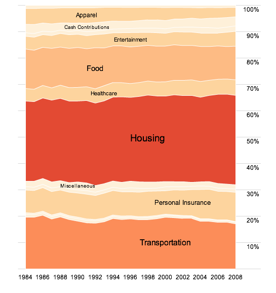
    8. How Consumers Around the World Spend Their Money
    9. Winners of NSF Visualization Challenge 2008 Announced
    10. Beautiful Generative Computer Art – Metamorphosis
  • I was in Chicago last week for Wired NextFest – it was impressive, beautiful, engaging, and imaginative. While I had fun presenting some of my own work, it was even more entertaining looking at (and trying out) the other exhibits. Here are some of the highlights of the event.
    Read More

  • It’s been something like a year and a half now since I started FlowingData. It has grown quite a bit since I was talking only to myself. However, with that growth has come greater (financial) responsibilities while I have remained a poor graduate student. Fortunately, I have these two great sponsors to thank for helping this little blog of mine keep running as well as giving me the chance to give back to all you readers.

    Check these groups out. They are doing amazing things with data.

    Eye-Sys – They make scientific visualization doable and emphasize data exploration. Take a look in case studies for the recent Digg example.

    Tableau Software – It’s about statistical visualization for Tableau. Analytics is the name and useful visualization is the game.

  • This is a guest post by Miguel Jiménez, a user experience and interaction designer based in Madrid.

    There’s a lot of noise today around Personal Branding and constructing your own self as a global brand on a certain topic. It makes complete sense to increase your professional value reflecting on others and using the Internet to build up this reputation. It’s said that you should start by creating an online identity, supposedly to reflect your Real Worldâ„¢ one, with an entry point in the form of a blog or similar. That’s a nice introduction and it’s quite easy to implement, but the main problem to the process of constructing a self-brand is monitoring and tracking how your efforts perform and the next steps you should take. So let’s have a conceptual look and sketch around the statistical data found nowadays in the Internet.
    Read More

  • In a follow up to Visualizing Information for Advocacy, the Tactical Technology Collective recently announced Maps for Advocacy: An Introduction to Geographical Mapping Techniques.

    The booklet is an effective guide to using maps in advocacy. The mapping process for advocacy is explained vividly through case studies, descriptions of procedures and methods, a review of data sources as well as a glossary of mapping terminology. Scattered through the booklet are links to websites which afford a glance at a few prolific mapping efforts.

    While the example maps look very Googley and won’t impress too many in the online mapping world, there are still some good links in there for data resources, terminology, and how maps play a role in displaying information.

  • Alisa Miller, President and CEO of Public Radio International, enlightens us on how little U.S. news coverage there is on the rest of the world. How does she do this? She uses maps of course. Miller uses visualization to tell a (short) story. She shows us all the coverage on Iraq and the lack of coverage on all other countries, which is practically nothing.

    The name of this type of morphed map escapes me right now. Maybe someone can remind me?

    [Thanks, Jodi]

  • James Surowiecki writes in The Wisdom of Crowds that the group is smarter than the individual (under four conditions). Essentially, the premise is that if you get enough different people to work on a single problem independently, you’re going to get as good or better results than that of a small group of experts working together. Think of it as advanced crowdsourcing.

    These three applications tap into the wisdom of crowds. It’s clearly election season.
    Read More

  • It’s about time we had a FlowingData open thread. We’ve seen that there are plenty of tools to monitor different aspects of our lives, but I’m wondering if they are tools people actually want or if they are tools that are just easy to make. So my question to all of you is:

    If you could track/monitor anything in your life, what would you track?

    Disregard whether or not the technology is there or any of those gross technical details. Assume anything is possible.

    I’ll get things started. I want to know how I spend every minute of my life. Not just on the computer. I want to know how much time I spend watching TV, going out, exercising, walking, sitting, driving, waiting, and eating. Everything.

  • While we’re on the subject of contests, lets not forget the epic battle for best caption. Thank you to everyone who participated. All the entries were great and really entertaining, but unfortunately, there could only be one winner. The winner of Stephen Baker’s The Numerati is – Mike for his caption (above), “Severity of Crash vs. Length of Ramp.” Congratulations, Mike! Expect an email from me soon. (Ricardo, if it’s any consolation, my wife liked yours the best :).

    I put a little something together for everyone else. For everyone who entered – this is for you. I hope you all like it. The darker ones are the honorable mentions.


    Click on image for full version.

    Please do let me know if I mistyped or accidentally left anyone out. Thanks again, everyone for participating. I hope you were all entertained as much as me.

  • Remember the NSF visualization challenge announced at the beginning of this year? Nine months have come and gone, and the winners (and several honorable mentions), from five categories, were announced today. Above is Life in a Biofilm, which won honorable mention in the Informational Graphics category, by Andrew Dopheide and Gillian Lewis from University of Auckland.
    Read More

  • I feel like I’ve been seeing and writing a lot about artistic visualization lately. Maybe it’s because summer’s ending and all the designers are finishing up their side projects. I dunno. In any case, Brendan Dawes provides you with a way to explore the news by doodling and scribbling. The piece is called DoodleBuzz. Type in a search term and then start doodling. News results (via the Daylife API) shoot off whatever path you draw.

    DoodleBuzz spawned from Brendan’s desire to browse the news in a way that was completely different from the usual top-down scrolling we’re used to seeing on the Web:

    DoodleBuzz was born out of an idea to create an entirely new way of exploring information – one that allows for a kind of “quiet chaos” that gives people the opportunity to explore unthought of paths and connections along their news gathering journey. You may start at Iraq but end up finishing on Britney, whilst taking in The Catholic Church, Global Warming and 50 Cent.

    I don’t know about you, but the “quiet chaos” gave me a small headache. What do you think? Go try it and let us know what you think in the comments.

    [via Data Mining]

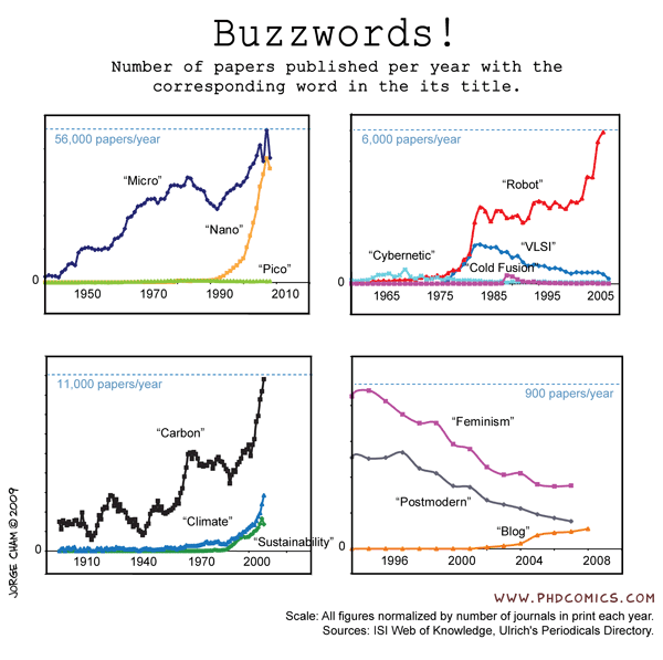
  • PhD Comics has grown to be my favorite comic of the moment. It’s unbelievable how much I relate to all of it. I am not alone. Anyways, have you registered to vote yet? If not, get on it!

  • It’s hard to believe that it’s been almost a year since I was in Madrid at the Medialab-Prado for the Visualizar workshop. It was a two-week event where designers from all around got together and created projects focused on data. There was a wide variety of data-centric projects on Twitter, email, art, spam, and traffic (above). I worked with migration data. It was also a pretty diverse group – computer science, graphic design, and of course, me, the token statistician.

    Call for Projects and Papers

    Now it’s time for Visualizar 2008: Database City. There’s an open call for projects and papers with the idea of a database city. Imagine a city where there are displays that show energy consumption, pollution, or carbon footprint. What would that city look like? Would we act differently with that type of information right in front of us?

    From the Visualizar page:

    Urban environments, which are becoming increasingly dense, complex and diverse, are one of contemporary society’s largest “databases”, daily generating volumes of information that require new methods of analysis and understanding.

    How can we use the data visualization and information design resources to understand the processes governing contemporary cities and better manage them? What can we learn from studying traffic and pedestrian movement flows through the streets of Madrid? What would happen if we filled the streets with screens providing information updated each moment about water and electricity consumption?

    Important Dates

    This year’s workshop is also two weeks long from November 5 – 18 and no doubt you will learn a lot. The Medialab-Prado offers housing to participants at a youth hostel and will also consider covering traveling expenses on a case-by-case basis. Submission deadline is October 5.

  • Glenn Marshall has released his finished version of Metamorphosis, a beautiful piece of computer generative art programmed in Processing. I wish I knew a bit more about what I was seeing, but I can only guess that the branches and butterflies follow certain laws of nature and rules defined by the music (I hope). Nevertheless, it’s beautiful. Here’s the video below, but go to Vimeo to watch the video in all it’s HD glory.
    Read More