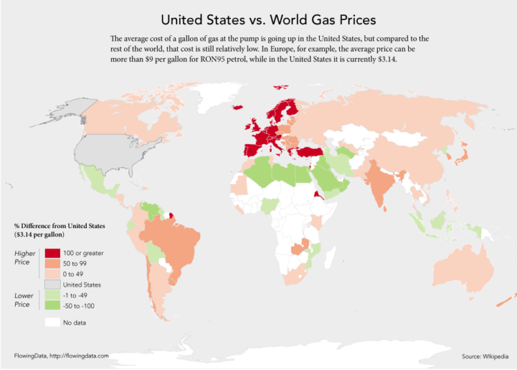
Since we’re on the subject of US gas prices, let’s take a look at how they compare to the rest of the world. Having talked to some of my international friends a while back, I already knew that gas is relatively cheap here, what with all of the government subsidies and what not.
But of course we still complain. I see $3.90 per gallon and I can’t help but give the stink eye, while our friends over there in the UK are forking over nine bucks per gallon.
Read More

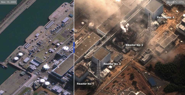


 The Society for News Design announced the
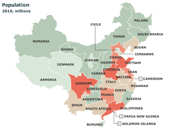


 Visualize This: The FlowingData Guide to Design, Visualization, and Statistics (2nd Edition)


