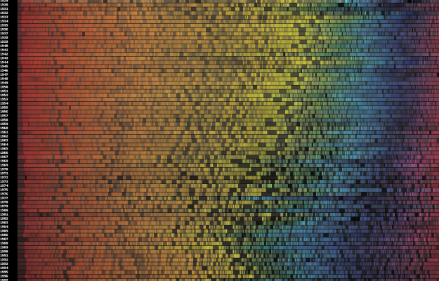
• Linda Eckstein sent this graphic along to show the main ideas of Russ Baker’s Family of Secrets. In Linda’s words, “[T]he idea was for me to come up with a visual representation of the scope and complexity of Baker’s book. In a way, it’s the unWordle. Wordle only analyzes what is said, sometimes it’s necessary to remind the public of what is NOT said.”

    From Vanity Fair:

    The editors of VF.com, fascinated by the concentric circles of intrigue and coincidence that connect the Bushes to various nerve centers, nefarious and benign, commissioned information designer Linda Eckstein to concoct a graphic device that would serve as a sort of 21st century Power Crib Sheet. Consider it a modern-day version of those 1960s and 70s conspiracy theory flow charts that sought to drag the apparatus of the oligarchs, the generals, and the spooks out of the shadows. The result is this VF.com exclusive, a loopy, labyrinthine Family of Secrets bullseye—part eye chart, part pie chart, part Otto Preminger-esque movie poster for the Bush-whacked masses.

    [Thanks, Linda]

  • Cincinnati’s local NBC news provides viewers with a customizable weather dashboard. Look up your city, drag and drop the different modules, and look at the weather from your neck of the woods. Unfortunately, it only really shows extensive details for Cincinnati. The dashboard seems to just show regular weather forecasts for other cities. At least I know that there are 79 schools closed today in Cincinnati.

    [Thanks, Kevin]

  • Twitter and maps just go well together. The New York Times maps Super Bowl-related tweets over the course of the game. A control timeline is provided up top and several categories are provided so that you can view certain types of tweets e.g. Steelers vs Cardinals and chatter about the ads. It looks like Doritos, Budweiser, and especially Careerbuilder were big hits. I guess Hulu got some buzz too. Press play and watch who’s talking about what as the game unfolds.

    [Thanks, William]

  • The past couple of months have been pretty exciting here on FlowingData. We hit the front page of some of the big social media sites, and our community continues to inch closer towards the 10,000-mark. I feel like FlowingData is nearing critical mass, and at this point, I’m just along for the ride.

    None of this would be possible without the help of FlowingData sponsors. I hope you’ll join me in thanking them by checking out the cool visualization stuff they have to offer, and I’d like to extend a special welcome to FlowingData’s two newest sponsors, InstantAtlas and NetCharts.

    Eye-Sys — Comprehensive real-time 3D visualization. Their gallery section in particular is quite impressive.

    Tableau Software — Data exploration and visual analytics for understanding databases and spreadsheets that makes data analysis easy and fun.

    NetCharts — Build business dashboards that turn data into actionable information with dynamic charts and graphs.

    InstantAtlas — Enables information analysts to create interactive maps to improve data visualization and enhance communication.

    SiSense — Easy-to-use reporting and analysis. No code required and directly connects to Excel, CSV files, SQL, MySQL, Oracle and SQL Analysis Services

    Also, thank you to all of you who continue to share FlowingData on Digg, del.icio.us, Twitter, StumbleUpon, via email, etc, and just helping me get the word out. It’s certainly none of my doing. I’m a horrible promoter. Please keep on doing whatever you’re doing, FlowingData readers. I appreciate all of it.

    If you’d like to sponsor FlowingData, please feel free to email me, and I’ll get back to you with the details.

  • The Mozilla group is starting to dig into visualization to participation within the active Mozilla community, and they’re looking for some input:

    If you’re a visual designer, data visualization guru, student or just interested in hacking on a cool project, join us to generate concepts and prototypes that build upon the LizardFeeder, a cool feed aggregator released earlier this year by Les Orchard.

    As Les describes it, LizardFeeder brings together and archives different types of activity from across the far reaches of the Mozilla universe and spits them out in a single, dynamic stream. It’s pretty darn cool to watch on its own, but we’d love to further develop a design concept that is approachable, meaningful—or at least entertaining—to virtually anyone who sees it.

    Here’s what the Lizard Feeder looks like now:

    So basically, there’s a whole lot of data waiting for your ideas. Get to it. I am sure you’ll get a lot of recognition in the process.

  • After I produced a map that shows the growth of Walmart, there were tons of comments that were along the lines of, “I would love to see this for insert company here.” I was happy to see the enthusiasm, but the hard part is getting the data for all store locations and opening dates.
    Read More

  • The first Visualize This for poverty rate in America was a very good start to something I hope to continue here on FlowingData. There were a lot of good entries and plenty of interesting discussion on what worked and what didn’t. Some used existing tools while others went custom; some used a combination of both. There were entries that went for emotion and others that were built for pattern-finding. My pick for best is Luca Masud‘s take on things with D.C. as focal point.
    Read More

  • Some of the best stuff comes out of student projects. During the Screendesign workshop in Fachhochschule Potsdam last summer, students were asked to collect, analyze, and visualize personal data. Topics ranged from haircuts to movie consumption to telephone habits. The assignment was largely inspired by Nick Felton’s Feltron Report:

    I loved every single issue of the Feltron annual report. From the first time I saw it I was convinced it was a great topic for a personal project – or for a university course. So the project setting became “personal annual report”. Since a long time, I’m interested in visualization methods from journalistic infographics to scientifc information visualisation – so I’m convinced it’s a great and important topic to encourage people getting involved with. And it is a field that never stops evolving, where you are never about to reach the ground, no matter how deep you dive (yeah, this is for interactive media or even media in general, but it feels stronger to me when it comes to data visualization).

    I really like to see courses like this centered around visualization and then the results from some inspired students. It goes to show how this area is growing. I just wish I got to take these types of courses.

    [Thanks, Christophe]

  • Grid/plane, a studio centered in Portland Orgeon, collaborated with Instrument, to visualize media buzz across various social media outlets. The client? Google.

    Working in tandem with Google Analytics, the Flash-based, interactive tools allow users to explore relationships and see the effects of blogs, as well as mainstream and social media over time.

    While this particular project wasn’t really focused on Google search results, can you imagine how cool it would be if it were? One day we will get visualization in lieu of listed results. Trust me. We will also have power laces, self-drying jackets, and flying Deloreans. I’ve seen it with my own eyes.
    Read More

  • A quick reminder: tomorrow is the last day to put in your entry for the first edition of Visualize This. There have been a lot of interesting visualization entries so far, so even if you’re not planning on making a graphic, make sure you put in your two cents for which one you think is best.

  • The worst thing about Los Angeles is the traffic hands down. As you sit there in a traffic jam, you first wonder what the hold up is, and as an hour of 5 mph traffic passes on a 70 mph speed limit freeway, you think of the cities you could’ve driven to in the time you are stuck in traffic. Stephen J. Beard and Rich Exner from The Plain Dealer try to explain the annoying phenomena in the above infographic. Yeah, traffic patterns are a bit more complex, but oh well. It’s still informative.

    [via Cool Infographics]

  • Doogie Horner from Comic vs. Audience created the above flow chart for heavy metal band names. So in case you’re in search of name for your heavy metal band, start at the skull and work your way out. Just for ideas though. Don’t be a biter. For example: Death -> Pleas for Help -> Adolescent Poetry -> System of a Down. Regular FlowingData readers might also recall Doogie’s similar flow charts for comedy and what to say during sex.

    [Thanks, Jess]

  • On Tuesday, January 20, 2009 at 12pm, Barack Obama officially became the 44th president of the United States of America. As we all watched Obama being sworn in front of the massive crowd, Twitter was abuzz with excitement. Just how excited was the Twittersphere? Watch for yourself. The map starts early Monday morning. As the day moves on more people wake and tweet at a steady rate with increasing volume as the time comes nearer. Europe gets in on some of the action when the US goes back to sleep. Tuesday morning comes in with a new beginning in the air. Then boom, it’s time, and Twitter bursts with excitement.

  • Remember Twistori? It’s the Twitter mashup that shows tweets of love, hate, think, believe, and wish. I guess naturally, there’s an inauguration version. It’s not as effective, but still worth a look.

  • The Photosynth of first-hand reader photographs is now up on MSNBC. If you’re not familiar with Photosynth, here’s a brief description:

    Photosynth is a potent mixture of two independent breakthroughs: the ability to reconstruct the scene or object from a bunch of flat photographs, and the technology to bring that experience to virtually anyone over the Internet.

    Essentially it’s a completely different way to look at thousands of photos. Photosynth stitches together images from many vantage points to create a panoramic view of the scene – in this case the view from the inaugural stands. Zoom in and out pan left, right, up, and down. It’s almost as if you were there. Watch the TED talk for more:

  • There’s a lot going on today, and of course the news interactive teams are pushing out. The New York Times pushes out an updated infographic that shows inaugural words all the way back to George Washington in 1789. Then there’s the guide that I mentioned earlier and the mosaic of reader photos. I’m still waiting for CNN’s views with photosynth and satellite views that Wolf keeps on promising. Updates to come.

  • It’s Inauguration Day! There’s a happy buzz in the air, and you can’t help but feel excited. I of course turn to The New York Times for a comprehensive guide.

  • These ads for Goldstar beer were hung above bar toilets. They’re comical flow charts that provide some “insight” on the man versus woman, um, decision-making process – clothes, love, and the bathroom. I wonder if the posters were hung in both men and women’s restrooms or just men’s. I guess the “Thank God you’re a man” bit wouldn’t go over too well with the opposite sex.
    Read More

  • People have fallen in love with word clouds that make pictures. Zoom in and you see a bunch of individual words. Zoom out and you see a famous person’s face. It is a dictionary or a portrait? Mystical. TBWA/Chiat/Day, an advertising agency in Nashville, Tennessee of all places, brings the concept to promotion for the 2009 Grammy Awards – in animated form. Float through the cloud of songs and lo and behold, it’s Stevie Wonder.

    It’s only a matter of time until someone creates the next version of Wordle. Let people upload a picture and some words and then charge people a few bucks for a printed poster. It’d be a huge hit. It’s the perfect gift I tells ya. I’m looking at you, Jeff. We need to talk.

    [via uncovering data]

  • Dopplr is a service that lets you share your travel schedule with friends and then highlights times when you and your friends will be in the same place. For example, if you’re traveling to Las Vegas in December, Dopplr will tell you if any of your friends are going too. OK. So yesterday Dopplr started sending out “Personal Annual Reports” to all of its users. The report shows what friends your travels coincided most with, where you traveled, how you traveled, and your carbon for 2008. What a great idea.

    Above is a report for Barack Obama. It should surprise nobody that Joe Biden tops the list on who Obama most coincided with, and then John McCain follows in a close a second.

    [Thanks, William and Tim]