• Membership
  • Newsletter
  • Projects
  • Learning
  • About
  • Member Login
  • Time-lapse of Earth from International Space Station

    November 14, 2011

    Topic

    Visualization  /  space, time-lapse, video

    Beautiful time-lapse video using photographs from crew onboard the International Space Station. I think this one’s a hair ahead the Very Large Telescope. Watch in HD on Vimeo for extra flavor.

    [Video Link via kottke]

  • What your favorite map projection says about you

    November 13, 2011

    Topic

    Maps  /  xkcd

    For the map nerds. xkcd says what your favorite map projection says about you. Mercator? “You’re not really into maps.”

  • Politilines shows what candidates talk about during debates

    November 11, 2011

    Topic

    Network Visualization  /  debates, interactive, Periscopic, words

    If you don’t watch the candidate debates — and let’s face it, that’s just about everyone — you pretty much miss everything, except for stuff like Rick Perry forgetting agency names. Politilines, by Periscopic, lets you see what the candidates talked about each night.

    The left column lists top issues, the middle shows words used, and the right column shows candidates. Roll over any word or name to see who talked about what or what was talked about by whom.

    The method:

    We collected transcripts from the American Presidency Project at UCSB, categorized them by hand, then ranked lemmatized word-phrases (or n-grams) by their frequency of use. Word-phrases can be made of up to five words. Our ranking agorithm accounts for things such as exclusive word-phrases – meaning, it won’t count “United States” twice if it’s used in a higher n-gram such as “President of the United States.”

    While still in beta, the mini-app is responsive and easy to use. The next challenge, I think, is to really show what everyone talked about. For example, click on education and you see Newt Gingrich, Ron Paul, and Rick Perry brought those up. Then roll over the names to see the words each candidate used related to that topic. You get some sense of content, but it’s still hard to decipher what each actually said about education.

    [Politilines]

  • Popular Science data issue

    November 11, 2011

    Topic

    News  /  Popular Science

    The November issue of Popular Science is a special on data. There are a couple of original graphics by Jer Thorp and Jan Willem Tulp, along with a handful of interesting articles. I also got to put together a gallery of some of favorite visualization projects over the past few years.

  • Visual Résumés

    November 10, 2011

    Topic

    Infographics  /  critique, resume

    A couple of infographic résumé sites, vizualize.me and re.vu, sprouted up that use your LinkedIn data to show your career stats. Just create an account, connect it to LinkedIn, and you get some graphs that show when and where you worked. It’s a visual form of your LinkedIn profile with a goal to replace the “old” and “boring” résumé that uses just text.

    Is this the best way to go though, if you’re applying for a job?
    Read More

  • Manual data design from Stefanie Posavec

    November 9, 2011

    Topic

    Data Art  /  Stefanie Posavec

    Designer Stefanie Posavec talks about her process of data collection, analysis, and design. There’s a lot of advantages to knowing how to program, but there can also be value in meticulous manual discovery if you’re willing to put in that extra time.
    Read More

  • Significant digits and relevance

    November 8, 2011

    Topic

    Design  /  numbers, significance

    Lulu Pinney goes over the subtle art of working with significant digits:

    When we say on the phone “I’ll be there in half an hour” it’s quite likely we’ll arrive sometime in the next 25 to 35 minutes. But for the context of meeting up with a friend “half an hour” will do. If you said “see you in 27 minutes” that would raise a laugh being an odd level of precision for the given context. The same ideas apply to numbers in journalism.

    Important in both accurate representation of data and readability.

  • A month of swearing in 90 seconds

    November 7, 2011

    Topic

    Maps  /  animation, swearing

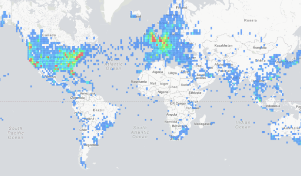
    A fun map by Jamie Popkin of Little Earth that animates the use of the F-bomb, C-word, and “regular swear word” over a month. There isn’t much information about where the data comes from, but I’m guessing Twitter. Each circle represents the use of a swear word, and the intensity grows as time passes. Too bad it doesn’t cover the world or the entire United States.

    [PottyMouth via @awoodruff]

  • Telling Stories with Data – VisWeek 2011

    November 4, 2011

    Topic

    News  /  guest, storytelling

    Note from Nathan: Last week, visualization researchers from all over gathered in Providence, Rhode Island for VisWeek 2011. One of the workshops, Telling Stories with Data, focused on data as narrative and what that means for visualization. This is a guest post by the organizers: Nick Diakopoulos, Joan DiMicco, Jessica Hullman, Karrie Karahalios, and Adam Perer.

    “Data storytelling” is all the rage on websites ranging from international news outlets, to political and economic organizations, to personal blogs. Indeed, this trend has captured the attention of those who research and work in information visualization. Scores of both aspiring and seasoned visual storytellers descended on the Telling Stories with Data workshop that we organized this year (the 2nd installment of the workshop) to discuss and learn about visualization storytelling tools, issues, and contexts. The workshop took place in Providence, Rhode Island on October 23rd and was part of the yearly international VisWeek conference which itself drew about 1,000 attendees.

    As in many technological fields, those interested in “narrative visualization” face the challenge of connecting with like-minded others across the oft un-negotiated boundary between academic research and practical applications or designs. Yet these groups have much to learn from one another. To bring visualization research in contact with visualization practice, we structured the workshop line-up of speakers to include both academicians (e.g. from Harvard, UC Berkeley, UIUC) and people from industry (e.g. New York Times, Microsoft Research, OECD, Workbook Project). The talks were organized into three blocks: (1) tools for structuring and sharing, (2) communicating with visualization, and (3) storytelling in context.
    Read More

  • Microsoft envisions the near future in technology and interaction

    November 3, 2011

    Topic

    Data Art  /  future, Microsoft

    In a follow-up to last year’s visions of the future, Microsoft imagines interacting with data and information in 2020. It is the land of big displays, linked devices, and projections in the real world. It’s mostly from a productivity standpoint, but there’s crossover to the everyday.

    To be honest though, all I really want are power laces, a self-drying coat, a flying car, and rehydrating pizza. I wouldn’t mind a hover board either, but it’s not urgent. I don’t think that’s too much to ask. I can deal with not being able to flick graphs in the air if it means getting the important things sooner.

    [Video Link via @juiceanalytics]

  • How we got to a population of 7 billion

    November 2, 2011

    Topic

    Infographics  /  NPR, population, video

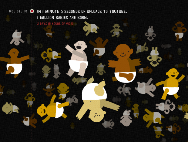
    NPR explains how we reached a population of 7 billion. Simply put, the world is making babies faster than people are dying, and with improved medicine and agriculture, people are living longer than before. The video above demonstrates the different birth and mortality rates, where each container represents a continent.

    There has been a shift in recent years:

    Much of that growth has happened in Asia — in India and China. Those two countries have been among the world’s most populous for centuries. But a demographic shift is taking place as the countries have modernized and lowered their fertility rates. Now, the biggest growth is taking place in sub-Saharan Africa.

    [NPR via Graphic Sociology]

  • Best of FlowingData – October 2011

    November 1, 2011

    Topic

    Best of FlowingData

    Another month, another crazy circular discussion on the chances of answering a question correctly. Thanks again for sharing and tweeting. Always appreciated.

    1. Best statistics question ever
    2. Where people don’t use Facebook
    3. The Venn Piagram
    4. Bible sentiment analysis
    5. Language communities of Twitter
    6. #thankyousteve
    7. All numbers lead to one
    8. Kill Math makes math more meaningful
    9. Nobel laureates by country and prize
    10. Venn diagram: Platypus playing a keytar
  • 7 billion people in the world: past, present and future

    October 31, 2011

    Topic

    Maps  /  bestiario, interactive, population

    According to estimates from the United Nations Population Division, there are now over seven billion people in the world. That’s enough people to fill, like, an entire room. Yeah. Visualization firm Bestiario, for The Guardian, shows this growth by country, using their home-brewed visual programming language, Impure.

    There are a few options to play with. You can click on the bubble for a country to see the time series on the bottom for population from 1950 to 2010, through a projected 2100 population. Life expectancy for the same range is also shown. To compare geographically, you can also choose the year filters in the bottom right to compare, say, population in 1950 to that of 2010.

    India and China of course pop out in that range, whereas many African populations are expected to increase a lot, percentage-wise, during the next century.

    [The Guardian]

  • Horrors coming to each state this Halloween

    October 31, 2011

    Topic

    Maps  /  horror, humor, movies

    So many movies, so many creepy crawlies that go bump in the night. Very Small Array continues its ongoing run of charts about movies with this map, just in time for Halloween. Watch out Indiana. Daylight Saving Time is coming to get you.

    Speaking of Halloween, my wife bought two bags of handout candy from Costco this year. I predict ten pounds will be going in my stomach next month.

    [Very Small Array]

  • Best statistics question ever

    October 28, 2011

    Topic

    Miscellaneous  /  featured, humor

    By way of Raymond Johnson, the best statistics multiple choice question ever written on a chalkboard. Try not to think too hard. [via]

  • Venn diagram: Platypus playing a keytar

    October 28, 2011

    Topic

    Miscellaneous  /  humor, keytar, venn

    The word you’re looking for is epic. From Tenso graphics, maker of amusing t-shirt sketches. [via]

  • Google+ Ripples show influence and how posts are shared

    October 27, 2011

    Topic

    Network Visualization  /  Google, interactive, Ripples

    Posts and links get shared over and over again, but we usually don’t know how. We get counts, but who shares what and how far do does a link reach? Google+ Ripples gives you a peak into the process. A link or status is posted, and like when a pebble is dropped in a pond, a pattern forms outwards.
    Read More

  • Page 303 of 392
  • <
  • 1
  • ...
  • 300
  • 301
  • 302
  • 303
  • 304
  • 305
  • ...
  • 392
  • >

Analyze, visualize, and communicate data usefully, beyond the defaults.

Become a member →

Recently for Members

May 8, 2025
When the data is not what it seems

May 1, 2025
Finding the Right Charts

April 24, 2025
Visualization Tools, Datasets, and Resources – April 2025 Roundup

April 17, 2025
Breaking Out of Chart Software Defaults

April 15, 2025
Line Chart with Decorative Neon Accents

Browse by Chart Type See All →

Baseline Chart Surface Plot Step Chart Cartogram Box Plot Horizon Graph Grid Map Word Cloud Moving Bubbles Bar Chart

Browse By Topic

  • Visualization

    Seeing data

  • Maps

    Seeing geographic data

  • Infographics

    Explaining data

  • Networks

    Connecting data

  • Statistics

    Analyzing data

  • Software

    Working with data

  • Sources

    Getting data

  • Design

    Making data readable

Get the Book

Visualize This: The FlowingData Guide to Design, Visualization, and Statistics

Available now.

Order: Amazon / Bookshop

Made by FlowingData

  • The Process

  • Data Underload

  • Chart Everything

  • Guides

  • Books

  • Shop

  • About
  • Contact
  • Newsletter
  • LinkedIn
  • Instagram
  • Bluesky
  • RSS
Copyright © 2007-Present FlowingData. All rights reserved.