• Membership
  • Newsletter
  • Projects
  • Learning
  • About
  • Member Login
  • Backbone of the flavor network

    December 27, 2011

    Topic

    Network Visualization  /  flavor, food

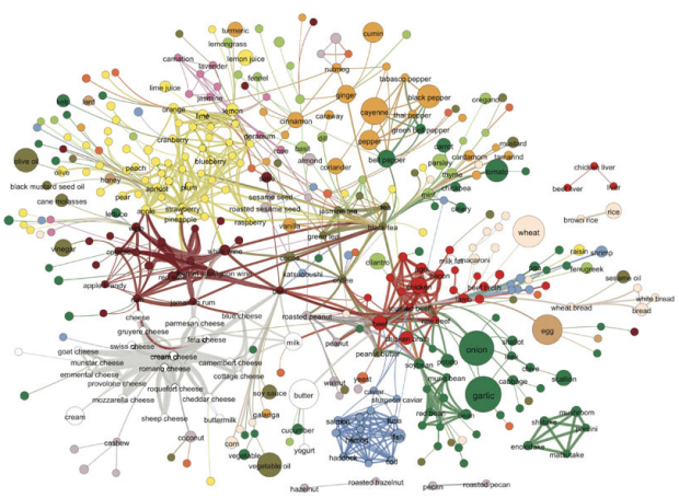
    Food flavors across cultures and geography vary a lot. Some cuisines use a lot of scallion and ginger, whereas another might use a lot of onion and butter. Then again, everyone seems to use garlic. Yong-Yeol Ahn, et al. took a closer look at what makes food taste different, breaking ingredients into flavor compounds and examining what the ingredients had in common. A flavor network was the result:

    Each node denotes an ingredient, the node color indicates food category, and node size reflects the ingredient prevalence in recipes. Two ingredients are connected if they share a significant number of flavor compounds, link thickness representing the number of shared compounds between the two ingredients. Adjacent links are bundled to reduce the clutter.

    Mushrooms and liver are on the edges, out on their lonesome.

    [Nature | Thanks, Elise]

  • Merry Christmas to you, from FlowingData

    December 23, 2011

    Topic

    Site News

    Thanks for making this a memorable year, everyone. Happy holidays!

  • Van Gogh for the colorblind

    December 22, 2011

    Topic

    Design  /  color, van Gogh

    After a chat with his color deficient friends about how Vincent van Gogh’s paintings seem to appeal to all eyes, Kazunori Asada used visual filters to see how the paintings looked to the colorblind. The experiment produced some interesting results and musings:

    Was van Gogh partially color vision deficiency (anomalous trichromat)? Perhaps using a strong color vision deficiency (dichromat) simulation was the wrong approach. How about carrying out the simulation by removing the middle portion of normal color vision, maybe then I could see van Gogh’s pictures in a better light?

    The color choices for van Gogh’s popular paintings seem less out there with the filters. The greens in the sky of Starry Night, for example turn to yellows.

    A colorblind van Gogh though? Probably not. Either way, don’t forget to pick your colors wisely. Asada has an easy-to-use tool to see what your own images look like to others.

    [Asada’s memorandum]

  • Visualization  /  annual, best-of, featured

    The Best Data Visualization Projects of 2011

    I almost didn’t make a best-of list this year, but as I clicked…

    Read More
  • Record your movements with AntiMap

    December 20, 2011

    Topic

    Self-surveillance  /  location, mobile

    AntiMap is an open source toolset that lets you record movements with your iPhone or Android phone. Originally developed as a way for snowboarders to record their movements and play the data back like a video game, the toolset was generalized for all outdoor activities.
    Read More

  • When numbers are too factual

    December 19, 2011

    Topic

    Statistics  /  PSA, scary

    Carl Bialik, for The Wall Street Journal, reports on PSAs and the use of scary numbers:

    The Ad Council usually avoids statistics in PSAs. “We know from our experience that effective advertising has to have an emotional component and statistics-based campaigns can be very rational,” Conlon said. “We’ve also found that people tend not to believe statistics.”

    And sometimes they just don’t care much about them. “When we were developing our underage drinking prevention campaign,” Conlon recalled, “we found that it doesn’t resonate with parents to learn about how many children are drinking underage. It’s too easy for them to say ‘it’s not my child.’ We found that it was much more compelling to include a statistic that was more about the consequences of underage drinking: Those who start drinking before age 15 are six times more likely to have alcohol problems as adults than those who start drinking at age 21 or older.”

    The well-known Stalin quote comes to mind.

    [The Numbers Guy]

  • Charts with explosions now easier than ever

    December 16, 2011

    Topic

    Miscellaneous  /  Excel, Microsoft

    Score.
    Read More

  • Causation is real, people

    December 15, 2011

    Topic

    Statistics  /  causation, correlation, humor

    Stop global warming. Decrease the National Science Foundation’s R&D budget. It’s so easy. More lessons on correlation and causation found here.

  • What Facebook knows about you

    December 14, 2011

    Topic

    Data Sources  /  facebook, privacy

    Facebook logs and saves a lot of data about you and what you do on their site. This shouldn’t be surprising given the more time people spend on Facebook, the greater the cash flow, but just how much data do they store? Austrian law student Max Schrems, because European law states that citizens can do this, requested all the data Facebook had about him. He got back a CD with 1,222 PDF files.
    Read More

  • Fox News still makes awesome charts

    December 12, 2011

    Topic

    Mistaken Data  /  Fox News, unemployment

    Charts and graphs are great, because they can let you see a pattern that you might not see in a spreadsheet, but they only work when you use the actual data. Fox News isn’t doing themselves any favors by putting up this chart. It shows the recently announced drop in unemployment rate to 8.6 percent as a non-change.
    Read More

  • Mapped: Transportation check-ins on foursquare

    December 12, 2011

    Topic

    Maps  /  foursquare, traveling

    Transportation check-ins on foursquare. This is from this past Thanksgiving, but relevant again with Christmas around the corner. White represents check-ins on highways and roads (really?), orange is for trains, and blue is of course is same-day check-ins at airports. I guess no one takes Amtrak cross-country anymore.

    [foursquare via datavis]

  • Corruption versus human development

    December 9, 2011

    Topic

    Statistical Visualization  /  corruption, Economist, human development

    Transparency International released annual data for the Corruption Perceptions Index. The Economist plotted it against the UN’s Human Development Index:

    Comparing the corruption index with the UN’s Human Development Index (a measure combining health, wealth and education), demonstrates an interesting connection. When the corruption index is between approximately 2.0 and 4.0 there appears to be little relationship with the human development index, but as it rises beyond 4.0 a stronger connection can be seen. Outliers include small but well-run poorer countries such as Bhutan and Cape Verde, while Greece and Italy stand out among the richer countries.

    Interesting, although I suspect that the indices have some factors in common.

    [The Economist via @mikeloukides]

  • Page 300 of 391
  • <
  • 1
  • ...
  • 297
  • 298
  • 299
  • 300
  • 301
  • 302
  • ...
  • 391
  • >

Analyze, visualize, and communicate data usefully, beyond the defaults.

Become a member →

Recently for Members

May 8, 2025
When the data is not what it seems

May 1, 2025
Finding the Right Charts

April 24, 2025
Visualization Tools, Datasets, and Resources – April 2025 Roundup

April 17, 2025
Breaking Out of Chart Software Defaults

April 15, 2025
Line Chart with Decorative Neon Accents

Browse by Chart Type See All →

Calendar Small Multiples Horizon Graph Word Cloud Streamgraph Surface Plot Pie Chart Ternary Plot Parallel Coordinates Line Chart

Browse By Topic

  • Visualization

    Seeing data

  • Maps

    Seeing geographic data

  • Infographics

    Explaining data

  • Networks

    Connecting data

  • Statistics

    Analyzing data

  • Software

    Working with data

  • Sources

    Getting data

  • Design

    Making data readable

Get the Book

Visualize This: The FlowingData Guide to Design, Visualization, and Statistics

Available now.

Order: Amazon / Bookshop

Made by FlowingData

  • The Process

  • Data Underload

  • Chart Everything

  • Guides

  • Books

  • Shop

  • About
  • Contact
  • Newsletter
  • LinkedIn
  • Instagram
  • Bluesky
  • RSS
Copyright © 2007-Present FlowingData. All rights reserved.