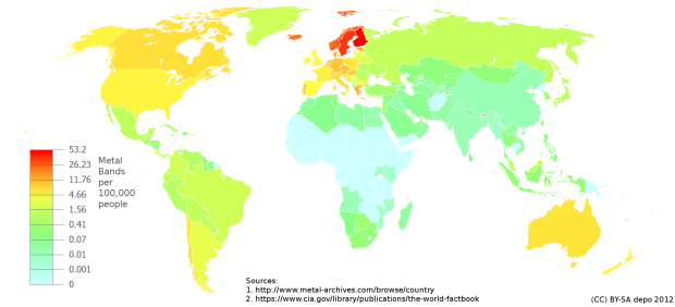
By Reddit user depo_, this map showing metal bands per capita around the world is making the rounds. Clear dominance in Sweden and Finland.
By Reddit user depo_, this map showing metal bands per capita around the world is making the rounds. Clear dominance in Sweden and Finland.

The New York Times, in collaboration with the New York University Movement Lab, explains music conducting in this beautifully produced video. It’s part interview with Alan Gilbert, music director of the New York Philharmonic, and part rendering of motion capture data, which represents Gilbert’s conducting.
To capture the data, the Movement Lab installed high-speed motion capture cameras, and Gilbert put on one of those funny-looking suits with the sensor balls on them. He conducted, and they recorded his body and his hands.
Fantasia will probably come to mind as you watch, specifically towards the end when only conducting trails and sensor spots are left to dance on the screen.
George E.P. Box, a statistician known for his body of work in time series analysis and Bayesian inference (and his quotes), recounts how he became a statistician while trying to solve actual problems. He was a 19-year-old college student studying chemistry. Instead of finishing, he joined the army, fed up with what the British government was doing to stop Hitler.
Before I could actually do any of that I was moved to a highly secret experimental station in the south of England. At the time they were bombing London every night and our job was to help to find out what to do if, one night, they used poisonous gas.
Some of England’s best scientists were there. There were a lot of experiments with small animals, I was a lab assistant making biochemical determinations, my boss was a professor of physiology dressed up as a colonel, and I was dressed up as a staff sergeant.
The results I was getting were very variable and I told my colonel that what we really needed was a statistician.
He said “we can’t get one, what do you know about it?” I said “Nothing, I once tried to read a book about it by someone called R. A. Fisher but I didn’t understand it”. He said “You’ve read the book so you better do it”, so I said, “Yes sir”.
Box eventually worked with Fischer, studied under E. S. Pearson in college after his discharge from the army, and started the Statistical Techniques Research Group at Princeton on the insistence of one John Tukey.
After reading another article about the flood of data that we’re drowning and struggling to stay afloat in, I wondered, “If everyone is drowning in data, does that mean statisticians are the life preservers?” Some agreed, but others went a slightly different route. Some said plumbers, and others said lifeguards. Someone said they’re the annoying kid doing cannonballs.
The metaphor seems to change depending on where you’re sitting and what body of water you’re in, so just for kicks and giggles, let’s see how far we can stretch this metaphor. If data is the tsunami and people are drowning, what does that make statisticians, data scientists, and information designers? Plus points for ridiculousness.
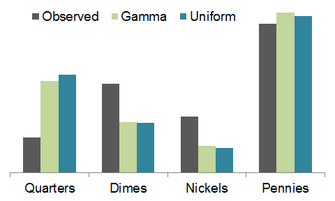
After seeing his friend’s CoinStar receipt for 27 pounds of coins that equalled $256.14, Dan Kozikowski dug deeper and estimated what a pound of change is worth, on average.
Now, to finish out the analysis, let’s tie this back to weight. Fortunately, the U.S. Mint standardizes and publishes the weight of each coin here. With that in hand… drumroll please… we’d expect about 34.9 quarters, 19.8 dimes, 11.5 nickels, and 61.2 pennies in a New York pound of coins, for a total value of $12.00. A Boston pound is worth slightly less&mdsah;$11.81.
I love it when people analyze the everyday. (Although I’m sure CoinStar looks at distributions like this all the time for storage supply something or other.)
Alas, the coin distribution of Kozikowski’s friend didn’t quite match the estimate, as shown in the graph above. He attributes it to the friend spending quarters, dimes, and nickels before going to the CoinStar. There are only fewer quarters though and almost twice the expected count of dimes and nickels, so the model needs to be refined.
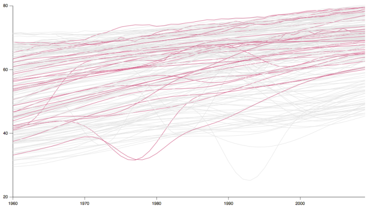
Time series charts can easily turn to spaghetti when you have multiple categories. By highlighting the ones of interest, you can direct focus and allow comparisons.
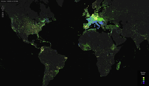
TraceMedia, in collaboration with the Oxford Internet Institute, maps language use across Wikipedia in an interactive, fittingly named Mapping Wikipedia.
Simply select a language, a region, and the metric that you want to map, such as word count, number of authors, or the languages themselves, and you’ve got a view into “local knowledge production and representation” on the encyclopedia. Each dot represents an article with a link to the Wikipedia article. For the number of dots on the map, a maximum of 800,000, it works surprisingly without a hitch, other than the time it initially takes to load articles.
This is part of a larger body of work from Mark Graham and Bernie Hogan, et. al, which focuses mostly on the gaps, specifically in the Middle East and North Africa.
There are obvious gaps in access to the Internet, particularly the participation gap between those who have their say, and those whose voices are pushed to the sidelines. Despite the rapid increase in Internet access, there are indications that people in the Middle East and North Africa (MENA) region remain largely absent from websites and services that represent the region to the larger world.
[via FloatingSheep]
Other than ten-year population estimates, the United States Census Bureau annually collects information about how people live in the country through the American Community Survey. It’s an eleven-page survey [pdf] that asks about your housing situation, education, and job, and there are 60 Republican members of Congress who want to make this currently mandatory survey optional.
The ACS will reach 3.5 million households this year, using dozens of detailed questions—including asking about a household’s use of flush toilets, wood fuel and carpools—to determine the need for various government programs. The survey’s mandatory status, along with telephone and in-person follow-ups to initial mailings, helps keep response rates near 100%.
Now, 60 Republican members of Congress, including presidential candidate and Texas Rep. Ron Paul, are challenging the survey’s mandatory status, with a bill that would make it voluntary to complete the ACS. The push is fueled by privacy concerns and the very detailed nature of the questions.
Find the full details of the bill on the Library of Congress site. Things got interesting when I searched for this link.
Read More

The 72-year mark has arrived, and the United States Census released individual records from 1940 yesterday. So you can now, for example, see that J.D. Salinger lived at 1133 Park Avenue.
 Visualize This: The FlowingData Guide to Design, Visualization, and Statistics (2nd Edition)
New tools, refined process.


