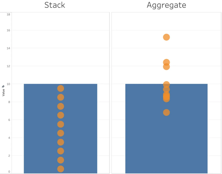
• Membership
  • Newsletter
  • Projects
  • Learning
  • About
  • Member Login
  • Members Only

    Baseline Point of View

    March 7, 2024

    Topic

    The Process  /  baseline, point of view, questions

    The point of visualization is to understand what data is about, which is rarely just about the numbers and almost always about what the data represents.

  • Analysis of when movies use their own names in the dialogue

    March 7, 2024

    Topic

    Statistical Visualization  /  Alice Thudt, dialogue, Dominikus Baur, movies, title

    A title drop is when a movie mentions its own name during the film. Dominikus Baur and Alice Thudt analyzed thousands of scripts to calculate when and how often title drops occur:

    Alright, so here’s the number you’ve all been waiting for (drumroll):

    36.5% – so about a third – of movies have at least one title drop during their runtime.

    Also, there’s a total of 277,668 title drops for all 26,965 title-dropping movies which means that there’s an average of 10.3 title drops per movie that title drops. If they do it, they really go for it.

    They used barcode charts disguised as film to show when title drops occur in individual movies. A fisheye effect, which is often disorienting or decorative, comes in handy to highlight the drops.

  • Guides  /  baseline, rules

    Why Line Chart Baselines Can Start at Non-Zero

    There is a recurring argument that line chart baselines, like bar chart baselines, must start at zero, because anything else would be misleading, dishonest, and an insult to all that is good in the world. The critique is misguided.

    Line chart baselines do not have to start at zero.

    Read More
  • Tiny chip manufacturing, visually explained

    March 5, 2024

    Topic

    Infographics  /  chip, Financial Times, manufacturing, scale

    Microchips have gotten tiny. Like smaller than a red blood cell tiny. Financial Times goes Powers-of-Ten to show the scale and process of manufacturing itty-bitty microchips.

  • Where to see the total eclipse

    March 4, 2024

    Topic

    Maps  /  Bloomberg, eclipse

    There’s a total eclipse (a real one, not of the heart) happening on April 8, 2024. The next one isn’t until 2045, so if you don’t want to wait two decades, now’s your chance. For Bloomberg, Denise Lu shows where, when, and how the eclipse will go down across the United States. She covered pretty much every angle, so there’s no need for anyone else to make an eclipse map.

  • If we didn’t have leap years

    March 1, 2024

    Topic

    Infographics  /  CNN, leap year

    For CNN, Amy O’Kruk and Kenneth Uzquiano asked what would happen if we didn’t have leap years. Without the extra day every four years, we’d eventually have seasons time-shifted by half a year.

    Also, because the exact time it takes the Earth to orbit the sun is just under a quarter of a day, leap year adjustments are slightly off. We’ll have to adjust by one day every 3,333 years. I never thought about it, but it makes sense.

  • Rock map of Scotland

    March 1, 2024

    Topic

    Maps  /  geology, Harry Young, physical, Scotland

    Harry Jefferies shared his grandfather’s 30-year project:

    My grandpa who is 85 started making this rock map of Scotland in 1992. He collected rocks during amateur geology trips over 30 years. He says it had to be geologically correct and also aesthetically pleasing. He asked if I could share online as He wants to go viral so please share

    Thirty years. I’m a sucker for slow data collection and physical visualization.

  • Members Only

    Visualization Tools and Learning Resources, February 2024 Roundup

    February 29, 2024

    Topic

    The Process  /  roundup

    Every month I collect tools and resources that help you make better charts. Here’s the good stuff for February.

  • Algorithmic road trip to visit a street named after each day of the year

    February 29, 2024

    Topic

    Maps  /  algorithm, Ben Ashforth, OpenStreetMap, road trip

    [arve url=”https://www.youtube.com/watch?v=MwRbr-MjwII” /]

    Ben Ashforth set out to visit a street named after a day of the year for each date. He used OpenStreetMap to find the streets and then algorithmically routed a trip. Then he followed through and went on the trip. In a five-minute lightning talk, he describes the journey. See a photo for every day here. [via Waxy]

  • Data Underload  /  golf, McDonald's

    McDonald’s Locations vs. Golf Courses

    I read that there are more golf courses than there are McDonald’s locations in the United States, which seemed surprising. There are about 16,000 golf courses and 13,000 McDonald’s locations. How could this be? Obviously, there are a lot of McDonald’s locations, but where are all these golf courses? Some maps made it clear.

    Read More
  • Interactive LED basketball court

    February 27, 2024

    Topic

    Infographics  /  basketball, display

    [arve url=”https://www.youtube.com/watch?app=desktop&v=752_rIE53Tk” /]

    During the 2024 NBA All-Star weekend, the basketball court was essentially a giant LED screen on the second day. The company behind the panels talked about the technical side for a WTHR news segment, shown above.

    The court was fun to watch but also distracting. It draws your eyes to the ground when the action is ahead and above the rim. So the technology seems less than ideal for an actual game. Maybe good as an expensive practice and training tool? I couldn’t believe not a single shot chart was shown during the three-point contest.

  • Map of most common domesticated animals

    February 26, 2024

    Topic

    Maps  /  animals, domestic, John Johnson

    Based on data from the USDA Census of Agriculture, this map by John Johnson shows the predominant domesticated animal in each county in the United States. It nonchalantly includes humans.

  • Data Underload  /  age, rest, sleep, well-being

    Feeling Rested with Age

    How much you sleep each night matters, but more importantly, it’s about the quality and if you feel rested when you wake up. This seems to shift with age as responsibilities and sleep patterns change.

    The following chart shows how rested people felt, based on answers to the American Time Use Survey.

    Read More
  • Members Only

    Looking for a Denominator

    February 22, 2024

    Topic

    The Process  /  comparison, denominator

    To decide if values are high or low, sometimes you have to divide the numbers for a relative comparison instead of an absolute one.

  • Love: math or magic?

    February 22, 2024

    Topic

    Statistics  /  love, This American Life

    This American Life tells the tales as old as time:

    When it comes to finding love, there seems to be two schools of thought on the best way to go about it. One says, wait for that lightning-strike magic. The other says, make a calculation and choose the best option available. Who has it right?

    Spoiler alert: there is a mix of practicality and feel. They each inform the other.

  • Data-driven running journal

    February 21, 2024

    Topic

    Self-surveillance  /  K.K. Rebecca Lai, marathon

    K.K. Rebecca Lai ran her first marathon. She recounts her training and the day of the event with a series of maps and charts. It reads like a data-driven journal entry, which I am always up for.

  • Rise of Caitlin Clark, scoring machine

    February 20, 2024

    Topic

    Statistical Visualization  /  basketball, Caitlin Clark, Washington Post

    Caitlin Clark, a basketball guard for the University of Iowa, has been steadily adding to her point total over the past four years. Clark broke the NCAA record this past week. But as we all know, it’s not official until there’s a step chart that shows the rise over time.

  • Data Underload  /  race, work

    Race and Occupation

    About 22 percent of physicians in the United States are Asian, but Asian people only make up about 6 percent of the full working population. Compare the former to the latter, and you could say that Asian people are about 3.5 times more likely to be physicians.

    Are there other jobs that jump out? What’s it like for other races and ethnicity?

    Read More
  • Members Only

    Better or Less Bad

    February 15, 2024

    Topic

    The Process  /  criticism

    People like to judge charts by pointing out all the things that are wrong, which is limiting in practice.

  • BrailleR, a R package to improve access for blind users

    February 15, 2024

    Topic

    Coding  /  accessibility, braille, R

    From CRAN:

    Blind users do not have access to the graphical output from R without printing the content of graphics windows to an embosser of some kind. This is not as immediate as is required for efficient access to statistical output. The functions here are created so that blind people can make even better use of R. This includes the text descriptions of graphs, convenience functions to replace the functionality offered in many GUI front ends, and experimental functionality for optimising graphical content to prepare it for embossing as tactile images.

    Has anyone tried this yet? It sounds really useful.

  • Page 29 of 392
  • <
  • 1
  • ...
  • 26
  • 27
  • 28
  • 29
  • 30
  • 31
  • ...
  • 392
  • >

Analyze, visualize, and communicate data usefully, beyond the defaults.

Become a member →

Recently for Members

May 8, 2025
When the data is not what it seems

May 1, 2025
Finding the Right Charts

April 24, 2025
Visualization Tools, Datasets, and Resources – April 2025 Roundup

April 17, 2025
Breaking Out of Chart Software Defaults

April 15, 2025
Line Chart with Decorative Neon Accents

Browse by Chart Type See All →

Step Chart Pie Chart Ternary Plot Streamgraph Bar Chart Calendar Variable Width Bar Chart Spiral Chart Pictogram Packed Bubble Chart

Browse By Topic

  • Visualization

    Seeing data

  • Maps

    Seeing geographic data

  • Infographics

    Explaining data

  • Networks

    Connecting data

  • Statistics

    Analyzing data

  • Software

    Working with data

  • Sources

    Getting data

  • Design

    Making data readable

Get the Book

Visualize This: The FlowingData Guide to Design, Visualization, and Statistics

Available now.

Order: Amazon / Bookshop

Made by FlowingData

  • The Process

  • Data Underload

  • Chart Everything

  • Guides

  • Books

  • Shop

  • About
  • Contact
  • Newsletter
  • LinkedIn
  • Instagram
  • Bluesky
  • RSS
Copyright © 2007-Present FlowingData. All rights reserved.