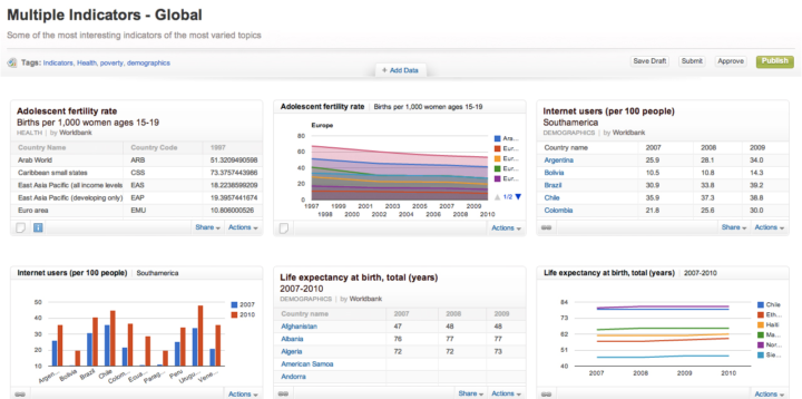
Open data is everywhere. However, open data initiatives often manifest as mere CSV dumps on a forlorn web page. Junar, Lunfardo (Argentina slang) for “to know” or “to view,” seeks to help government and organizations take the guesswork out of developing their own software for such efforts.
Their open data platform allows organizations to collect and select their data, publish it, create reports and dashboards, and share their data online. The solution can be hosted or integrated into the organization’s website, and the data can be made open or for internal use only. End users can “follow” live data on the site, download it, or embed it. There’s also a built in API, so the organization doesn’t have to develop one of their own.
Junar looks like it’s ready to fill the gap in open data publishing with its soup to nuts approach. With lots of great features and an easy to use interface, it seems like a welcome change to the alternatives.


 Visualize This: The FlowingData Guide to Design, Visualization, and Statistics (2nd Edition)


