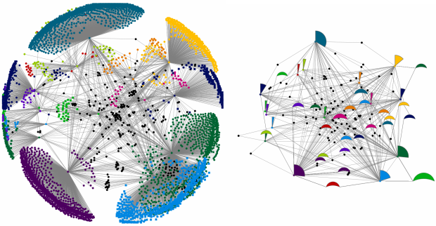
Network diagrams are notoriously messy. Even a small number of nodes can be overwhelmed by their chaotic placement and relationships. Cody Dunne of HCIL showed off his new work in simplifying these complex structures. In essence, he aggregates leaf nodes into a fan glyph that describes the underlying data in its size, arc, and color. Span nodes are similarly captured into crescent glyphs. The result is an easy to read, high level look at the network. You can easily compare different sections of the network, understand areas that may have been occluded by the lines in a traditional diagram, and see relationships far more quickly.
I love the elegance and simplicity of Cody’s work. He details every step of the new layout in his paper, and it’s definitely worth a read. The code for it will be pushed to NodeXL, an open-source tool for Excel, in the coming weeks.
 Visualize This: The FlowingData Guide to Design, Visualization, and Statistics (2nd Edition)
Has anyone used the NodeXL tool?
Hi,
I have seen the paper and my personal impression is that the this does not simplify the reading, because it necessitates to learn a few conventions which are not that intuitive without changing much in terms of what is learned from the network layout.
Another effort in the direction of improving the readability of network diagrams is Hive, by the creator of Circos (http://www.hiveplot.net/). While Hive also introduces new conventions, I find that their ratio (gain of insights / cost of learning these conventions) much higher.
Nice work!
We have a similar concept in a new network layout in our commercial network visualization tool http://key-lines.com
Rather than designing a new representation for a group of nodes, our system arranges the nodes into a meaningful pattern based on their structurally similarity. These patterns can be recognised quickly by eye – see pictures at http://key-lines.com/blog/structural_graph_layout_for_keylines
Does anyone have a case study (or just an anecdote) showing how visually modelling a network actually led to an action that improved that network? I can find examples of people making sociograms like this of various types, which all end up looking very nice. But they just seem to stop at declaring that they’ve successfully modelled of the network. What I’d like to know is whether, by presenting a visual model of a network, somebody has gone on to use that model to discover a property of that network which they didn’t expect it had, and then gone on to take an action that affected the network in some way.
It’s odd that I can’t find these examples. Perhaps I’m looking in the wrong place (ie Google)?