
By Dan Piraro of Bizarro Comics. This is what happens when you don’t label your axes. Also this. [via Laughing Squid]
By Dan Piraro of Bizarro Comics. This is what happens when you don’t label your axes. Also this. [via Laughing Squid]
From Take Part, a short video on how a virus spreads and its possible global effects. Apparently one million deaths could be prevented every year if people would just wash their hands regularly. Too bad there’s that temporary allergy to soap and water people get after doing their business in public restrooms.
[via Brain Pickings]
During a one-week visualization course at the Copenhagen Institute of Interaction Design, Kat Zorina, Ruben van der Vleuten, and Kostantinos Frantzis put together a working prototype that makes smoothies based on mentions of fruit on Twitter.
Using the Twitter API, it collects tweets containing mentions of specific fruits such as blueberry, pineapple, apple and carrot and creates a smoothie that represents the blend. The smoothie is created based on the same proportions of fruits collected from the tweets. Because twitter trends change quickly, each smoothie has a unique palette of flavors.
Next steps: a blender that provides variable consistency like chunky versus completely blended, a scoop of sherbet, and free energy boost. Oh, the possibilities.
[via @golan]
After noticing the Obama campaign was sending variations of an email to voters, ProPublica identified six distinct types with certain demographics and showed the differences. It was called the Message Machine. Now ProPublica is taking it a step further, hoping to dissect every email from all 2012 campaigns.
Today, we are relaunching the Message Machine, and expanding it from handling just one mailing to handling every email from all of the campaigns in the 2012 election. It will seek a broad understanding in real time of the new and sophisticated ways modern campaigns are targeting voters.
It’s a big puzzle, and to solve it, we need a big sample of political emails, and an understanding of who received them. That’s where you come in.
If you get campaign emails on any subject — donation, get-out-the-vote, volunteering, events, etc. — just forward them to [email protected] using your email program’s standard forwarding feature. Nothing fancier than that needed.
Way cool. Although I bet there will be a lot of noise, especially from the smaller, less data-savvy campaigns.
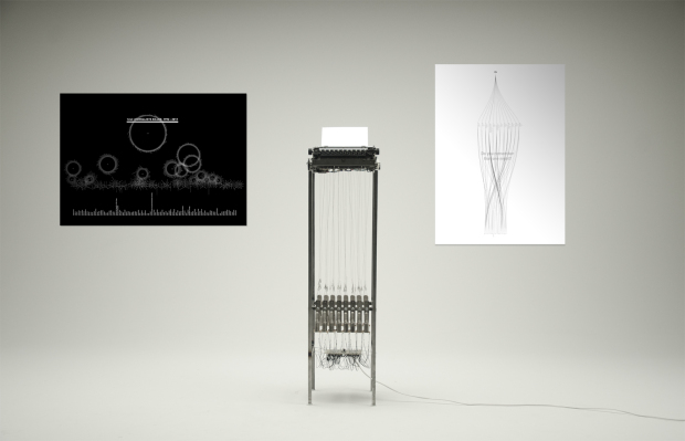
Julian Koschwitz uses a typewriter linked to data from the Committee to Protect Journalists to generate stories about those who have fallen doing their jobs.
The typewriter installation On Journalism #2 Typewriter writes generatively constructed stories about all journalist who have been killed worldwide between 1992 and today based on the existing data of their lives as well as their published work. The individual stories are connected through common fields of coverage, places, professions and many other aspects. Besides the text the typewriter creates also images e.g. flags which are heavier distorted the more journalists got killed in that particular country.
I’m not sure how I missed this, but PBS’s America Revealed, which has apparently been running since last month, is the American version of the popular Britain From Above. Four episodes have aired so far on transportation, electricity, and manufacturing, along with a making-of episode. Here’s a clip from the transportation episode.
The series airs on Wednesdays at 10/9c. Although it looks like the full series ran already. It wouldn’t make much sense to go over the making-of in the middle. On the upside, four episodes are available online.
Had I known this existed, maybe I wouldn’t have subjected myself to the monstrosity of a show in United Stats of America.
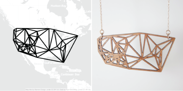
Location data typically stays within the realm of online maps and digital check-ins, but in many ways it’s the most personal data that you can find. It represents where you are, where you’ve been, and where you’re going. Meshu, by Sha Hwang and Rachel Binx, is a project that takes this sentiment to heart.
Select and enter locations on a map or grab your check-ins from foursquare to create your own piece of unique jewelry — necklace, earrings, or cufflinks. Once you’ve got your design, you have your choice of acrylic, wood, nylon, and silver and you can pick from a variety of colors for each material. Hit complete, they’ll fabricate it, and you’ve got your own personal snapshot of life.
Screw the sword swallowing and giant screen of moving bubbles. Just get Rosling a handful of rocks and he draws a crowd.
[via infosthetics]
A previously banned Disney cartoon on menstruation. So informative.
[Thanks, Kevin]
After a couple of weeks of phone-only Internet, I’ve got my hands on a keyboard again and I’m looking at a screen bigger than four inches. It feels strange, but it’s good to be back.
My many thanks to Kim for holding down the fort while I’m gone. Be sure to follow her at @krees and check out Periscopic for your information visualization needs.
So what’d I miss?
 Visualize This: The FlowingData Guide to Design, Visualization, and Statistics (2nd Edition)
New tools, refined process.


