• Tarot cards don’t cut it anymore as a predictors. We turn to data for a look to the future:

    “We’re finally in a position where people volunteer information about their specific activities, often their location, who they’re with, what they’re doing, how they’re feeling about what they’re doing, what they’re talking about,” said Johan Bollen, a professor at the School of Informatics and Computing at Indiana University Bloomington who developed a way to predict the ups and downs of the stock market based on Twitter activity. “We’ve never had data like that before, at least not at that level of granularity.” Bollen added: “Right now it’s a gold rush.”

    Or you could just get yourself a flux capacitor and save yourself some time.

    [Boston]

  • Team lead, David Ferrucci, recalls the early days of putting together the team that built Watson:

    Likewise, the scientists would have to reject an ego-driven perspective and embrace the distributed intelligence that the project demanded. Some were still looking for that silver bullet that they might find all by themselves. But that represented the antithesis of how we would ultimately succeed. We learned to depend on a philosophy that embraced multiple tracks, each contributing relatively small increments to the success of the project.

    As I sit here reading about egos within IBM, with the NFL playoffs in front of me, I can’t help but smirk.

    [New York Times via Simply Statistics]

  • In August 2006, real estate search site Trulia had 609,000 visitors. Five years later, there were 27 million. Trulia’s most recent visualization shows this growth (bottom bar graph) and where people are searching for homes (map). Press play and watch it go. It’s pretty much population density, but for me, the method is more interesting than the material in this case.

    The grass aesthetic is kind of nice. It looks like you have a one pixel blade of grass for each zip code with a significant search count (If only there was something to provide scale…), and where there’s more search there’s more grass.

    I also like the relatively simple tech behind the graphic. We usually see animated and interactive maps generating everything on the fly, but the maps and bar graphs for this are pre-generated for each month. Then each image is displayed one after the other chronologically like a flip book.

    [Trulia via @shashashasha]

  • Members Only

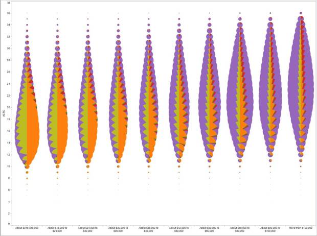
    When you have several time series over many categories, it can be useful to show them separately rather than put it all in one graph. This is one way to do it interactively with categorical filters.

  • It was about five years ago when I got into visualization. Before I actually made anything, I read books and guides that made suggestions and preached a handful of design principles, but when it was time to make a data graphic for publication, I didn’t know what I was doing. Theory is great. Being able to apply it to your own data is better.

    Back then — which seems like forever but isn’t actually that long ago — there weren’t many practical tutorials or books on how to visualize data. Visualize This is the book I wish I had when I was starting out. A steady foundation and an introduction to what’s out there, written to my old self.

    There’s still so much more to visualization though. There are different points of view to explore, new software and methods to try, and growing data sources to play with.

    That’s where FlowingData memberships come in. Having great sponsors lets me write tutorials and longer articles occasionally, but memberships will allow me to write more and perhaps bring in others’ expertise from time to time.

    Here’s what you get with FlowingData membership:

    • Monthly Tutorials: How to make and design publication-level data graphics.
    • Downloads: Source code and files to use with your own data.
    • Guides and Resources: Design principles and the best places to learn them.
    • Curated Links: Hand-picked links from around the Web that focus on the how of visualization.

    Those who have Visualize This will recognize the style of the guides and tutorials (first members-only tutorial coming soon after this post). You can also check out past tutorials for a taste. Long-time readers will notice a new layout that’s easier to follow, and writing online lends itself better to more code-heavy projects.

    All this for the introductory price of $25 per year — less than a coffee a month. I’ll also throw in a warm, fuzzy feeling from directly supporting an independent FlowingData. Your support helps ensure that the lights stay on, hopefully for years to come.

    Become a member.

    UPDATE: Paypal is acting up. Looking into it now.

    UPDATE 2: Seems to be going okay again. It might take a couple of tries due to your awesomeness.

    UPDATE 3: I think most of the kinks have been ironed out, but if you can’t log in for some reason, please email me at nathan [at] flowingdata [dot] com. Thanks for the support, everyone.

  • From Yanni Loukissas of the MIT Laboratory for Automation, Robotics, and Society, comes the story of the Apollo 11 lunar landing told via multiple time series running in parallel and the back and forth between astronauts and mission control.

    The Apollo 11 visualization draws together social and technical data from the 1969 moon landing in a dynamic 2D graphic. The horizontal axis is an interactive timeline. The vertical axis is divided into several sections, each corresponding to a data source. At the top, commentators are present in narratives from Digital Apollo and NASA technical debriefings. Just below are the members of ground control. The middle section is a log-scale graph stretching from Earth (~10E9 ft. away) to the Moon. Utterances from the landing CAPCOM, Duke, the command module pilot, Collins, the mission commander, Armstrong, and the lunar module pilot, Aldrin, are plotted on this graph.

    Climax hits around the 4-minute mark. Too bad it doesn’t get to the one small step for man part.

  • Kyle McDonald and Arturo Castro play around with a face tracker and color interpolation to replace their own faces, in real-time, with celebrities such as that of Brad Pitt and Paris Hilton. Awesome. And creepy.

    See Castro’s video of him doing the same thing, but with a different blending algorithm. His looks more like a maleable mask rather than a face substitution.

    Grab the code on GitHub.

    [Video Link via Waxy]

  • Jon Kleinberg, whose work influenced Google’s PageRank, is working on ranking something else. Kleinberg et al. developed an algorithm that ranks people, based on how they speak to each other.

    “We show that in group discussions, power differentials between participants are subtly revealed by how much one individual immediately echoes the linguistic style of the person they are responding to,” say Kleinberg and co.

    The key to this is an idea called linguistic co-ordination, in which speakers naturally copy the style of their interlocutors. Human behaviour experts have long studied the way individuals can copy the body language or tone of voice of their peers, some have even studied how this effect reveals the power differences between members of the group.

    Now Kleinberg and co say the same thing happens with language style.

    That’s why I just don’t talk at all. Introvert to the max.

    [Technology Review]

  • Seth Stevenson, for Slate Magazine, covers cartographer David Imus’ hand-crafted wall map, which Stevenson calls the greatest paper map of the United States you’ll ever see.
    Read More