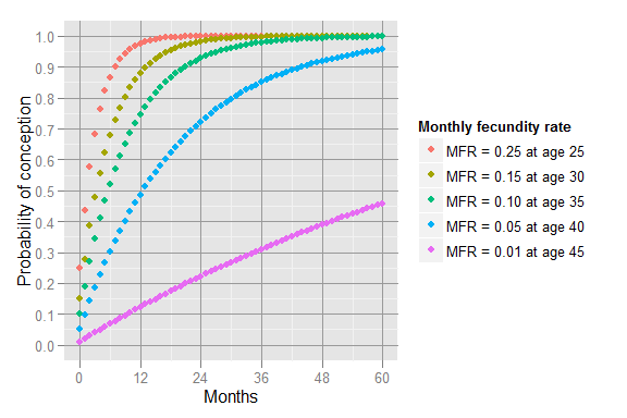
• Your online visualization options are limited when you don’t know how to program. The Miso Project, a collaboration between The Guardian and Bocoup, is an effort to lighten the barrier to entry.

    While the goal is to build a toolkit that makes visualization easier and faster, the first release of the project is Dataset, a JavaScript library to setup the foundation of any good data graphic. If you’ve ever worked with data on the Web, you know there are a variety of (usually painful) steps you have to go through before you actually get to fun stuff. Dataset will help you with the data transformation and and management grunt work.

    One of the most common patterns we’ve found while building JavaScript-based interactive content is the need to handle a variety of data sources such as JSON files, CSVs, remote APIs and Google Spreadsheets. Dataset simplifies this part of the process by providing a set of powerful tools to import those sources and work with the data. Once data is in a Dataset, it becomes simple to select, group, and calculate properties of, the data. Additionally, Dataset makes it easy to work with real-time and changing data, which pose one of the more complex challenges to data visualization work.

    Gonna keep an eye on this one. I’m curious to see how the visualization component starts to build out.

  • The BitTorrent protocol lets groups of people download parts of a single file from each other, so instead of one file from a single source, you get multiple bits from different places. Artist Conor McGarrigle shows this activity via an episode of Mad Men, as it’s downloaded.

    The video captures an episode of the popular TV show in the act of being shared by thousands of users on bittorent with the corruption of the file a direct result of the bittorrent protocol. The video acts as a visualisation of bittorrent traffic and the practice of filesharing and avoids infringing the copyright of Madmen as it is incomplete. Curiously the greater number of simultaneous users sharing the file the more aesthetically pleasing are the distortion effects.

    Poetic almost.

    [via Waxy]

  • Live flight tracking site FlightAware shows destinations and current routes. It’s everyday stuff for the most part, but around noon time today, a plane was circling above the ocean and crashed into the Gulf of Mexico.

    CNN reports:

    The Air Force, which had dispatched fighter jets to monitor the twin-engine Cessna 421, reported it crashed about 12:10 p.m., said Lt. Cmdr. Christopher O’Neil, a Coast Guard spokesman. The aircraft had been circling over the Gulf about 200 miles south of Panama City, Florida, another spokesman, Chief Petty Officer John Edwards, told CNN.

    The plane took off from Slidell, Louisiana, en route to Sarasota, Florida, with a single pilot on board, a Federal Aviation Administration source told CNN. It had been circling at an altitude of about 28,000 feet.

    Whoa.

    [via @DataJunkie]

  • From illustrator Stephen Wildish: the pancake venn diagram. Is it Friday yet? [via]

  • It was bound to happen at some point. Doctor and statistician Hans Rosling, best known for his sword-swallowing TED talk, among plenty of other things, made the Time 100 Most Influential list this year.

    What does Rosling make of his statistical analysis of worldwide trends? “I am not an optimist,” he says. “I’m a very serious possibilist. It’s a new category where we take emotion apart and we just work analytically with the world.” We can all, Rosling thinks, become healthy and wealthy. What a promising thought, so eloquently rendered with data.

    [Thanks, wife]

  • We intentionally and unintentionally put data in places like Facebook and Google but most of us don’t think much of it. In an interview with The Guardian, Tim Berners-Lee, inventor of the Web, says why you should care.

    My computer has a great understanding of my state of fitness, of the things I’m eating, of the places I’m at. My phone understands from being in my pocket how much exercise I’ve been getting and how many stairs I’ve been walking up and so on.”

    Exploiting such data could provide hugely useful services to individuals, he said, but only if their computers had access to personal data held about them by web companies. “One of the issues of social networking silos is that they have the data and I don’t … There are no programmes that I can run on my computer which allow me to use all the data in each of the social networking systems that I use plus all the data in my calendar plus in my running map site, plus the data in my little fitness gadget and so on to really provide an excellent support to me.

    Of course, getting users to see that is easier said than done. And until users see, the incentive for companies to provide such a service is low. In turn, it’s hard for data people to make a case to users, and you end up with a lot of hand waving. Challenge accepted?

  • NPR has a look at weekly drought figures over the past couple of years. The focus is on Texas, a state that’s been hit hard the past few months. In 2011, there was an estimated agricultural loss of $7.62 billion.

    The current drought began in October 2010. Though the situation has improved recently, the drought is far from over — and the conditions that caused it aren’t going away anytime soon.

    Texas is a place susceptible to extreme weather, and the last year was no exception. Thousands of square miles were burned in wildfires, billions were lost in agriculture, and its impact could still linger in years to come.

    Hit the play button, and the string of images runs like a flip book. Low tech, but effective.

    [via Matt Stiles]