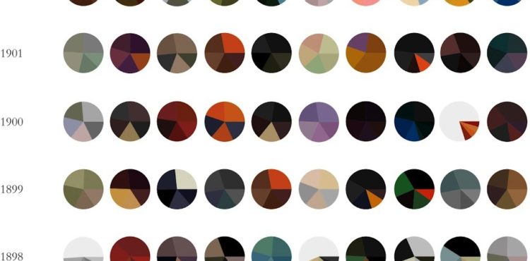
Expanding on his Vincent van Gogh pie charts, Arthur Buxton minimalized famous paintings from ten artists into more of everyone’s favorite chart type. The color distribution of each pie represents the five most used shades in each painting. Like the first time around, you’re either loving this or foaming at the mouth.
-
-
-
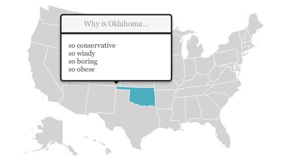
Renee DiResta got to wondering about state stereotypes, so she looked them up on Google and mapped them.
In the months before a US Presidential election, the quality of political discourse hits new lows. Blue State/Red State tropes dominate the news cycle as the media gins up outrage over perceived injustices in the culture wars. It’s all about our differences. So I started wondering, how do Americans really think about “those people” in other states? What are the most common stereotypes? For each of the fifty states and DC, I asked Google: “Why is [State] so ” and let it autocomplete. It seemed like an ideal question to get at popular assumptions, since “Why is [State] so X?” presupposes that X is true.
Roll over a state on the map, and the top four suggestions are listed. Hilarity ensues. “Why is California so… liberal, broke, anti-gun, and expensive?”
[via @rachelbinx]
-
-
Thousands of people have attended Edward Tufte’s one-day course on data graphics. Robert Kosara did not like it.
My advice? Buy his books. Read them. They’re good. Just realize that you’re getting a historical perspective on data visualization, not the cutting edge. Understand that Tufte’s ideas are a good starting point, not a religion. There are many things that Tufte doesn’t know, including pretty much anything related to visual perception and cognition, recent work (less than 30 years old), and interaction.
I’ve never been, but that’s sort of what I expected. Has anyone had a different experience with the course?
Update: Lots of good stuff in the comments. The consensus seems to be good/great for beginners, and others should stick to the books for refreshers.
-
-
-
-
Meters, by Berlin-based designers Patrick Kochlik and Monika Hoinkis, celebrates the joy of measuring for the sake of measuring. The pieces include a compass brooch and a bubble level that you wear as a watch, which is nice because everyone likes to know where they’re going while walking a level surface.
[via infosthetics]
-
In the what-happens-when-technology-takes-over-our-lives genre, Sight by Eran May-raz and Daniel Lazo, imagines a world where we wear contacts that augment our reality at such a high level that digital becomes physical. Life becomes a game, and everything is gamified, including an incredibly awkward date. But wait, there’s an app for that.
-
-
-
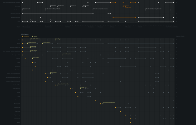
I’ve never played Portal 2 (or the first), but I suspect some of you will find these timelines by designer Piotr Bugno interesting.
As a fan of Valve’s Portal 2 video game, I designed this infographic led by my curiosity to get a better grasp on its plot, on how mechanics informed the gameplay, and on the development of its main themes — good vs evil, descent vs ascent, destruction vs construction.
Seriously, all meaning is lost for me on these. Any Portal 2 fans care to chime in?
-
-
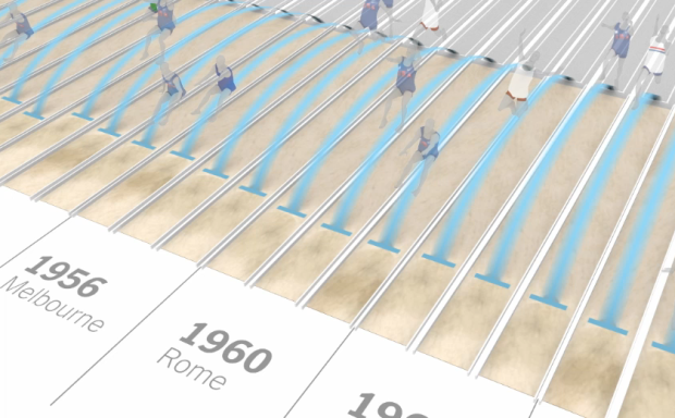
We’ve been hearing Olympic records rattled off for the past week, but it’s hard to grasp just how great these athletes are performing. I mean, we know they’re doing amazing things, but just how amazing? Kevin Quealy and Graham Roberts for The New York Times put it into perspective with two videos, one on the long jump and the other on the 100-meter sprint.
After I watched each, all I could think was, “Oh crap, that’s good.”
The videos frame distances and times in a way that’s immediately relatable, such as a basketball court to show how far medals winners jumped or how far previous sprinters would be behind Usain Bolt. Smooth transitions move you through different perspectives and pauses give focus to the most notable athletes, and although each video covers a lot of information, you never feel disoriented. They cover the overall picture, down to the individual, and back again.
Good stuff. Give ’em a watch.
-
-
-
-
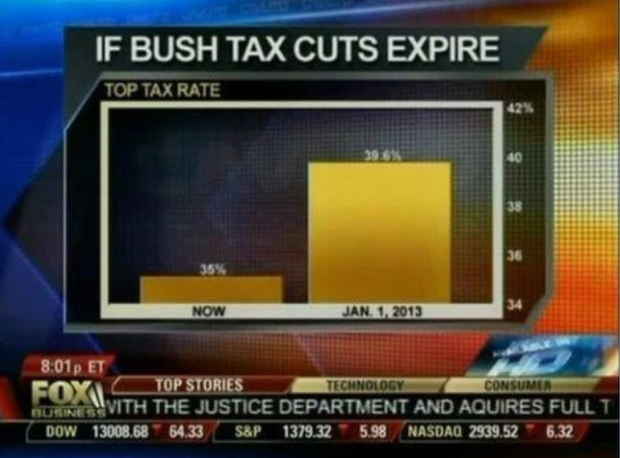
Fox News tried to show the change in the top tax rate if the Bush tax cuts expire, so they showed the rate now and what’d it be in 2013. Wow, it’ll be around five times higher. Wait. No.
The value axis starts at 34 percent instead of zero, which you don’t do with bar charts, because length is the visual cue. That is to say, when you look at this chart, you compare how high each bar is. Fox News might as well have started the vertical axis at 34.9 percent. That would’ve been more dramatic.
Here’s what the bar chart is supposed to look like:
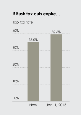
With a difference of 4.6 percentage points, the change doesn’t look so crazy.
[via Effective Graphs]


 Visualize This: The FlowingData Guide to Design, Visualization, and Statistics (2nd Edition)


