I’ve never played Portal 2 (or the first), but I suspect some of you will find these timelines by designer Piotr Bugno interesting.
As a fan of Valve’s Portal 2 video game, I designed this infographic led by my curiosity to get a better grasp on its plot, on how mechanics informed the gameplay, and on the development of its main themes — good vs evil, descent vs ascent, destruction vs construction.
Seriously, all meaning is lost for me on these. Any Portal 2 fans care to chime in?
 Visualize This: The FlowingData Guide to Design, Visualization, and Statistics (2nd Edition)
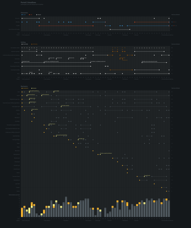
It’s a timeline documenting each level of the game. On the first graph, a dot or a line indicates that that character shows up in that level. For GLaDOS and Wheatley specifically, it also shows whether that character was good or evil during that level. Noticeably, in levels 35 and 61, one of them switches from good to evil and the other vice versa.
On the mechanics graph, a dot or a line indicates that that game mechanic shows up in that level. These are just different means used to reach the end of the level, such as shooting portals, pressing buttons, or avoiding falling into toxic water.
As for the setting graph, many different things show up here:
In the story, Aperture Laboratories has a “new facility” which is the place you start out in, and is recognizably similar to the Aperture facility in the original Portal game. Aperture also has an “old facility” which is defunct and inoperative (until you activate it) and shows a bit of Aperture’s history. Notice how some characters do and don’t show up in different facilities.
Test chambers are purely part of the story. Sometimes you’re inside a test chamber; sometimes you’re running around the facilities, snooping behind the scenes where GLaDOS or Wheatley doesn’t want you to be. The test chamber number is just a decorative thing displayed on a large computer screen at the beginning of each test chamber.
Secret areas are easter eggs that expose a little depth into the story if you happen to find them.
Facility status should be self-explanatory.
As for ascending and descending the facility, that just refers to your physical location within the facility. In the beginning, you go deeper and deeper, until Wheatley finally knocks you and GLaDOS into a long shaft that sends you to the very bottom of the facility. You start ascending through the old facility and eventually make your way back to the new facility above, as it’s being destroyed by Wheatley.
I’m not sure about the music graph. That probably means music is playing during that level.
Yep, the music line shows in which level music plays and when it’s diegetic (the source is part of the game world, e.g. a radio) or non-diegetic (e.g. a soundtrack).
Great explanation of the graph.
One notable takeaway from this graph is an indication of the complexity of the tests. Note that there are nearly 30 different tools a player needs to keep track of to solve a test, but a single level never uses more than 11 of them. This is a rough indication of the complexity of the levels. Also note how Valve spreads out the introduction of new ideas through the entire game, and how the final third of the game, the climax, is consistently difficult. All of these conclusions are not readily noticeable in game, and the graphic makes them clear… the hallmark of a good infographic. :-)
Speaking from the point of view of a devout Portal fan boy, It’s a really interesting piece of research and resultant content.
It fascinates me how people such as the creator of this can be so incisive to just splice such pertinent, relevant information from such large pieces of media like Portal 2 and compress it into one infographic. Brilliant.