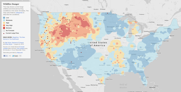
As megafires in the Southwest are becoming the new normal, NPR reports in a five-part series. An interactive map by Matt Stiles, Stephanie D’Otreppe and Brian Boyer provides a daily update on burning conditions across the country.
As megafires in the Southwest are becoming the new normal, NPR reports in a five-part series. An interactive map by Matt Stiles, Stephanie D’Otreppe and Brian Boyer provides a daily update on burning conditions across the country.
Edwin Chen, a data scientist at Twitter, took an in-depth look at what people are more inclined to tweet on Twitter and like on Facebook. He used FlowingData as his main data source, but also analyzed Quora, xkcd, and New Scientist. The main finding:
Twitter is still for the techies: articles where the number of tweets greatly outnumber FB likes tend to revolve around software companies and programming. Facebook, on the other hand, appeals to everyone else: yeah, to the masses, and to non-software technical folks in general as well.
I saw the analysis when it was posted over a year ago but never got around to sharing it. It crossed my desktop again recently. The results still seem to apply.
From a practical standpoint, I don’t think about whether or not people are going to share something more on Twitter or Facebook before I post it. I just link to what I think is interesting. However, when I post something with a poop or fart joke in it (so half the time, basically), I make sure I share it on Facebook, which I have to do manually. Because you know, bowel movements have universal appeal.
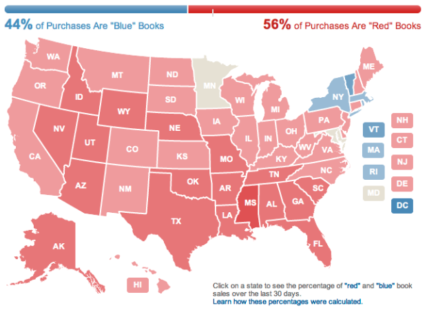
Amazon used their book sales data to color a map red and blue.
Our 2012 Election Heat Map colors each state according to the percentage of red and blue book purchases, based on shipping address, that have been made on Amazon.com during the past 30 days. We take the top-selling political books on Amazon.com and categorize them as “red,” “blue,” or neutral. We classify books as red or blue if they have a political leaning made evident in book promotion material and/or customer classification, such as tags. We compute percentages, updated daily, for each state and the US by comparing the 250 best-selling blue books during the time period against the 250 best-selling red books during the same time period, including new book launches.
The country is practically colored all red, so there’s not a ton to glean from the map. Although I wonder what it’d look like at the county or city level. They should do that. I also wonder what other trends can come from Amazon sales data. They should do that, too.
Water Light Graffiti is an installation by Antonin Fourneau that lets you use water and light as your painting medium.
The “Water Light Graffiti” is a surface made of thousands of LED illuminated by the contact of water. You can use a paintbrush, a water atomizer, your fingers or anything damp to sketch a brightness message or just to draw. Water Light Graffiti is a wall for ephemeral messages in the urban space without deterioration. A wall to communicate and share magically in the city.
Pretty awesome how the wall illuminates when a couple of buckets of water are thrown at it.
[via Co.Design]
Using DNA as a storage device, Harvard researchers managed to store one million gigabits of data per cubic millimeter.
Biology’s databank, DNA has long tantalized researchers with its potential as a storage medium: fantastically dense, stable, energy efficient and proven to work over a timespan of some 3.5 billion years. While not the first project to demonstrate the potential of DNA storage, Church’s team married next-generation sequencing technology with a novel strategy to encode 1,000 times the largest amount of data previously stored in DNA.
So does this qualify as big data or super tiny data?
[via @jakeporway]
 For the past ten years, researchers have been tagging hump back whales in the Gulf of Maine with a temporary tracking device called a D-tag. Whereas old tech only recorded location at the surface, the D-tag records depth and orientation allowing researchers to record feeding and diving patterns, which turns out to be pretty unique for each whale.
Scientists hope to use the data to shift fishing and boating policies in the area. Kelly Slivka for the New York Times reports. Be sure to watch the video with the scientists pointing at their computer screens.
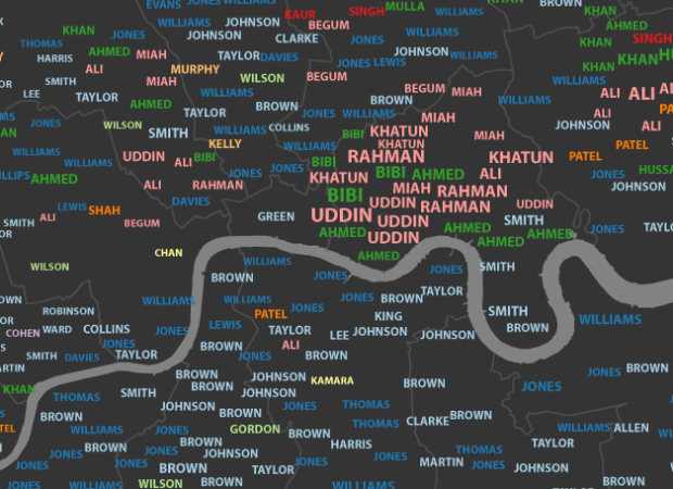
James Cheshire, a geography lecturer at the University College London, mapped common surnames in London.
This map shows the 15 most frequent surnames in each Middle Super Output Area (MSOA) across Greater London. The colours represent the origin of the surname (not necessarily the person) derived from UCL’s Onomap Classification tool. The surnames have also been scaled by their total frequency in each MSOA.
A slider lets you browse through the most common down to the 15th most common, revealing clusters of cultural majorities, down to minorities.
 Visualize This: The FlowingData Guide to Design, Visualization, and Statistics (2nd Edition)
New tools, refined process.


