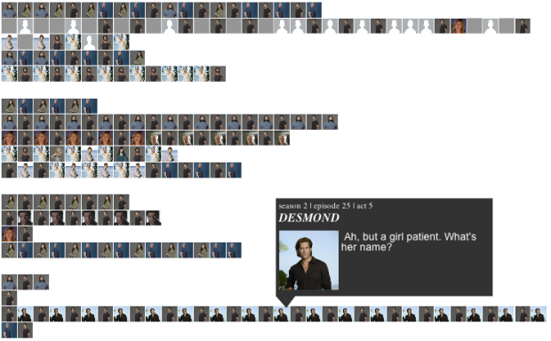
Santiago Ortiz visualized every episode of the show in the interactive Lostalgic. It’s a set a four views that shows character occurrences and relationships and the lines they said during various parts of each episode.
The first view, shown above, is a bar chart vertically arranged by time, where each row represents an act. A profile picture is shown whenever the corresponding character says something. The next two views, the network graph and co-occurrence matrix show interactions between characters, and finally, if you want to relive it all over again, you can choose the reenactment, and the animation will cycle through the characters and scripts.
I only watched a handful of episodes right before the last one, but realized my efforts to watch all six seasons would be useless, even if I watched 24/7 before the finale. I got to the part where they found a dead person in a tree. So I’m only appreciating this from the technical side. I suspect fans of the show will love it. [Thanks, Santiago]


 Visualize This: The FlowingData Guide to Design, Visualization, and Statistics (2nd Edition)


