• Researchers Pengyu Zhua and Yaoqi Zhang noted in their 2008 paper that “the demand for urban forests is elastic with respect to price and highly responsive to changes in income.” Poor neighborhoods tend to have fewer trees and the rate of forestry growth is slower than that of richer neighborhoods.

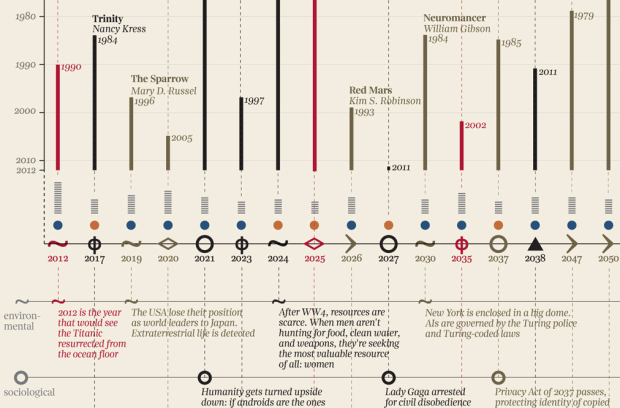
    Tim De Chant of Per Square Mile wondered if this difference could be seen through satellite images in Google Earth. It turns out that you can see the distinct difference in a lot of places. Above, for example, shows two areas in Rio de Janeiro: Rocinha on the left and Zona Sul on the right. Notice the tree-lined streets versus the not so green.

    De Chant notes:

    It’s easy to see trees as a luxury when a city can barely keep its roads and sewers in working order, but that glosses over the many benefits urban trees provide. They shade houses in the summer, reducing cooling bills. They scrub the air of pollution, especially of the particulate variety, which in many poor neighborhoods is responsible for increased asthma rates and other health problems. They also reduce stress, which has its own health benefits. Large, established trees can even fight crime.

    Okay, I don’t now about that last part about fighting crime. Without seeing the data, I think that sounds like a correlation more than anything else, but still. Trees. Good.

    [via Boing Boing]

  • As part of their mission to reform destructive fishing practices, Ocean2012 explains the risk of catching too much fish, in motion graphics. I like the pixelated aesthetic.

    See also Nigel Upchurch’s video on farmed fish.

    As a consumer, I’m still confused. Can someone make a list of fish I can and can’t eat without disrupting ocean equilibrium?
    Read More

  • New York University graduate student Josh Begley grabbed 4,916 satellite images of prisons via the Google Maps API and put them all in one place. It’s called Prison Map.

    The United States is the prison capital of the world. This is not news to most people. When discussing the idea of mass incarceration, we often trot out numbers and dates and charts to explain the growth of imprisonment as both a historical phenomenon and a present-day reality.

    But what does the geography of incarceration in the US actually look like? Prison Map is my attempt to answer that question.

    Most are isolated boxes surrounded by a lot of field, but oddly there are some in close proximity to residential. There’s one towards the bottom that actually does look like a residential area. Either it’s a blip or grandma is running a prison in the basement. Probably the former.

  • Members Only

    When base graphics and existing packages don’t do it for you, turn to low-level graphics functions to make what you want.

  • Wireless network SSIDs in residential areas are typically left on default router names like Belkin or LinkSys, but some people use them as a subtle way to broadcast a message. Sometimes it’s simple like “DontStealMyInternet” or “Big Bob’s playhouse.” Others use their SSIDs to make a political statement. With that in mind, James Robinson, a developer for OpenSignalMaps, wondered if political allegiance could be inferred from assigning sentiment to SSIDs.

    According to this eccentric measure of sentiment Obama is much more popular outside of the US than within. Why is this? It may be that Obama is genuinely more popular in the rest of the world but maybe it is because outside of the US people are less likely to express negative sentiments towards politicians in this manner. We can’t answer this definitively but looking at Argentina, at least, does suggest this is the case.

    I’m surprised it was so evenly split in the US between negative and positive since in a way it’s like putting a sign up on your lawn. Usually you see signs in support of a candidate rather than one that says an opposing candidate sucks.

    Anonymity probably plays the main role in this case. You can’t put up a mean sign in front of your house and pretend it’s not yours, but you can make an insulting SSID, and no one would be the wiser.

  • Guides  /  ,

    R, the open source statistical software environment, is powerful but can be a…

  • By Dan Piraro of Bizarro Comics. This is what happens when you don’t label your axes. Also this. [via Laughing Squid]

  • From Take Part, a short video on how a virus spreads and its possible global effects. Apparently one million deaths could be prevented every year if people would just wash their hands regularly. Too bad there’s that temporary allergy to soap and water people get after doing their business in public restrooms.

    [via Brain Pickings]

  • During a one-week visualization course at the Copenhagen Institute of Interaction Design, Kat Zorina, Ruben van der Vleuten, and Kostantinos Frantzis put together a working prototype that makes smoothies based on mentions of fruit on Twitter.

    Using the Twitter API, it collects tweets containing mentions of specific fruits such as blueberry, pineapple, apple and carrot and creates a smoothie that represents the blend. The smoothie is created based on the same proportions of fruits collected from the tweets. Because twitter trends change quickly, each smoothie has a unique palette of flavors.

    Next steps: a blender that provides variable consistency like chunky versus completely blended, a scoop of sherbet, and free energy boost. Oh, the possibilities.

    [via @golan]