Something changed. [via]
-
-
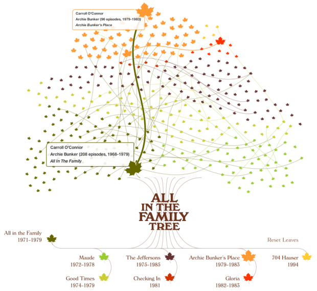
James Grady from Fathom Information Design had a look at the family tree of All in the Family, a popular television from the 1970s:
All in the Family was the origin of seven spin-off shows that aired between the early ’70s and the mid-’90s: Maude, Good Times, The Jeffersons, Checking In, Archie Bunker’s Place, Gloria, and 704 Hauser.
In tribute to nostalgia, the end of fall and its beautiful colors, and my fascination with retro TV shows, I’ve created All in the Family Tree, an interactive visualization of all the characters from each of the eight shows listed above. Each character is represented by a leaf and each show is indicated by a separate color. A branch line connects a character’s crossover from original show to spin-off and vice versa.
It’s a charming piece that’s sure to bring back good memories for anyone who watched the shows. I was too young to appreciate them at the time, and all I can remember is the opening sequence of The Jeffersons. I think they were moving on up. To the east side.
-
-
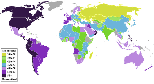
Max Fisher for the Washington Post mapped country emotion ratings, based on the results of a recent Gallup study. Singapore was ranked least emotional, whereas the Philippines was ranked most emotional. The United States was also relatively high. From Gallup:
While higher incomes may improve people’s emotional wellbeing, they can only do so to a certain extent. In the United States, for example, Nobel Prize-winning economist Daniel Kahneman and Princeton economist Angus Deaton found that after individuals make $75,000 annually, additional income will have little meaningful effect on how they experience their lives. Consider this finding in the context of Singapore, a country with one of the lowest unemployment rates and highest GDP per capita rates in the world, but a place where residents barely experience any positive emotions. This research shows that it will take more than higher incomes to increase positive emotions or decrease negative emotions. Singapore leadership needs to consider strategies that lie outside of the traditional confines of classic economics and would be well-advised to include wellbeing in its overall strategies if it is going to further improve the lives of its citizenry.
I’m curious about what we’re seeing here though. The research infers wellbeing, but the survey was done by phone and face-to-face. Did Americans call overseas, or did residents call other citizens? The former might be kind of weird for some.
More importantly though, they asked questions like “Did you smile or laugh a lot yesterday?” and “Did you experience enjoyment?” Some cultures just don’t express emotions, but it doesn’t mean they don’t feel them. (Read as: I’m not a robot! I have feelings, too!)
[Thanks, John]
-
-
-
-
In 1979, Atari released Lunar Lander, a game whose object was to land a module safely on the moon. Digital artist Seb Lee-Delisle turned the game into an installation in which you play the game, and your paths are drawn on a wall by a hanging robot. The result, a unique trace of players’ paths in the game, is quite nice.
I’m surprised we haven’t seen more video game-based pieces likes this. The only one that comes to mind is the Just Cause 2 point cloud, which showed 11 million player deaths. It revealed terrain and gameplay mechanics. There’s also this graphic that shows what buttons to push to beat Super Mario Brothers 3, but that doesn’t really count. It’d be fun to see the direct path of a Mario expert versus a novice path that doubles back and ends early. Pac-Man might be a fun one to see, too. Yeah, let’s do that.
-
Jer Thorp talks ethics in the data-as-new-oil metaphor:
[W]e need to change the way that we collectively think about data, so that it is not a new oil, but instead a new kind of resource entirely. For this to occur we need to foster a deep understanding of data in society. As it happens, humanity has a mechanism for this kind of broad cultural change: the arts. As we proceed towards profit and progress with data, let us encourage artists, novelists, performers and poets to take an active role in the conversation. In doing so we may avoid some of the mistakes that we made with the old oil.
See also: Jer’s talk on the human side of data.
-
-
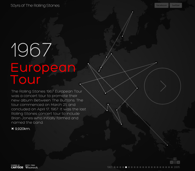
CartoDB mapped every Rolling Stones tour from 1963 to 2007.
The Stones passed the half-century mark as a band this year. An incredible achievement for an incredible band. They also happen to be one of the most prolific touring bands in the world with more than 1,300 concerts all over the world, and over the last 50 years they have have traveled almost 1,000,000 Km (960,000 km actually).
Made with the newly introduced CartoDB 2.0, with added support for MapBox, more mapping capabilities, and a JavaScript API.
-
-
A research paper version of Noah Kalina’s photo project by Timothy Weninger. Weninger saved versions of the paper at various stages of writing, and strung them together in a time-lapse video. It reminds me of Ben Fry’s On the Origin of Species.
I wish I had done this with my dissertation. [via @revodavid]
-
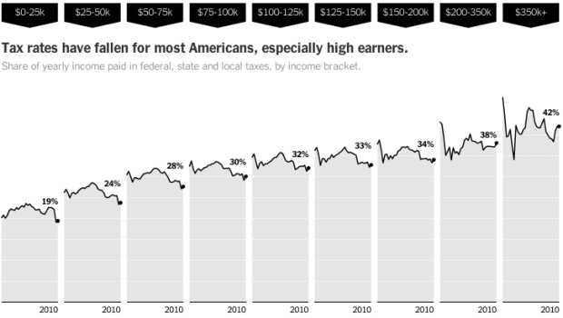
Mike Bostock, Matthew Ericson and Robert Gebeloff for the New York Times explored changing tax rates from 1980 to 2010, for various income levels.
Most Americans paid less in taxes in 2010 than people with the same inflation-adjusted incomes paid in 1980, because of cuts in federal income taxes. At lower income levels, however, much of the savings was offset by increases in federal payroll taxes, state sales taxes and local property taxes. About half of households making less than $25,000 saved nothing at all.
Instead of trying to squeeze everything into one space, the graphic reads like a story, with changes in different types of taxes and comparisons across income levels.
-
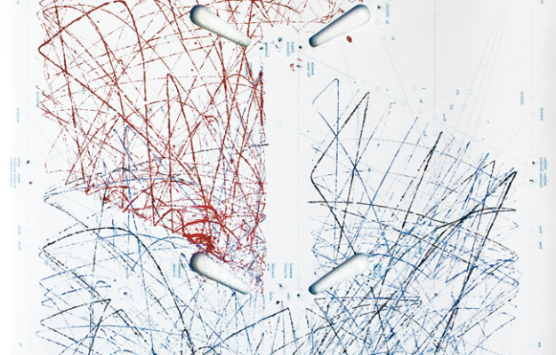
When you plan pinball, the ball bounces around creating paths for itself and the better you play, the more control you have over those paths. Recent design graduate Sam van Doorn modified a machine so that you can see those paths in his project STYN. A poster is placed underneath the flippers, and the ball gets a douse of paint on the way out, so you get a unique sketch each time you play. [via infosthetics]
-
With Google’s driverless cars now street legal in California, Florida, and Nevada, Gary Marcus for the New Yorker ponders a world where machines need a built-in morality system.
That moment will be significant not just because it will signal the end of one more human niche, but because it will signal the beginning of another: the era in which it will no longer be optional for machines to have ethical systems. Your car is speeding along a bridge at fifty miles per hour when errant school bus carrying forty innocent children crosses its path. Should your car swerve, possibly risking the life of its owner (you), in order to save the children, or keep going, putting all forty kids at risk? If the decision must be made in milliseconds, the computer will have to make the call.
Data analysis seems to be headed in the same direction. Where machines will have to start making human-like decisions, data represents more of the real world and looks less like snippets in time. As the gap between numbers and what they represent shrinks, the more we have to think about ethics, privacy, and whether or not what we’re doing is right.
-
-
-


 Visualize This: The FlowingData Guide to Design, Visualization, and Statistics (2nd Edition)


