• Visualization is a great way to explain and describe data to people who don’t know data. Good visualization lets the data speak, as they say. But this doesn’t mean you shove your data into a program or stick it into a presentation template and expect others to care. You still have to analyze and explore the data yourself, find what’s interesting, and you present that.

    “But how do I make this graphic look cool?”

    Tell people something more about the data that isn’t just, “Here’s the data.”

    You could use an obscure visualization method in place of your standard one, but what’s the point if you just say the same thing? You might catch an eye or two because of the novelty, but those eyes will bolt just as quickly if there isn’t any substance.

    So instead of showing the same non-message in different ways, you iterate. You cut and explore the data in different ways, and you make a lot of graphics that never see the light of day. Many will be ugly, and most of them will be uninteresting, but you might also find something worthwhile. Let that something guide you.

  • I’m so glad there are people like Jake Porway in the world. The founder and executive director of DataKind gives his quick pitch on “using data in the service of humanity.”

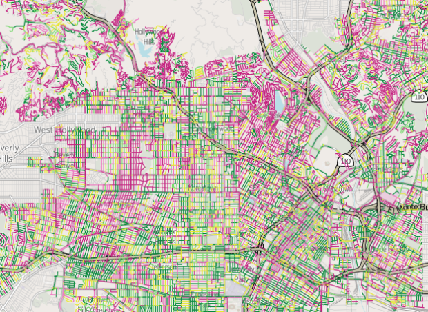
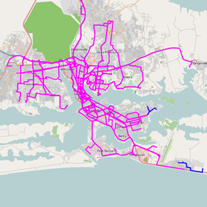
  • I’m late to this party. TileMill, by mapping platform MapBox, is open source software that lets you quickly and easily create and edit maps. It’s available for OS X, Windows, and Ubuntu. Just download and install the program, and then load a shapefile for your point of interest.

    For those unfamiliar with shapefiles, it’s a file format that describes geospatial data, such as polygons (e.g. countries), lines (e.g. roads), and points (e.g. landmarks), and they’re pretty easy to find these days. For example, you can download detailed shapefiles for roads, bodies of water, and blocks in the United States from the Census Bureau in just a few clicks.

    The fun part is that you can easily customize the maps using a map stylesheet, which is similar to CSS. There are examples with the software, so you can get a feel for how everything fits together. You can also export your results as an image file or as SVG to edit in your favorite vector-editing software. Or if you want to publish your map online, it’s straightforward to upload it to MapBox with an account.

  • During the Olympics, Studio NAND, Moritz Stefaner, and Drew Hemment tracked Twitter sentiment with Emoto. This interactive installation and data sculpture is the last leg of the project.

    The emoto data sculp­ture repres­ents message volumes, aggreg­ated per hour and senti­ment level in hori­zontal bands which move up and down according to the current number of Tweets at each time. This resulted in simpli­fied 3-dimensional surfaces which allows visitors to identify patterns in message frequency distri­bu­tion more easily. And while not being specific­ally designed in this direc­tion, the surfaces also nicely support haptic exploration.

    The sculpture itself is black and unchanging, and it’s used as a projection surface to display a heat map and overlay text. The projection is controlled by the user, which makes for an interesting blend of physical and digital.

  • A couple of years ago, xkcd ran a survey that asked people to name colors. Stephen Von Worley plotted that data by gender in an interactive.

    That’s a dot for each of the 2,000 most commonly-used color names as harvested from the 5,000,000-plus-sample results of XKCD’s color survey, sized by relative usage and positioned side-to-side by average hue and vertically by gender preference. Women tend to use color names nearer the top, men towards the bottom, and the dashed line represents the 50-50 split (equal usage by both sexes).

    While his original version was static, the interactive version lets you sort by hue, saturation, brightness, popularity, and name length. Most importantly, you can see the color names now when you mouse over. I like the vertical spectrum of purple, where women use names like bright lilac, orchid, and heather, and men tend to label similar shades as purplish, lightish purple, and oh yes, very light purple. [Thanks, Stephen]

  • Thomas H. Davenport and D.J. Patil give the rundown on what a data scientist is, what to look for and how to hire them. It’s an article in Harvard Business Review, so it’s geared towards managers, and I felt like I was reading a horoscope at times, but there are some interesting tidbits in there.

    Data scientists don’t do well on a short leash. They should have the freedom to experiment and explore possibilities. That said, they need close relationships with the rest of the business. The most important ties for them to forge are with executives in charge of products and services rather than with people overseeing business functions. As the story of Jonathan Goldman illustrates, their greatest opportunity to add value is not in creating reports or presentations for senior executives but in innovating with customer-facing products and processes.

    I still call myself a statistician. The main difference between data scientist and statistician seems to be programming skills, but if you’re doing statistics without code, I’m not sure what you’re doing (other than theory).

    Update: This recent panel from DataGotham also discusses the data scientist hiring process. [Thanks, Drew]

  • This month the Netherlands held national elections, and now that the results are in, interaction designer Jan Willem Tulp had a look at voting similarity between cities. I’m not sure what metric was used to judge similarity, but it looks like it was based on voting distributions for candidates.

    Each circle represents a city, and you can choose between a geographic layout or a radial one. When you select a circle, the others change size and color, where more red and larger means more similar. In the radial layout, circles that are farther are away are less similar. Be sure to look at the city of Urk in the radial layout. According to Tulp, it’s the most religious city, and it votes completely differently from the rest. [Thanks, Jan]

  • I’m not sure what I’d do with Ablaze.js, a JavaScript library by Patrick Gunderson, but the results are sexy. Play around with the app here. [via @jeffclark]

  • The Forest of Advocacy is a series of animations that explores the political contribution patterns among eight organizations, such as Bain Capital, Goldman Sachs, and Harvard Business School.

    These visualizations provide a dynamic look at the partisan tilt of giving within organizations. For each organization, individuals are characterized as points sketching out a line over time. The X axis is time, and the Y axis represents the net partisan tilt of contributions over the preceding 6 months. Over the decades, one sees lines sketched out, reflecting the partisanship of individuals over time. For each organization, we also provide the net contributions of the entire organization, and the names of biggest Democratic, Republican, and “bipartisan” contributors (the individual with the highest product of Democratic and Republican contributions).

    At the core, each animation is a time series chart, but the aesthetic and animation, which is narrated, provides for a more organic feel. In particular, the movements of people, represented by squares shifting straight across or up and down, makes it easy to see consistent and not so consistent contributions. [Thanks, Mauro]