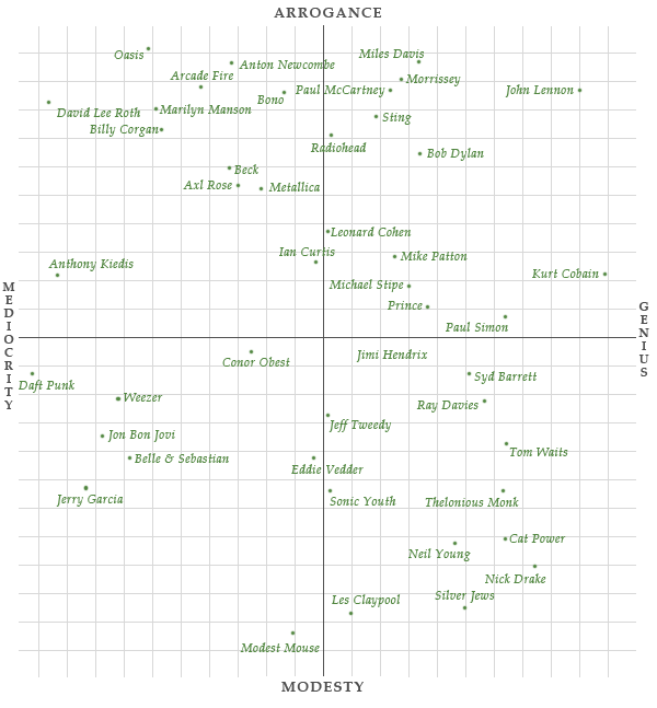
Just for kicks, Jimmy Chen plotted artists on a subjective arrogance-vs-genius scale. Above is the one for singers.
-
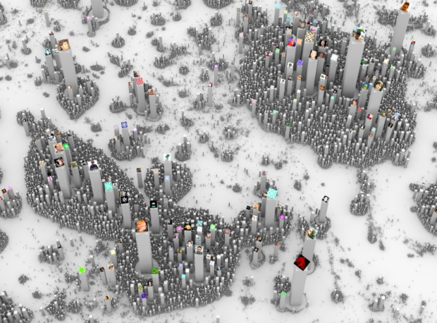
Ekisto, by visual artist Alex Dragulescu, is an experiment in visualizing online communities that provides an interesting city effect. So far there are views for StackOverflow, Github, and Friendfeed.
A graph layout algorithm arranges users in 2D space based on their similarity. Cosine similarity is computed based on the users’ network (Friendfeed), collaborate, watch, fork and follow relationships (Github), or based on the tags of posts contributed by users (StackOverflow). The height of each user represents the normalized value of the user’s Pagerank (Github, Friendfeed) or their reputation points (StackOverflow).
Also available in print.
-
Based largely on satellite data and the results of an airborne data collection mission compiled by the British Antarctic Survey, Bedmap2 by NASA Goddard is a construction of what Antarctica looks like underneath the giant sheet of ice. This iteration of the map used 25 million more observations than the original Bedmap1, which was released in 2001, and provides a more granular view.
[via Wired]
-
A video from the International Geosphere-Biosphere Programme explains global warming and projected changes in the near future. I wanted them to provide more contrast to the data they showed over the globe, but the story itself is an interesting one.
-
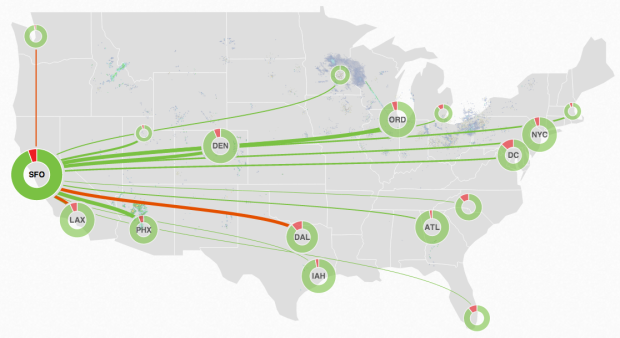
FlightAware is a live flight tracker that lets you look up a flight to see where a plane is (and also provides a for-fee API). Their new MiseryMap focuses on delays and cancellations, a sore spot for all fliers and especially relevant given the holiday season and wintery weather. Donuts on the map represent on-time flights in green and delayed and canceled ones in red.
They also show weather underneath, which is important context and a leading cause of misery. However, I wish there was a legend to tell me what those rainbow spectrum clouds mean.
-
The holiday season came out of nowhere this year. Everyone put their lights up over the weekend while I’m stuck trying to figure out what day it is. If you’re like me and need some quick gift ideas for your fellow data nerd, here are some fine ones that you can’t go wrong with.
Read More -
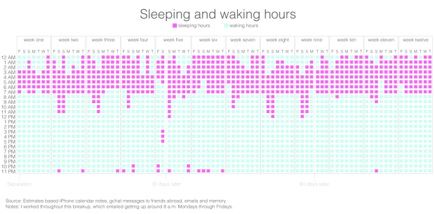
A recently divorced woman is using her personal data — phone logs, emails, chats, bank statements, and GPS traces — as her own way to cope with the new situation.
Divorce is hard. Putting this process into numbers, images and data visualizations is helpful. It yanks me out of these all-consuming moments of sadness and helps me understand how, perhaps as time passes, things are going to be ok in the long run (looking for positive trends within the data!) I hope these web things can help you, too.
Data and charts as a route to clarity. Sounds right.
See also: What Love Looks Like.
-
Looking for a job in data science, visualization, or statistics? There are openings on the board.
Data Scientist at Mi9 in Sydney, Australia.
Data Visualization Specialist at infogr8 in London, UK.
Product Engineer at Practice Fusion in San Francisco, CA.
Data Scientist at Thumbtack in San Francisco, CA.
Content Marketing Designer in New York, NY.
-
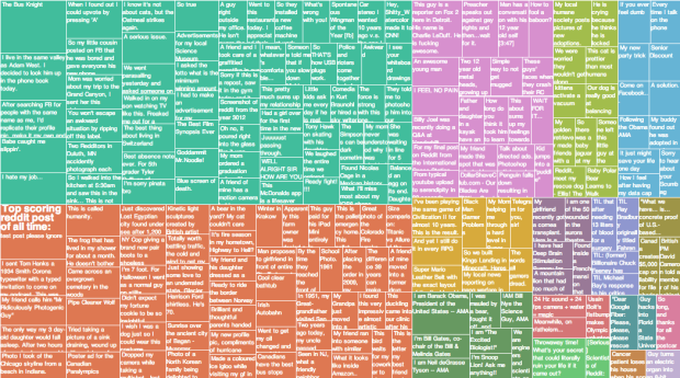
For the downtime post-turkey. James Trimble stuck the top 200 reddits of all time into a treemap. Let the time suck begin.
-
Using the effective jellybean method, Ze Frank describes the finite time we have. Each bean represents a day in the life of an average person.
Happy Thanksgiving, everyone.
-
The Baseline and Working with Time Series in R
A big part of statistics is comparisons, and perhaps more importantly, to figure out what to compare things to. Perspective changes with the baseline.
-
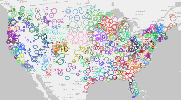
Andrew Filer mapped the reach of public radio stations in the United Stations, based on data from Wikipedia and the station search from the Federal Communications Commission. Each circle represents a station and its coverage, and colors represent media outlets. For example, Capital Public Radio in Northern California is available across several stations in Sacramento, Modesto, Tahoe City, and others.
So now you know where to go the next time you grow tired of the usual Billboard top 20.
-
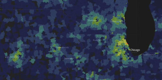
The Washington Post looked at Super ZIP codes, a classification based on household income and education levels. It’s a featured story, but it leads off with an interactive map so that you can see the ZIPs you’re interested in.
The ranks, ranging from 0 to 99, represent the average of each Zip’s percentile rankings for median household income and for the share of adults with college degrees. Super Zips rank 95 or higher. This approach is adapted from one used by author Charles Murray.
The map at top shows the nation’s 650 Super Zips. Among them, the typical household income is $120,272, and 68 percent of adults hold college degrees. That compares with $53,962 and 27 percent for the remaining 23,925 Zips shown. Only Zips with at least 500 adults are displayed.
I wonder what you get when you look at just education alone. Does it look the same? And, as usually is the case with these sorts of studies, how does cost of living play a role?
-
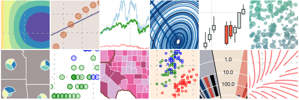
Bokeh, a Python library by Continuum Analytics, helps you visualize your data on the web.
Bokeh is a Python interactive visualization library for large datasets that natively uses the latest web technologies. Its goal is to provide elegant, concise construction of novel graphics in the style of Protovis/D3, while delivering high-performance interactivity over large data to thin clients.
If you’re new to this stuff, you might just want to start with D3.js simply to avoid the Python setup, but if you use Python exclusively already, this might fit well in your workflow.
-
Presented mostly for my fond memories as a grade schooler, with a fresh 2400 bps modem in the 486, who recently discovered something called a BBS. Those were the good old days. My dad got me a 50-foot phone line to run from the computer to the phone jack in the back corner of another room.
-
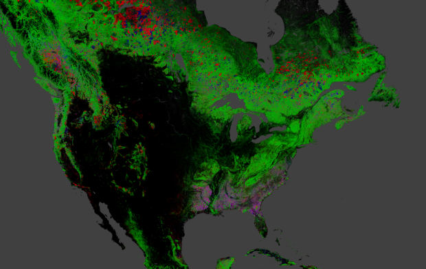
Hansen, Potapov, Moore, Hancher et al. produced high-resolution maps of global forestry to estimate change between 2000 and 2012.
Quantification of global forest change has been lacking despite the recognized importance of forest ecosystem services. In this study, Earth observation satellite data were used to map global forest loss (2.3 million square kilometers) and gain (0.8 million square kilometers) from 2000 to 2012 at a spatial resolution of 30 meters. The tropics were the only climate domain to exhibit a trend, with forest loss increasing by 2101 square kilometers per year. Brazil’s well-documented reduction in deforestation was offset by increasing forest loss in Indonesia, Malaysia, Paraguay, Bolivia, Zambia, Angola, and elsewhere. Intensive forestry practiced within subtropical forests resulted in the highest rates of forest change globally. Boreal forest loss due largely to fire and forestry was second to that in the tropics in absolute and proportional terms. These results depict a globally consistent and locally relevant record of forest change.
Be sure to select the various data products and zoom in on example locations via the dropdown menus on the right of the map.
-
Nice. See also Lisa Simpson on the curve of knowledge. [via reddit]
-
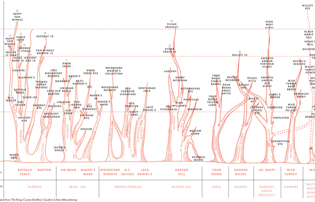
Colin Spoelman for GQ illustrated an educated guess of the bourbon family tree.
This chart shows the major distilleries operating in Kentucky, Tennessee, and Indiana, grouped horizontally by corporate owner, then subdivided by distillery. Each tree shows the type of whiskey made, and the various expressions of each style of whiskey or mash bill, in the case of bourbons. For instance, Basil Hayden’s is a longer-aged version of Old Grand-Dad, and both are made at the Jim Beam Distillery.
This is important.
-
Friedrich Lindenberg and Gregor Aisch recently released dataset, a Python library to take the grunt work out of using databases in Python.
Although managing data in relational database has plenty of benefits, they’re rarely used in day-to-day work with small to medium scale datasets. But why is that? Why do we see an awful lot of data stored in static files in CSV or JSON format, even though they are hard to query and update incrementally?
The answer is that programmers are lazy, and thus they tend to prefer the easiest solution they find. And in Python, a database isn’t the simplest solution for storing a bunch of structured data. This is what dataset is going to change!
So many times I start with a dataset, try to avoid the busy work in creating a database for a smallish project, and eventually dig up an old script or the most recent version of it. Saving this one for later.





 Visualize This: The FlowingData Guide to Design, Visualization, and Statistics (2nd Edition)


