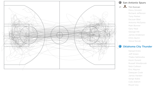
Where do street names come from? Sometimes there’s actual history behind a name, and other times a street just needed a label, so someone pretty much pulled one out of a hat. For the former, there can be some interesting stories at work. Web developer and Knight-Mozilla fellow Noah Veltman mapped the history of street names in San Francisco under this premise. Just click on a blue street in the interactive and information pops up.
-
Kevin Jamieson, an electrical and computer engineering graduate student at the University of Wisconsin-Madison, put his work in active ranking into practice. The experimental app is called Beer Mapper.
The application presents a pair of beers, one pair at a time, from a list of beers that you have indicated you know or have access to and then asks you to select which one you prefer. After you have provided a number of answers, the application shows you a heat map of your preferences over the “beer space.”
Around 10,000 beers with at least 50 reviews on RateBeer were used as the foundation of the recommendation system. The reviews were reduced to just the individual words and counts, which gives sort of a profile for each beer (or a “weighted bag of words”). You rate beers, and the system tries to find profiles that are mathematically most similar.
Two caveats. The first is that it looks like the app just gives you a heat map of the styles of beer you might like. A recommended list of actual beers would be way better. Second, the app is a research project that likely won’t be in the app store any time soon, so the first point is moot. Sad face. Maybe Untappd should read Jamieson’s paper. [via Fast Company]
-
Ben Orlin likes math and teaching. He’s bad at drawing. He has a blog on math and teaching with bad drawings.
This blog is about the things I like. It’s also about the things I can’t do. I hope that the juxtaposition here — polished, thoughtful writing alongside art that my fiancee (charitably) likens to “the average 6th grader” — captures the contradictory state of the teacher, of the mathematician – and, what the hell, of the human. We are all simultaneously experts and beginners, flaunting our talents while trying to cover our shortcomings the way an animal hides a wound. You could call this a “math blog,” or a “teaching blog,” but I would call it a blog about owning up to weakness and drawing strength from successes, however transient or trivial they may seem.
-
Small Multiples in R
Make a lot of charts at once, line them up in a grid, and you can make quick comparisons across several categories.
-
Jake Porway, the founder of DataKind, has a new show on the National Geographic channel called The Numbers Game. I unfortunately don’t have the channel, so the clips on the site will have to suffice for now.
Keep in mind this show is for a wide audience though. Jake notes:
Now for those of you who have been writing to me excited that Big Data is finally getting its own TV show, I should point out that this show is a lot more like a science show than a show about data. You won’t find discussions about Hadoop, machine learning, or even the basics of correlation vs. causation here. Instead, the show tries to make the latest statistics accessible to a wide audience of people who may just be dipping their toes in to this new world of data. It’s more Guy Fieri than Carl Sagan, but it’s a blast.
The first of three episodes aired last week, and the second is on tonight. You should watch it.
-
-
In this straightforward video, Marius Budin offers a look at our insecurities as get older through the eyes of Google Suggest. If anything, it’s clear that there’s one thing we fear throughout: loneliness. Although, the suggestions in the early years worry me.
-
Stephen Wolfram analyzed the Facebook world, based on anonymized data from the Wolfram|Alpha Data Donor program. He visits topics from how people friend, how the Facebook world compares to the real one, and how people change with age.
People talk less about video games as they get older, and more about politics and the weather. Men typically talk more about sports and technology than women—and, somewhat surprisingly to me, they also talk more about movies, television and music. Women talk more about pets+animals, family+friends, relationships—and, at least after they reach child-bearing years, health. The peak time for anyone to talk about school+university is (not surprisingly) around age 20. People get less interested in talking about “special occasions” (mostly birthdays) through their teens, but gradually gain interest later. And people get progressively more interested in talking about career+money in their 20s. And so on. And so on.
Worth the full read.
-
As an alternative to dot density maps, Binify by Kevin Schaul allows you to map with hexagon binning in Python.
Dot density maps are a straightforward way to visualize location data, but when you have too many locations, points can overlap and obscur clusters and trends. That’s where binning comes in. Generally speaking, the goal is to look at an area on a map and then count how many points are within that area. Do that across the entire area.
Grab the package on GitHub and go to town.
-
This stop motion video from BuzzFeed shows how much food you can buy for $5 USD in different countries. For example, five bucks will get you 7 pounds of rice in the United States and 12 pounds in China. The video is straightforward, but the animation of food appearing and disappearing — or rather, added and taken away — lends well to the context that you wouldn’t get from a quick chart.
Read More -
-
Mr. Dalliard provides this handy flowchart to organize time travel movies. And yes, I immediately looked for Back to the Future and backtracked.
-
-
-
The Kepler mission by NASA has discovered more than 100 planets that orbit stars. Jonathan Corum for The New York Times visualized the ones with known size and orbit using small multiples. Scroll all the way down for our solar system as a point of reference.
-
With the start of the NBA playoffs tomorrow, it’s worth coming back to Kirk Goldsberry’s analysis on the evolution of Lebron James’ shot preference. James used to hang around the 3-point line a lot, but he spends a lot more time in the low post these days.
Read More -
Designer Ruben van der Vleuten was curious about the shipping process, so he did what anyone would do. He installed a camera in a cardboard box and shipped it to himself. Below is a time-lapse video of the package’s journey.
[via Co.Design]
-
-
Data is an abstraction of something that happened in the real world. How…
-
This video clearly describes the distribution of wealth in America using a set of transitioning charts. The graphics are good. The explanation is better.