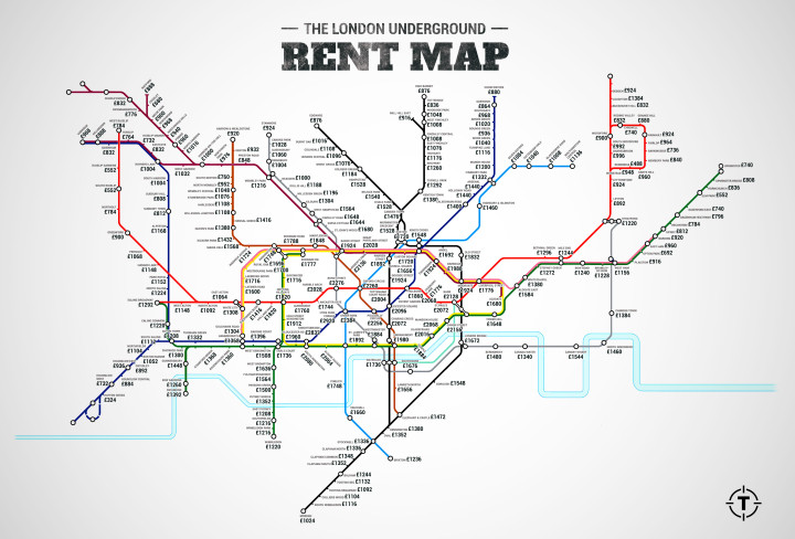
In a straightforward map, Jason Allen for Thrillist replaced station names on the London Tube map with median rent prices for a one-bedroom apartment in the area. I’m sure someone is working on U.S. subway maps at this very moment.
In a straightforward map, Jason Allen for Thrillist replaced station names on the London Tube map with median rent prices for a one-bedroom apartment in the area. I’m sure someone is working on U.S. subway maps at this very moment.
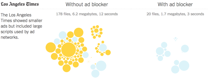
The ethics and future of ads to keep sites running is still up in the air. But one thing’s for sure: Ads and their trackers take up a lot of the bandwidth and load time for many sites. This is a problem especially for mobile where data caps and speed are more often an issue than on desktops. The New York Times ran tests on 50 major news sites to estimate the true cost of ads on your phone.
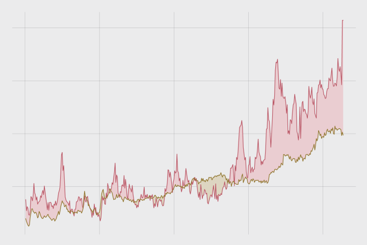
Quickly compare two time series variables with this line-area chart hybrid that originated in the 1700s. Also known as: difference chart.
In most depictions of the Solar System, planets are drawn big enough to show details and placed side-by-side to show order. The scale of the planets and the space in between them are usually a footnote. Alex Gorosh and Wylie Overstreet were curious about what you would get if you placed scale in the foreground. So they built a 7-mile model of the Solar System to scale in the middle of the desert, with Earth the size of a marble.
See also: if the moon were one pixel.
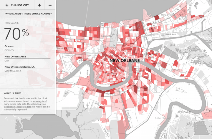
In 2014, five people died in New Orleans in a house fire. Three of them were children. There was no working smoke alarm. So the city analytics team and New York-based data group Enigma developed a model to predict which blocks in the city were at high risk.
If the city knew the areas that tended not to have smoke alarms, they could allocate resources appropriately to assure more people had the proper safeguards.
Enigma just expanded the project to more Metropolitan Statistical Areas in what they call Smoke Signals. See what areas near you look like.
Read More

Sensible Data by Martin Hertig is an installation that asks what personal data is worth to you. Using a photo of you and an email, it gives you a self-portrait sketch and guess at your mood, age, gender, and beauty based on your words. In the last step, the user presses a button for a nice stamp. There’s a catch though.
Read More
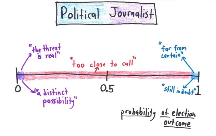
Statistically, probability ranges from 0 to 1 — impossible to definitely without a doubt. Math with Bad Drawings characterized what those values mean in various fields of expertise. This amuses me.
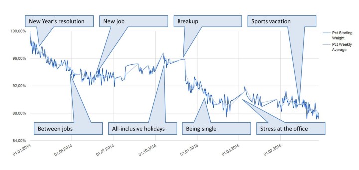
Reddit user superemmjay tracked his weight for 20 months and plotted the measurements. The annotation makes interesting what would otherwise be just some graph of someone’s weight over time.
See also: eight years of dating, the fitbit during sex, the marriage proposal heartbeat, and the quantified breakup.
There’s “letting the data speak” and then there’s this, where people who are closely familiar with their own data explain what’s there with some simple notes. Those little pointers make a big difference for outsiders who don’t know the context of where the numbers come from.

Willard Cope Brinton is credited as one of the pioneers of information visualization, and I just found out his 1939 book Graphic Presentation is available in its entirety at the Internet Archive. You can download it in various formats. The book was an update to his previous book from 25 years prior, Graphic Methods for Presenting Facts. It’s also at the Archive.
It’s always fun to read through these older publications. Naturally, there’s the historical significance and pretty graphs, along with tidbits on printing processes and paper (whatever those are).
But they talk about a lot of the same stuff that we do now—perception, narratives, attention, and all that—which always catches me off guard because we tend to think of visualization as this relatively new thing. Then it’s like oh wait, someone did this more than a century ago.

Nicky Case made an interactive explanation of how neurons work. It’s part narrated video and part game.
But the most important concept I wanted to introduce here was exposure therapy, which is part of Cognitive Behavioral Therapy. CBT is basically being mindful of your crappy neural connections, and gaining skills to retrain those connections.
I like how Case’s narrated responses change depending on what and how you click. It feels like he’s sitting there next to you.
You’ll want to set aside a bit of time to click through. It’s on the long-ish side by internet standards, and there’s no way to pick up where you left off if you come back to it later. Or, you can download the open source code and do it yourself.
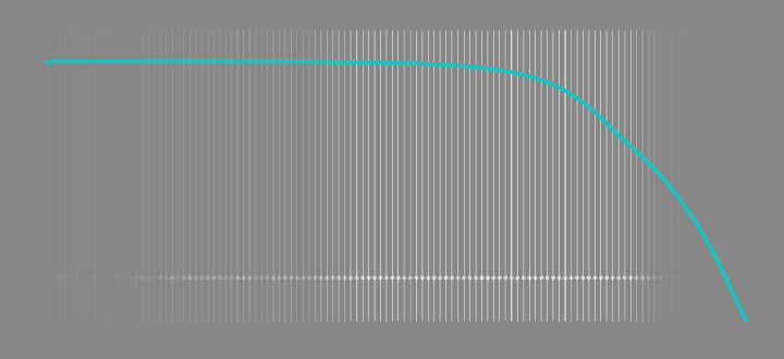
The individual data points of life are much less predictable than the average. Here’s a simulation that shows you how much time is left on the clock.
Dan Burns explains some properties of time and space using marbles and two large pieces of spandex sewn together in a classroom demonstration.
Read More
Trey Causey just finished an interview roundabout for data science jobs. He outlines his experiences and describes what interviewers seem to want, what questions to expect, and what to expect from yourself.
Sooner or later you’re going to find yourself looking for a data science job. Maybe it’s your first one or maybe you’re changing jobs. Even if you’re fully confident in your skills, have no impostor syndrome, and have tons of inside leads at great companies, it’s a tremendously stressful experience. The process of looking for a new job is often one that occurs secretly and confidentially and then is so exhausting that discussing the process is the last thing you want to do. I hope to change that.
A must-read for those about to get your feet wet.
See also Causey’s short guide on getting started with data science.
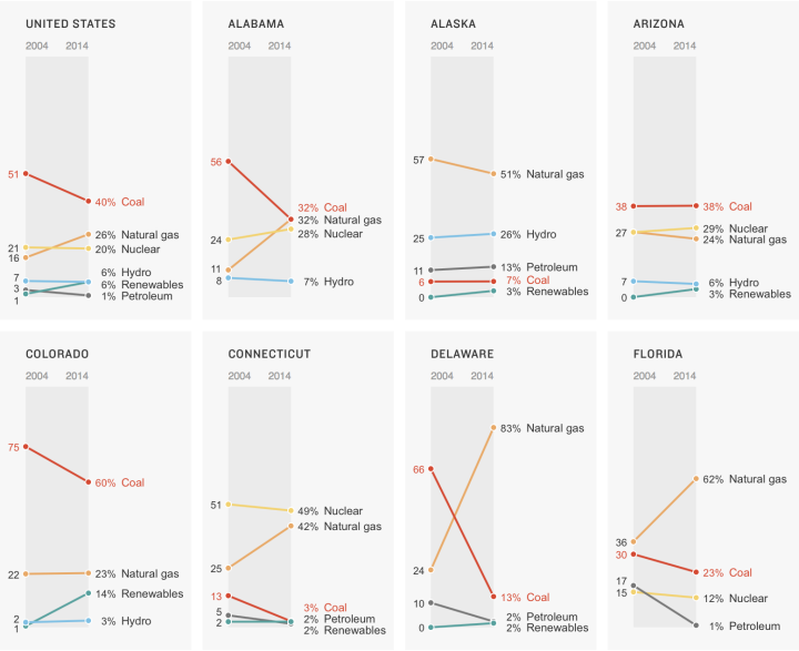
In a clean and simple set of slope charts, Alyson Hurt for NPR shows the shifts in power sources — coal, gas, nuclear, hydroelectric, and renewables — from 2004 to 2014. As you might guess, coal power output is down in most states and natural gas is up. On a national scale, the hydroelectric and renewable sources need more time.
Grab the data from the U.S. Energy Information Administration to look yourself.

Luis Dilger made a set of fine-looking prints that show city landscapes in 3-D. They look like little cardboard cutouts.
Read More
You know the thing. It’s the triangle of numbers that you learned about in high school. Each number in a row is the sum of the two numbers above it in the previous row. Of course, as explained in the video below, there’s more to it than that. SECRETS REVEALED.
[via kottke]
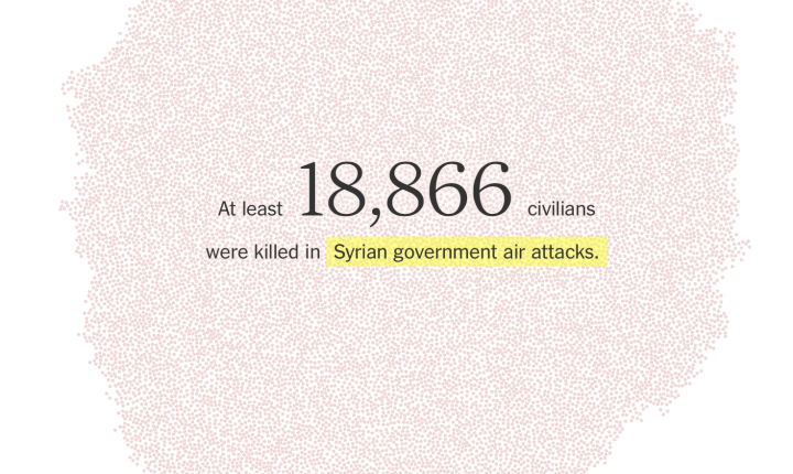
It is estimated that over 200,000 people have been killed during the Syrian civil war. That’s a lot of lives. Lives. In a striking representation by the New York Times, a dot represents each life lost.
 Visualize This: The FlowingData Guide to Design, Visualization, and Statistics (2nd Edition)
New tools, refined process.


