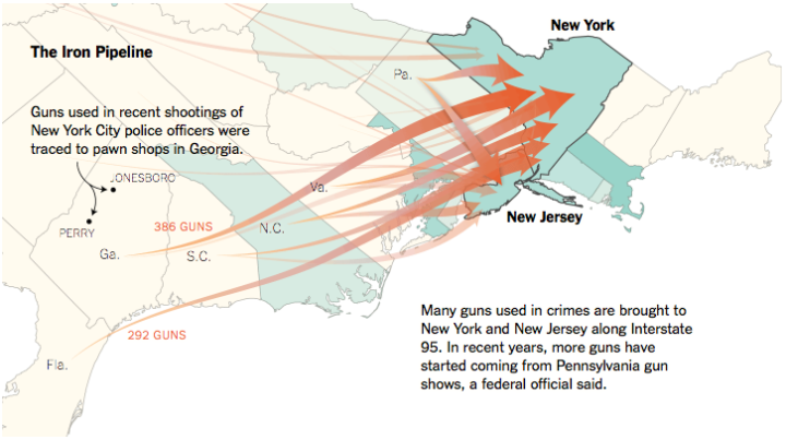
• Membership
  • Newsletter
  • Projects
  • Learning
  • About
  • Member Login
  • Cost to replace cable with streaming services, etc

    June 9, 2015

    Topic

    Statistics  /  cable, cut the cord

    The Washington Post has a straightforward calculator to figure out how much it will cost you to cut out cable television and replace it with streaming services. Just select the features you want, and the cost on the right tells you how much. Kind of fun to click at.
    Read More

  • Length of the average master’s thesis

    June 9, 2015

    Topic

    Statistical Visualization  /  R, thesis

    A while back beckmw found the average length of a dissertation for various fields of study, based on digital archives at the University of Minnesota. Here’s a follow-up to that data scrape with average lengths of masters’ theses, again for various fields. Medical Chemistry wins this round.

    By the way, the colors don’t mean anything. They’re just there for flourish.

    On the upside, the R code for scraping along with the resulting data is available for download.

  • More presidential candidates please

    June 8, 2015

    Topic

    Infographics  /  elections, government, New York Times

    “If it seems as if the list of presidential candidates for 2016 is growing by the day, that is because it is, at least on the Republican side.” Alicia Parlapiano for the New York Times charts the changing campaign calendar with more candidates and earlier starts. Because you know, we’re not even halfway through 2015 yet.

    On the upside: more charts.

  • A color analysis of Western films

    June 8, 2015

    Topic

    Statistics  /  color, movies, Western

    Kevin Ferguson examined color usage in Western films from various angles. One of those was the sum image using the movie frames every ten seconds.

    These shapes and colors are evocative in a way that tea leaves and tarot are: they don’t actually tell you much about what you’re looking at, but they allow you an emotional response confirmed or denied once you come to discover what the image “really” is.

    The methods themselves you’ve seen before, but probably not used in this way.

  • Aggregate the Los Angeles realtime bus feed

    June 5, 2015

    Topic

    Data Sources  /  bus, Los Angeles, transportation

    There is a realtime feed for the location of Los Angeles buses. It’s a bit messy. Morgan Herlocker made it straightforward to aggregate. Have at it. [Thanks, @augustjoki]

  • Iowa liquor sales data, 3m rows

    June 5, 2015

    Topic

    Data Sources  /  Iowa, liquor

    Iowa released liquor sales data for weekly purchases at the store level.

    This dataset contains the spirits purchase information of Iowa Class “E” liquor licensees by product and date of purchase from January 1, 2014 to current. The dataset can be used to analyze total spirits sales in Iowa of individual products at the store level.

    There are over three million rows that contain a store name, address, liquor category, liquor vendor, and cost. I imagine this could be a fun spatial time series dataset to play with. Look for seasonal trends, when stores expect to sell more rum or vodka, brand bestsellers, or regional favorites. Even though it’s just for Iowa, there’s probably a close relationship to national sales.

    See some preliminary documentation by Dan Nguyen on how to get started.

  • Endangered species depicted with geometric pieces

    June 5, 2015

    Topic

    Infographics  /  CSS, species

    In Pieces by designer Bryan James is an animated piece that uses simple geometric shapes to depict thirty endangered species.
    Read More

  • Getting bees to construct geographic maps

    June 4, 2015

    Topic

    Data Art  /  bees, physical

    In an exploration of the connection between humans an nature, artist Ren Ri uses beeswax as his medium and the bee colony as the builder. Yeah.

    Because a colony will follow the queen bee and build a hive based on the pheromones that she releases, Ri is able to move the queen such that the others in the colony act accordingly.
    Read More

  • Browser extension shows where you really are on the web

    June 3, 2015

    Topic

    Self-surveillance  /  browser, privacy

    The Citizen Ex browser extension guesses where you’re geographically located on the web. That is, it guesses where the server — the one you just pulled that website from — is in the world. It also guesses where you are physically located. The extension keeps track of these locations and computers something called Algorithmic Citizenship.
    Read More

  • Growth of Las Vegas metro and skyline

    June 2, 2015

    Topic

    Maps  /  drought, Las Vegas, ProPublica

    Western cities are growing but water supplies are decreasing. That’s not good. ProPublica, as part of their series Killing the Colorado, focuses on the fastest growing Western city: Las Vegas.
    Read More

  • Counting people killed by police

    June 2, 2015

    Topic

    Data Sources  /  deaths, Guardian, police

    The US government doesn’t keep a complete record of fatal shootings by police, but with recent events, it’s become increasingly obvious why such data is important. So instead of waiting, the Guardian built their own database.
    Read More

  • Chess piece moving patterns

    June 1, 2015

    Topic

    Maps  /  chess

    Million Base is a database of 2.2 million chess games. Steve Tung visualized chess piece journeys based on this data, for each piece on the board. Above is the footprint for the white knight. Each thin line represents 500 moves, and from what looks like a little bit of random noise to offset each line, you see a more prominent path for more frequent hops.
    Read More

  • From European cities, how long it takes to travel elsewhere

    May 29, 2015

    Topic

    Maps  /  isochrone, transportation

    After seeing an isochrone map drawn by Francis Galton, Peter Kerpedjiev was curious if he could apply the method to travel times in Europe.
    Read More

  • Why the subway isn’t getting a move on already

    May 29, 2015

    Topic

    Infographics  /  subway, transportation

    You’re headed to the subway platform and you hear a train coming. The warm musty air that blows directly into your nostrils is near. So you speed up your steps. Oh forget it, who are you trying to impress? You run to make sure you get to the platform. Yes, you made it! You hop on with your heart rate up a few beats. Nice.

    But the doors stay open.

    The train isn’t moving.

    What gives? ARGH.

    Of course, there’s a perfectly logical explanation. The Metropolitan Transportation Authority provides a scenario in 8-bit format.
    Watch the video

  • Size of Minecraft

    May 28, 2015

    Topic

    Infographics  /  game, Minecraft, Wired

    I tried playing Minecraft a couple of times but quickly lost interest. Clearly not the case for millions of others. Wired did a bunch of back-of-the-napkin math on how big Minecraft is and put it in an 8-bit video. Find answers to such burning questions such as the volume of the Minecraft world or the time it would take to explore the entire world in real life.
    Watch the video

  • Science formally retracts LaCour paper

    May 28, 2015

    Topic

    Mistaken Data  /  fake data, retraction

    Last week, graduate student Michael J. LaCour was in the news for allegedly making up data. The results were published in Science. LaCour’s co-author Donald Green requested a retraction, but the paper stayed while the request was considered. Today, Science formally fulfilled the request.
    Read More

  • Compare your curve to reality for income versus college attendance

    May 28, 2015

    Topic

    Statistical Visualization  /  education, income, Upshot

    Those who grow up in poorer families are less likely to go to college, and those who grow up in richer families are more likely. The question is: How much does the likelihood of college attendance increase as family income increases? Gregor Aisch, Amanda Cox, and Kevin Quealy for the Upshot ask you this question. Draw a curve on a blank chart, and then compare your guess to reality and other readers’ guesses.
    Read More

  • Homicide Monitor shows distribution of violence worldwide

    May 28, 2015

    Topic

    Maps  /  globe, homicide

    It’s difficult to grasp the severity of homicide around the world. Homicide Monitor attempts to at least provide a little bit of sense of what’s going on.
    Read More

  • Interactive documentary connects World War II data to the events

    May 27, 2015

    Topic

    Infographics  /  documentary, World War II

    Millions of peopled died during World War II, but it’s difficult to grasp what all the big numbers associated with the war mean. Neil Halloran explains in The Fallen of World War II, a hybrid between interactive visualization and documentary.
    Read More

  • Page 198 of 392
  • <
  • 1
  • ...
  • 195
  • 196
  • 197
  • 198
  • 199
  • 200
  • ...
  • 392
  • >

Analyze, visualize, and communicate data usefully, beyond the defaults.

Become a member →

Recently for Members

May 15, 2025
Step Chart, Enhanced

May 8, 2025
When the data is not what it seems

May 1, 2025
Finding the Right Charts

April 24, 2025
Visualization Tools, Datasets, and Resources – April 2025 Roundup

April 17, 2025
Breaking Out of Chart Software Defaults

Browse by Chart Type See All →

Density Plot Barcode Chart Baseline Chart Parallel Coordinates Small Multiples Choropleth Map Line Map Square Pie Chart Unit Chart Pyramid Chart

Browse By Topic

  • Visualization

    Seeing data

  • Maps

    Seeing geographic data

  • Infographics

    Explaining data

  • Networks

    Connecting data

  • Statistics

    Analyzing data

  • Software

    Working with data

  • Sources

    Getting data

  • Design

    Making data readable

Get the Book

Visualize This: The FlowingData Guide to Design, Visualization, and Statistics

Available now.

Order: Amazon / Bookshop

Made by FlowingData

  • The Process

  • Data Underload

  • Chart Everything

  • Guides

  • Books

  • Shop

  • About
  • Contact
  • Newsletter
  • LinkedIn
  • Instagram
  • Bluesky
  • RSS
Copyright © 2007-Present FlowingData. All rights reserved.