• Membership
  • Newsletter
  • Projects
  • Learning
  • About
  • Member Login
  • 8 years of dating as a chart

    September 1, 2015

    Topic

    Self-surveillance  /  dating

    Robin Weis recollected her dating record over the past eight years, and made a simple chart to show the data. Purple represents an established relationship, green represents a causal one, and black lines represent first dates. Darker shades of purple and green represent days We saw the corresponding person in real life.

    The short anecdotes for each record make it.

  • How to Make Maps in R That Include Alaska and Hawaii

    The conterminous United States always gets the attention, while Alaska and Hawaii are often left out. It is time to bring them back into view.

  • Guides  /  baseline, rules

    Bar Chart Baselines Start at Zero

    There are visualization rules and there are visualization suggestions. Most are suggestions. The ones that are rules exist because of how our brains process visual information. There’s just no getting around it.

    Read More
  • Square mile grid-ness of the United States

    August 28, 2015

    Topic

    Maps  /  grid, Thomas Jefferson

    Named after the grid system Thomas Jefferson used to apportion land acquired through the Louisiana purchase, the Jefferson Grid Instagram account highlights remnants of the system through satellite shots from Google Earth. Each picture is the land that fits into one square mile.

    The most fun ones more me are the desert shots. It’s a square mile of development and just dirt everywhere else.

  • Minimum Wage Machine pays in pennies

    August 28, 2015

    Topic

    Data Art  /  minimum wage, perspective

    The Minimum Wage Machine by Blank Fall-Conroy places minimum wage in the context of seconds and pennies. Turn the crank, and every 4.5 seconds a penny drops out of the plexiglass case, which is the equivalent of eight dollars an hour. Stop cranking and you get nothing. [via Boing Boing]

  • Extracting NBA player movement data

    August 27, 2015

    Topic

    Coding  /  API, basketball, Python, sports

    NBA basketball teams have tracking systems installed in their arenas called SportVu, essentially a system of cameras pointed at the court to track player movements. Some of that data is browsable through the NBA site, but there’s understandably no direct download link. However, there is an API. Savvas Tjortjoglou wrote a thorough tutorial on how to grab data via the API and plot it Python.

    This will be fun.

  • Live cyber attack map

    August 27, 2015

    Topic

    Maps  /  Internet, security

    Norse monitors cyber attacks in real-time. This is their map of what’s going on. (All I hear is pew, pew, pew when I watch it.) [via Boing Boing]

  • I’m doing a Reddit AMA

    August 26, 2015

    Topic

    Site News  /  Reddit

    I’m doing a Reddit AMA tomorrow hosted by the DataIsBeautiful subreddit. It’ll be at 1:30pm EST on August 27, 2015.

    In case you’re unfamiliar with the AMA (ask me anything), it’s just a fun Q&A thing, where you ask me questions on Reddit, and I pause to think of something good to say. I might type some answers.

    Ask me about visualization, data, blogging, graduate school, my hate of commuting, my kid’s poop habits, beer, or whatever else. I’m game.

  • Subway complaints by station

    August 26, 2015

    Topic

    Maps  /  complaints, subway

    This map of subway complaints in Madrid isn’t geographically relevant to me, but the encoding scheme is interesting.

    Each spot represents a station, and a collection of concentric circles represent the various types of complaints for that station. Larger circles represent more complaints, and more circles represent more complaint types.

    So for someone in charged of repairs, maintenance, and overall system performance could pretty quickly figure out the problem areas and what actions to take.

  • Making a hit song with Bieber, Diplo, and Skrillex

    August 25, 2015

    Topic

    Data Art  /  audiolization, music, New York Times

    The New York Times got me to watch an interview with Justin Bieber in it multiple times. Along with (mostly) Diplo and Skrillex, a visual layer set on top of the video interview further explains what the musicians are talking about.

    Here, just watch it.
    Read More

  • Bias from bias from bias

    August 25, 2015

    Topic

    Statistics  /  bias

    Jim Davies for Nautilus on our unconscious bias and how being non-biased leads to more bias:

    And the more we convince ourselves that we don’t have certain biases, the more likely we are to exhibit them. If we believe we’re good people, for example, we may stop trying to be better and may be more likely to act indecently. Similarly, if we think we’re smart, we might skip studying for a test and give ignorant answers. In general, if we believe we’re unbiased, we’re giving ourselves permission to be biased.

    I don’t know. Seems biased.

  • Same BMI, different body

    August 24, 2015

    Topic

    Infographics  /  health, New York Times, weight

    Body mass index is often used as a way to set weight classes of underweight to obese, but the measurement is likely too basic. From the New York Times:

    The illustrations here were created from scans of six people, who were all 5 feet 9 inches tall and 172 pounds. This means that though their bodies look very different, they all have exactly the same body mass index, or B.M.I. At 25.4, technically each of them could be considered overweight.

    And Dwayne “The Rock” Johnson is classified as obese.

    Of course, this applies to most indexes and classifications. You try to get it to work for as many as people, places, or things as you can, but there’s always going to be exceptions and more information to be had.

  • Predictable Android lock patterns

    August 21, 2015

    Topic

    Statistics  /  Android, Ars Technica, passwords

    Passwords are annoying, which is why so many people use passwords that are less than secure. Maybe the keys are a bit shorter than they should be, match a word in the dictionary, or are repeats across services. In these cluster of passwords, patterns become obvious.

    Marte Løge, for her master’s thesis at Norwegian University of Science and Technology, wondered if similar rules applied to Android lock screen patterns. Dan Goodin for Ars Technica explains:

    Data breaches over the years have repeatedly shown some of the most common passwords are “1234567”, “password”, and “letmein”. Løge said many ALPs suffer a similar form of weakness. More than 10 percent of the ones she collected were fashioned after an alphabetic letter, which often corresponded to the first initial of the subject or of a spouse, child, or other person close to the subject. The discovery is significant, because it means attackers may have a one-in-ten chance of guessing an ALP with no more than about 100 guesses. The number of guesses could be reduced further if the attacker knows the names of the target or of people close to the target.

    So wait a minute. What’s a lock screen?

  • Decent presidential candidate options.

    August 21, 2015

    Topic

    Miscellaneous  /  government, humor

    I have no idea what’s going on here, and I prefer to keep it that way.

  • Lessons in statistical significance, uncertainty, and their role in science

    August 20, 2015

    Topic

    Statistics  /  FiveThirtyEight, p-value, uncertainty

    Science is hard. Statistics is hard. Proving cause and effect is hard. Christie Aschwanden for FiveThirtyEight, with graphics by Ritchie King, discusses the uncertainty in data and the challenge of answering seemingly straightforward questions via the scientific method.

    Leading the article is a description of p-hacking. Mess around with variables enough, and you too can get a p-value low enough to publish results in a distinguished journal.

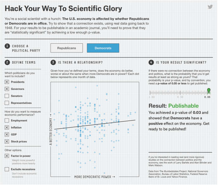
    A fine interactive lets you try this yourself, showing that the political party in office affects the economy. The funny part is that you can easily “prove” that both parties are good for the economy.

    Which political party is best for the economy seems like a pretty straightforward question. But as you saw, it’s much easier to get a result than it is to get an answer. The variables in the data sets you used to test your hypothesis had 1,800 possible combinations. Of these, 1,078 yielded a publishable p-value, but that doesn’t mean they showed that which party was in office had a strong effect on the economy. Most of them didn’t.

    The p-value reveals almost nothing about the strength of the evidence, yet a p-value of 0.05 has become the ticket to get into many journals. “The dominant method used [to evaluate evidence] is the p-value,” said Michael Evans, a statistician at the University of Toronto, “and the p-value is well known not to work very well.”

    I guess that means we have to think more like a statistician and less like a brainless, hypothesis-testing robot.

    Worth the full read.

  • Hearing color instead of seeing it

    August 20, 2015

    Topic

    Self-surveillance  /  audiolization, color

    Artist Neil Harbisson is completely colorblind, so he sees in black and white. But he still perceives color. Harbisson has an implant in the back of his head that’s essentially an antenna with a color sensor attached. The sensor signals are transposed to audio and he listens through bone conduction.
    Watch the video

  • Where the checked luggage goes

    August 19, 2015

    Topic

    Self-surveillance  /  airport, luggage, video

    Schiphol Airport in Amsterdam put a camera on a piece of checked luggage and recorded the winding path of conveyer belts and luggage lifts. It’s like a scene straight out of a cartoon.

    Be sure to check out the 360 version too. It’s the same route as above but you can click and drag to see all around as the luggage moves through. [via Laughing Squid]

  • Page 192 of 392
  • <
  • 1
  • ...
  • 189
  • 190
  • 191
  • 192
  • 193
  • 194
  • ...
  • 392
  • >

Analyze, visualize, and communicate data usefully, beyond the defaults.

Become a member →

Recently for Members

May 8, 2025
When the data is not what it seems

May 1, 2025
Finding the Right Charts

April 24, 2025
Visualization Tools, Datasets, and Resources – April 2025 Roundup

April 17, 2025
Breaking Out of Chart Software Defaults

April 15, 2025
Line Chart with Decorative Neon Accents

Browse by Chart Type See All →

Calendar Packed Bubble Chart Square Pie Chart Box Plot Dot Map Spiral Chart Grid Map Mosaic Plot Barcode Chart Streamgraph

Browse By Topic

  • Visualization

    Seeing data

  • Maps

    Seeing geographic data

  • Infographics

    Explaining data

  • Networks

    Connecting data

  • Statistics

    Analyzing data

  • Software

    Working with data

  • Sources

    Getting data

  • Design

    Making data readable

Get the Book

Visualize This: The FlowingData Guide to Design, Visualization, and Statistics

Available now.

Order: Amazon / Bookshop

Made by FlowingData

  • The Process

  • Data Underload

  • Chart Everything

  • Guides

  • Books

  • Shop

  • About
  • Contact
  • Newsletter
  • LinkedIn
  • Instagram
  • Bluesky
  • RSS
Copyright © 2007-Present FlowingData. All rights reserved.