Stacked Area Chart
Place multiple categories on top of each other for a sense of distribution and overall change. Watch out for large counts eclipsing the small ones.
Shifts in Job Distribution
In the 1950s, almost half of all employed people were either in farming or manufacturing. As you can imagine, work changed a bit over the years.
Cost of College
We know that more education usually equals more income, but as the cost of education continues to rise, the challenge to earn a college degree also increases.
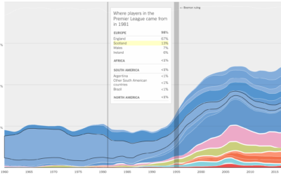
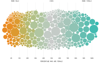
Where athletes in professional sports come from
Sports are growing more international with respect to the athletes. Gregor Aisch, Kevin…
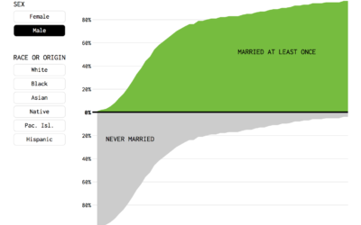
Percentage of People Who Married, Given Your Age
Or, given your age, the percentage of fish left in the sea. Here's a chart.
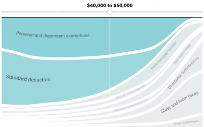
Given your income, most beneficial tax breaks
With the release of the Republican proposed tax plan, Reuben Fischer-Baum and Kevin…
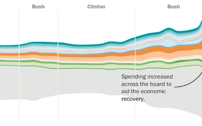
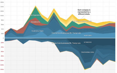
Shifting national budget
The Washington Post looks at the shifting national budget over the past 40…
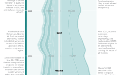
Visa restrictions and possible impact on innovation
The Washington Post talked to three experts on the American workforce and innovation…

Marital Status by Age
Separately, we looked at marrying age, divorce rates, and those who never married. Now let’s look at marital status all together, with the addition of the widowed status.

How to Visualize Proportions in R
There are many ways to show parts of a whole. Here are quick one-liners for the more common ones.
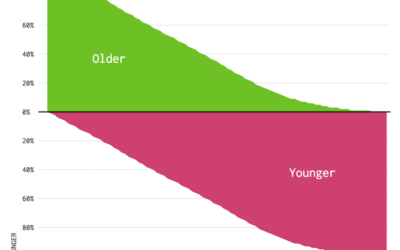
Who is Older and Younger than You (2014)
Here's a chart to show you how long you have until you start to feel your age.
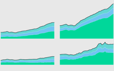
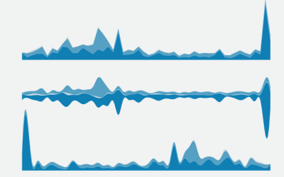
How to Make an Interactive Stacked Area Chart
Stacked area charts let you see categorical data over time. Interaction allows you to focus on specific categories without losing sight of the big picture.
Causes of Death
There are many ways to die. Cancer. Infection. Mental. External. This is how different groups of people died over the past 10 years, visualized by age.
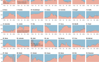
The Most Unisex Names in US History
Moving on from the most trendy names in US history, let’s look at…
How to Make Stacked Area Charts in R
From the basic area chart, to the stacked version, to the streamgraph, the geometry is similar. Once you know how to do one, you can do them all.
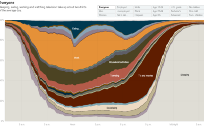
How People in America Spend Their Day
From Shan Carter, Amanda Cox, Kevin Quealy, and Amy Schoenfeld of The New…