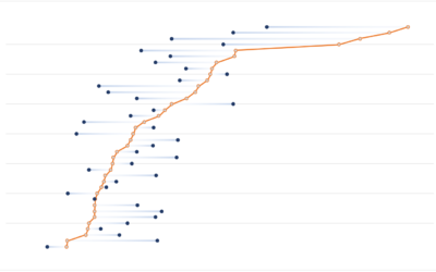
Dot Plot
A generalized form of the scatter plot, the dots can be placed in various coordinate systems.
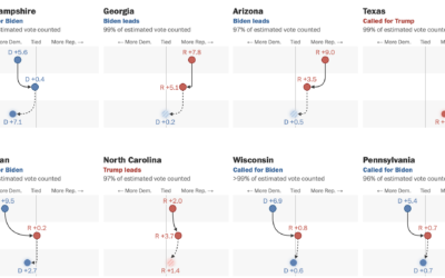
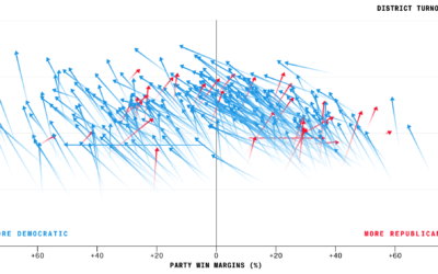
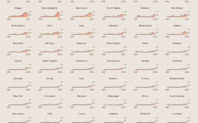
Swings in the battleground states
For The Washington Post, Ashlyn Still and Ted Mellnik show the shifts in…
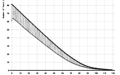
Redefining Old Age
What is old? When it comes to subjects like health care and retirement, we often think of old in fixed terms. But as people live longer, it's worth changing the definition.
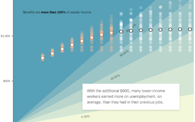
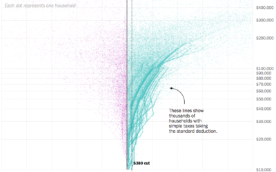
If the unemployed lose $600 per week
A $600 per week benefit expires for the unemployed at the end of…
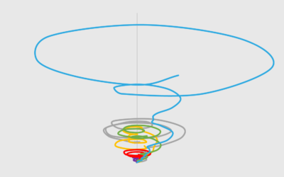
Tornado Lines – Useful or Not? (The Process 088)
It looks like a tornado. It's messy. It's circular. It almost looks intentionally confusing. But how bad is it really?
How to Make a Multi-Series Dot Plot in Excel
Easily compare multiple categories and spot differences between two or more series.

Saving for Retirement and Age
People tend to have more money saved up over time, but range and variation also grow, and often it’s not enough.
Differences Between Women and Men’s Everyday with Kids
The day-to-day changes a lot when you have kids. However, it seems to change more for women than it does for men.
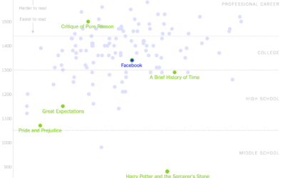
Readability of privacy policies for big tech companies
For The New York Times, Kevin Litman-Navarro plotted the length and readability of…

What Qualifies as Middle-Income in Each State (2017)
The meaning of "middle-income" changes a lot depending on where you live and your household size.

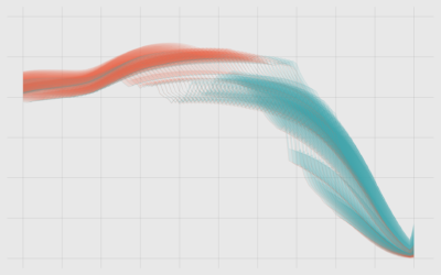
Higher turnout for midterm elections
Bloomberg charted voter turnout for the just past midterm elections, comparing 2018 against…

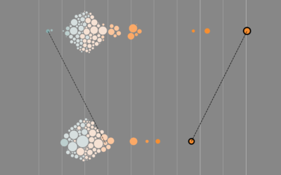
Millions of data points with deep scatterplots
Ben Schmidt uses deep scatterplots to visualize millions of data points. It’s a…
Ask the Question, Visualize the Answer
Let's work through a practical example to see how asking and answering questions helps guide you towards more focused data graphics.

Cuisine Ingredients
What are the ingredients that make each cuisine? I looked at 40,000 recipes spanning 20 cuisines and 6,714 ingredients to see what makes food taste different.
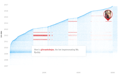
Finding fake followers
This fake follower piece by Nicholas Confessore, Gabriel J.X. Dance, Richard Harris, and…
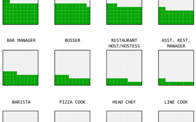
Working on Tips, by State
What percentage of a waiter and waitress's income comes from tips and what comes from salary? The calculation isn't straightforward but we can try.

Divorce and Occupation, in 2015
Some jobs tend towards higher divorce rates. Some towards lower. Salary also probably plays a role.
Finding the craft beer capital of America
You had me at craft beer. Russell Goldenberg for The Pudding looks for…
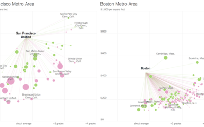
Looking for more affordable homes and better schools in the suburbs
Families often move out of the city to the suburbs for more affordable…