Bar Chart
The old standby. The classic. The bar height or length represents data. The baseline starts at zero.
NBA Players Traded, Historical Percentages
It seems like there’s been more player movement than usual over the years. Didn’t players used to play on a single team for the entirety of their careers?
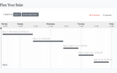
How to Make Marimekko Charts in Excel
Marimekko charts, or mosaic plots, allow you to compare categories over two quantitative variables.
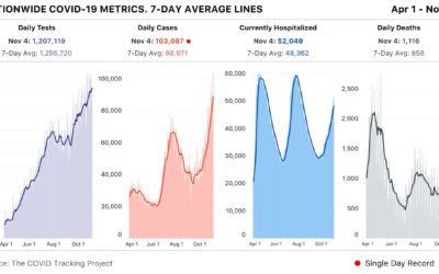
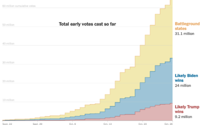
Spike past 100k Covid-19 cases in a day
Meanwhile… based on estimates from The COVID Tracking Project, the United States had…
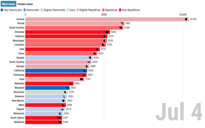
Covid-19 cases and state partisanship
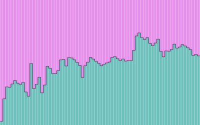
From Dan Goodspeed, the bar chart race is back. The length of the…
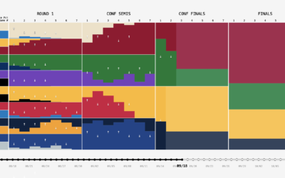
NBA playoff win probabilities, animated over time
FiveThirtyEight publishes win probabilities for NBA games throughout the season. During the playoffs,…
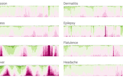
Google search trends dataset for Covid-19 symptoms
Google released a search trends dataset earlier this month. Using this dataset, Adam…
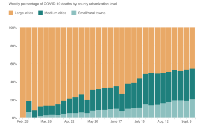
Shift of Covid-19 deaths to medium and small cities
When this all started, Covid-19 was impacting large cities at a much higher…
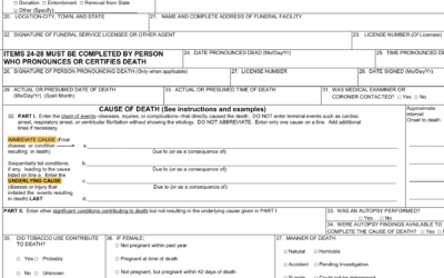
Multiple Causes of Death
There's a 6 percent figure from the CDC that could be easily misinterpreted. Here's what it means.
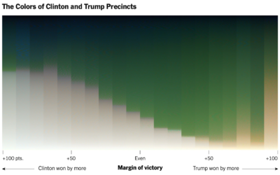
Red-blue electoral map and the green-gray in satellite imagery
For NYT’s The Upshot, Tim Wallace and Krishna Karra looked at how the…
Variable Width is Back (The Process 102)
This past month an old chart type poked its head out from behind the trees and I'm here for it.
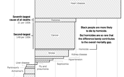
Gaps between mortality rates for black and white Americans
For NYT Opinion, Gus Wezerek charted the gaps between white and black mortality…
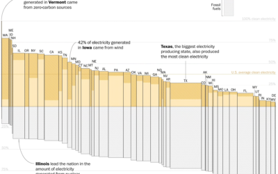
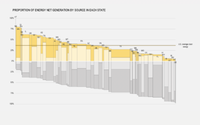
Electricity sources by state
With Joe Biden calling for 100% clean electricity, John Muyskens and Juliet Eilperin…
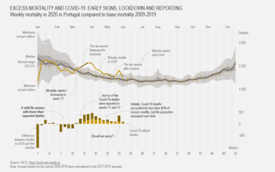
How to Make a Customized Excess Mortality Chart in Excel
Show current evolution against expected historical variability and add one or more series that could account for the difference.
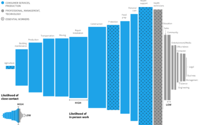
Remote work and industry
Some industries are more compatible with remote work than others. Jonathan I. Dingel…
A Better Chart, Limitations Considered: Exit Poll Results (The Process #77)
Welcome to a new segment where I try to put myself in the shoes of someone who made a bad chart and try to make it better.
Guessing Names Based on What They Start With
I'm terrible at names, but maybe data can help. Put in your sex, the decade when you were born, and start putting in your name. I'll try to guess before you're done.