Visualization
Showing the stories in data through statistics, design, aesthetics, and code.
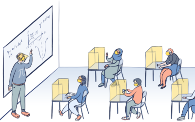
What schools might look like if students go back
Dana Goldstein, with illustrations by Yuliya Parshina-Kottas, imagines what school might look like…

Spacecraft orbits
For The New York Times, Jonathan Corum illustrated the dozens of spacecraft orbiting…
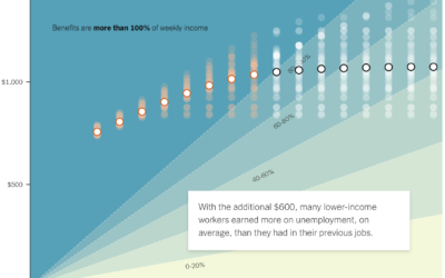
If the unemployed lose $600 per week
A $600 per week benefit expires for the unemployed at the end of…
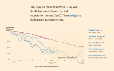
Defining ’90s music, based on song recognition
In search of songs that define music in the 1990s, Matt Daniels and…
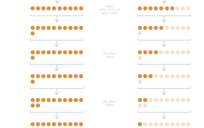
Wearing masks and infection rate
Studies suggest that wide adoption of masks can reduce the spread of the…
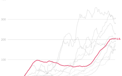
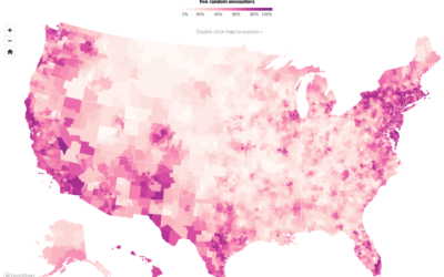
Comparing U.S. coronavirus case rates to other hot spots
The numbers are high here in the United States, and at this point,…
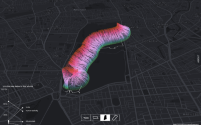
Park sounds before and during the pandemic
With lockdown orders arounds the world, places that we’re allowed to go sound…
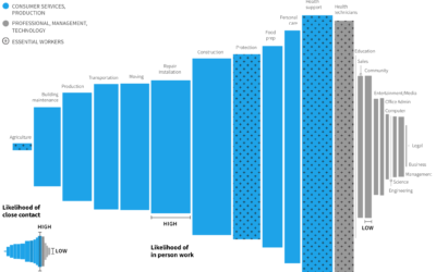
Remote work and industry
Some industries are more compatible with remote work than others. Jonathan I. Dingel…
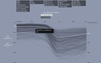
Unemployment for different groups
Unemployment has hit the United States hard over the past several months, for…
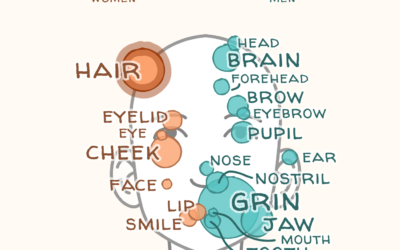
Words used to describe men and women’s bodies in literature
Authors tend to focus on different body parts for men and women, and…
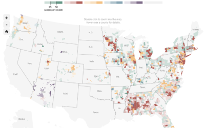
Where people are wearing masks
NYT’s The Upshot ran a survey through the data firm Dynata asking people…

Bitcoin scam, Twitter hacked
Twitter was hacked yesterday. Over a few hours, prominent accounts were tweeting that…

A million dollars vs. a billion visualized with a road trip
A million dollars. A billion dollars. The latter is 1,000 times more than…
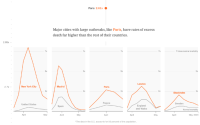
Comparing the coronavirus to past deadly events
One way to estimate the impact of the coronavirus is to compare it…
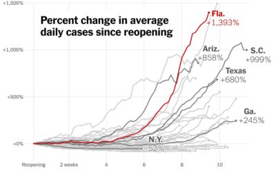
Increase in cases since states reopened
Using the now all too familiar baseline chart, where all of the time…
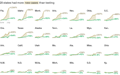
Cases vs. testing
There have been assertions that increased case counts are all from increased testing.…
Coronavirus counts across Europe
Going with the shaded triangle peaks to show case counts and deaths, The…