Visualization
Showing the stories in data through statistics, design, aesthetics, and code.
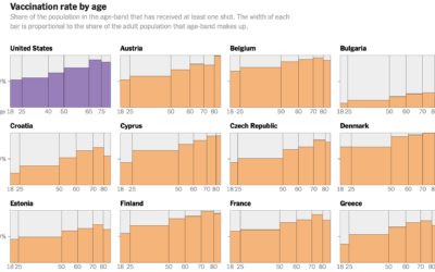
Decline of U.S. vaccination rate compared against Europe’s
Elian Peltier and Josh Holder for The New York Times highlight the vaccination…
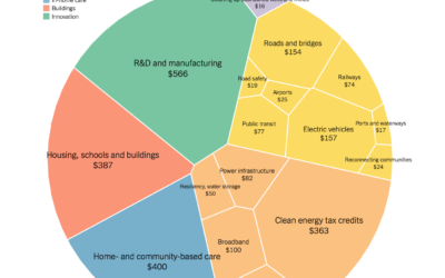
Comparison of Biden infrastructure plan and updated bipartisan plan
Aatish Bhatia and Quoctrung Bui for NYT’s The Upshot made the comparison using…
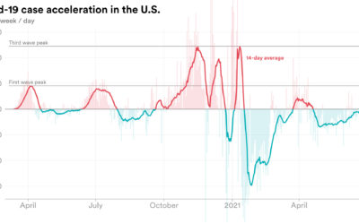
Rate of change in Covid-19 cases
We’re all familiar with the Covid-19 line charts that show cases over time,…
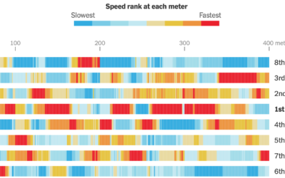
Calculating swim speeds
The New York Times charted speed ranks during the women’s 4×100 freestyle relay.…

New Olympic sports explained
The 2020 Summer Olympics are here, so ’tis the season for experimental visual…

Olympic event visual explainers
With the Olympics starting on Friday, The New York Times started their coverage…
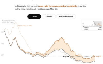
Case rates adjusted for the unvaccinated
Covid-19 cases in the United States were down, but they’re moving up again,…
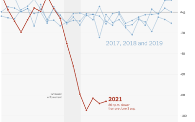
Falling spin rates in baseball after rule enforcement
NYT’s The Upshot analyzed spin rate on pitches before and after enforcing a…
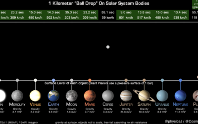
How long it takes a ball to drop on various Solar System bodies
James O’Donoghue made this straightforward animation that shows how long it takes for…
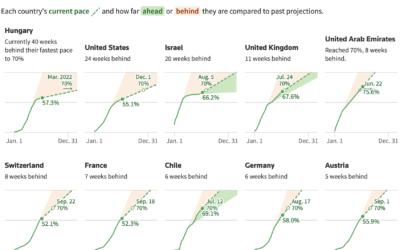
Slowing and then renewed interest in getting vaccinated
When countries gained access to vaccines, there was an initial burst of vaccinations,…

Map of drying reservoirs in the west
To show water levels in California’s drying reservoirs, The Washington Post used upside…
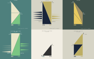
UEFA Euro 2020 matches visualized with triangle sets
Krisztina Szűcs used sets of animated triangles to show how each match played…
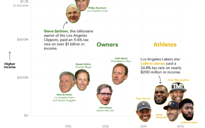
How sports owners pay less taxes than athletes
ProPublica continues their analysis of an anonymous dump of tax records, this time…
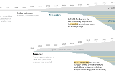
How big tech grew by acquiring small tech
Big tech — Amazon, Apple, Google, and Facebook — got big and then…