Visualization
Showing the stories in data through statistics, design, aesthetics, and code.
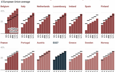
Progressive tax rates in Western Europe
There is always ample discussion about progressive tax rates in the United States.…

Data-driven story on the first vaccine
As we enter a time when people question the usefulness of vaccines, even…
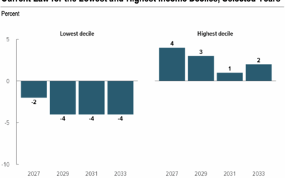
Pay more taxes and receive less
The Congressional Budget Office published a report estimating effects on household income if…
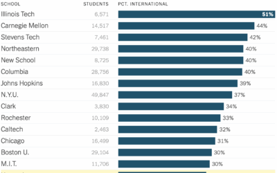
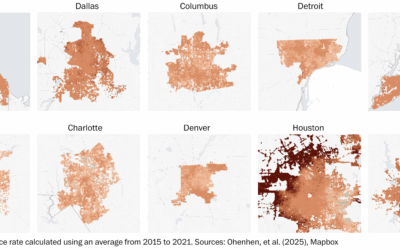
Schools with the most international students
As the administration tries to block international students from attending Harvard University, NYT’s…
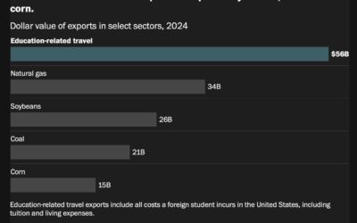
Education as an export
The administration is making it more difficult if not impossible for foreign students…

Fading lights in Ukraine mapped
Ukraine has suffered ongoing damage to their power infrastructure since the invasion began.…
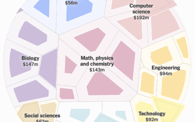
Lower science funding so far in 2025
With a circular voronoi diagram, NYT’s the Upshot shows a much slower rate…
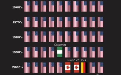
MVP honors dominated by international NBA players
Kirk Goldsberry plotted MVP winners in the NBA, by nationality. Shai Gilgeous-Alexander from…
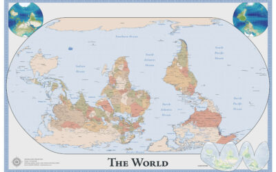
Map of an upside down world
While we’re on maps oriented in unfamiliar ways, Robert Simmon made an upside…
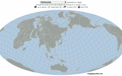
Center the map on the country you want
Speaking of maps centered on specific countries, Engaging Data made an interactive map…

World map with south on top and Brazil in center
The Brazilian Institute of Geography and Statistics (IBGE), Brazil’s agency for statistics and…
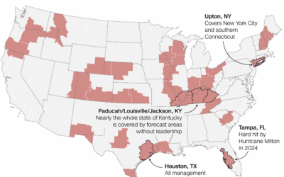
National weather forecasting in jeopardy
For CNN, Andrew Freedman reports:
Of the hundreds of vacancies, the 30 open…
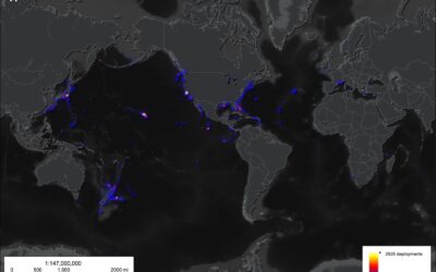
Limited surveying of the deep sea, a tiny 0.001%
Researchers from the Ocean Discovery League estimated how little we know about the…
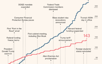
Lawsuits against executive orders
For Bloomberg, Zoe Tillman and Christopher Cannon break down the lawsuits against the…
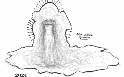
Met Gala dress silhouettes over the years
This is outside my wheelhouse, but it seems like Met Gala dresses grow…
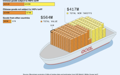
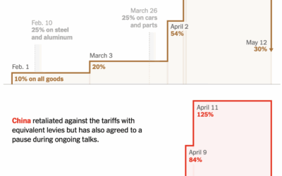
Value of Chinese goods vs. tariffs
Bloomberg, leaning in to a shipping container metaphor, shows the value of goods…