Visualization
Showing the stories in data through statistics, design, aesthetics, and code.

Infertility path from the perspective of mother and child
Getting pregnant and having a child is typically described as an effortless process…
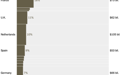
Oil imports from the Middle East, by country
Lazaro Gamio and Josh Holder for the New York Times break down energy…

Cheap drones allowing war with volume
Unmanned and relatively cheap drones that can be manufactured in high volume have…
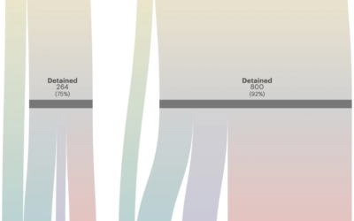
Immigrant mothers separated from U.S. citizen children
Along with more arrests, the current administration has deported mothers at twice the…
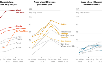
Cities with most ICE arrests
For the New York Times, Albert Sun, Allison McCann, and Hamed Aleaziz obtained…
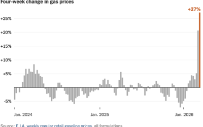
Gas price jump feels like a lot because it is
For NYT’s the Upshot, Francesca Paris gives context to the recent spike in…
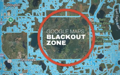
Mapping the unmapped Google Maps city
In most places, property lines stop at the street, but in North Oaks,…
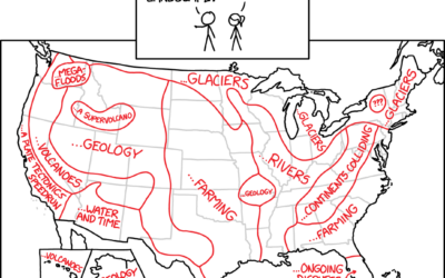
What if you floated upwards one foot every second
xkcd continues to answer the important questions.…
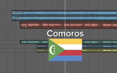
Africa by Toto with the lyrics switched out for the countries
You’re probably familiar with the song “Africa” by Toto. This version, by There…
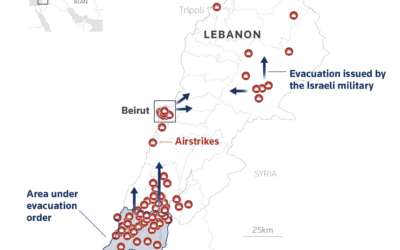
Maps and charts for what is happening in Iran
Reuters Graphics has a feed of maps and charts for updates on Iran.…
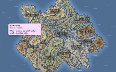
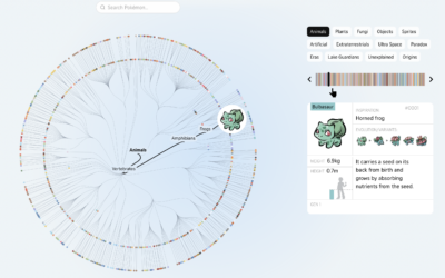
Mapping what makes us happy
In 2017, researchers asked study participants via MTurk to list three happy moments…
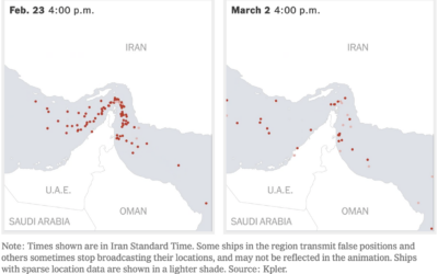
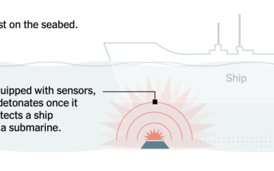
Oil supply chain slowdown
The New York Times mapped the traffic difference at the Strait of Hormuz,…
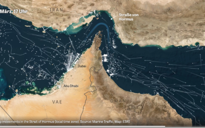
Marine traffic through the Strait of Hormus
Normally there is a steady flow of ships through the strait, but when…