Visualization
Showing the stories in data through statistics, design, aesthetics, and code.
Network map of Bluesky users
Theo Sanderson visualized the network of 3.4 million Bluesky users, placed by follow…
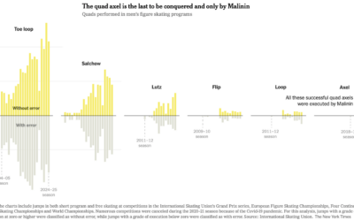
Mechanics of the Quad God’s quadruple axel
Olympic figure skater Ilia Malinin earned the nickname “Quad God” for all his…
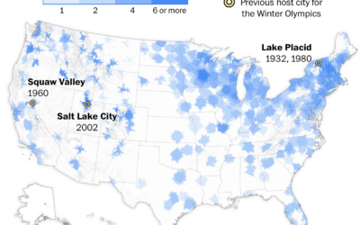
Access to Winter Olympic sports near you
While it’s easy to go out for a run in most places, finding…
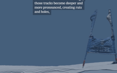
Why the best skiers don’t always win in the Olympics
Olympic gold medalist Ted Ligety is on the New York Times to explain…

Map of data center infrastructure
More processing power requires more data centers, and for better or worse, they…
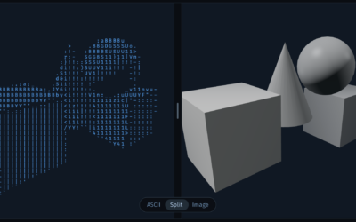
ASCII art, visually explained
ASCII art is text-based art that uses printable characters instead of pixels. Alex…

Tariff revenue is nowhere close to enough
The administration continues to add expenses for the country and insist tariff revenues…
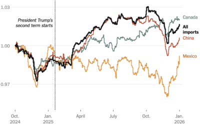
Impact of tariffs on cost of goods
One year into these tariffs, Ana Swanson for the New York Times has…
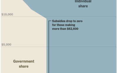
Financial cliff of health subsidies
In January, the scale for U.S. healthcare subsidies changed, which reintroduced a cliff.…

Cumulative measles rising with South Carolina outbreak
In 2000, measles in the United States was declared eliminated by the World…


IsoCity, an open source city building game
If you’re a fan of SimCity, then you’ll appreciate IsoCity, an open source…

Cuts to science and research in the U.S. over the past year
The administration cut science funding, withheld grants, and eliminated jobs in research areas…


Pentagon Pizza dashboard to track activities
There is a dashboard for pizza places around the Pentagon.
The Pentagon Pizza…

Mapping 200-mile formation of Chinese fishing boats
For the New York Times, Chris Buckley, Agnes Chang, and Amy Chang Chien…