Visualization
Showing the stories in data through statistics, design, aesthetics, and code.
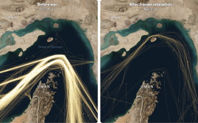

Crackdown on democracy in Hong Kong
Millions of people protested in Hong Kong against China’s Communist Party back in…
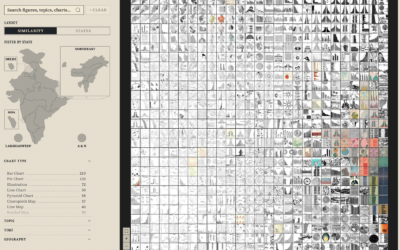
Data portraits of population
To make India’s census documents more accessible to the public in the 1970s,…
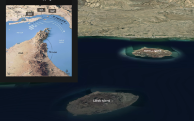
Visual guide to Iran’s coastline and islands at the Strait of Hormuz
For Al Jazeera, Mohamed A. Hussein and Mohammed Haddad provide a map of…
Days that Trump spends at his own properties
Trump spends a lot of time at his own hotels and golf clubs.…
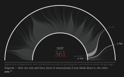
Visual guide for Infinite Jest
Infinite Jest by David Foster Wallace was published 30 years ago. To commemorate,…
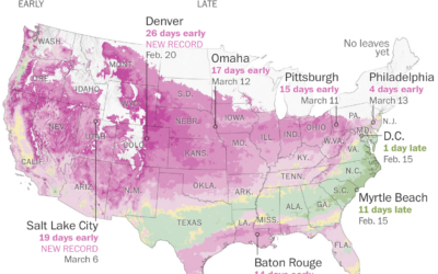
Where leaves are emerging and flowers are blooming
It’s that time of year again when we hear about how the plants…
Artemis II tracker, to know if the space toilet is working
NASA makes a lot of live data available about the Artemis II mission.…

First images from Artemis II astronauts
The first downlinked images were published by NASA. The best view of Earth’s…
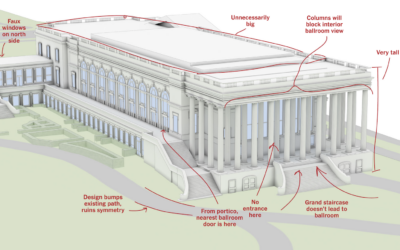
Ballroom design, many notes
After demolishing the East Wing of the White House and rushing into construction…
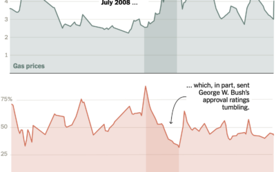
Approval ratings vs. high gas prices
For the New York Times, Ruth Igielnik and Katherine Chui charted presidential approval…

A worst-case scenario in a country without vaccines
Researchers at Stanford University, epidemiologists Mathew Kiang and Nathan Lo, estimated the number…
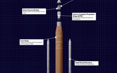
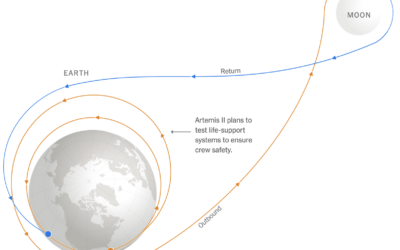
Artemis II flight sequence
For Bloomberg, Loren Grush, Sana Pashankar, and Stephanie Davidson describe the Artemis II…
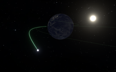
Flying to the moon on Artemis II mission
Four astronauts are rocketing to the moon on April 1. They’ll spend 10…
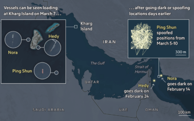
Shadow fleet transporting oil
A so-called shadow fleet of tankers transport oil illicitly around the world. They…