Visualization
Showing the stories in data through statistics, design, aesthetics, and code.

Mapping where Taylor Swift performs on stage during a show
Taylor Swift is currently on tour. During a show, she sings 44 songs…
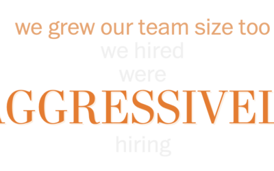
Words used in layoff letters
Tech layoffs continue, and as companies deliver more letters, there are some repeated…

Visual explainer on what an AR-15 does to the human body
This is necessarily uncomfortable to go through, but for The Washington Post, N.…
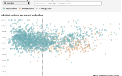
UC admission rates for California public and private high schools
For the San Francisco Chronicle, Nami Sumida shows admission rates at University of…
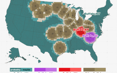
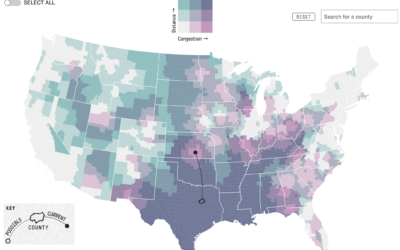
Among cities with the same name, which one people are probably talking about given their location
Throughout the United States, there are a surprising number of cities that have…
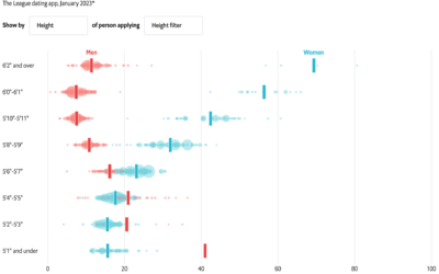
Online dating, who filters out what
With online dating apps, you’re able to filter out potential matches based on…
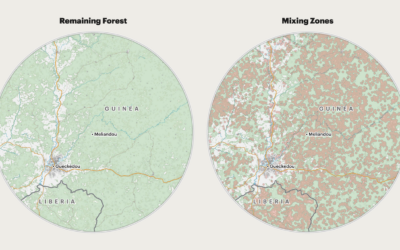
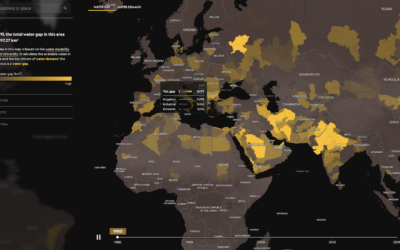
Deforestation and increased risk of outbreaks
For ProPublica, Al Shaw, Irena Hwang, and Caroline Chen explain the increased risk…

Fake sugars in your food
For The Washington Post, Anahad O’Connor, Aaron Steckelberg, and Laura Reiley visually describe…
Past and present California drought severity
It’s been raining a lot here in California, which is helpful, because most…
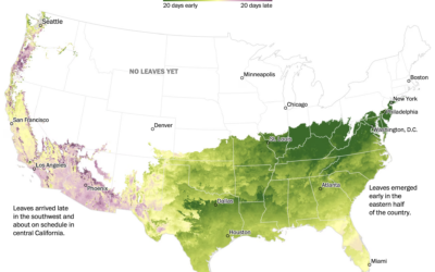
When spring is coming where you live
Going off the calendar, today is the first day of spring, but nature…
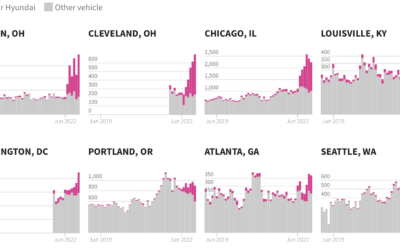
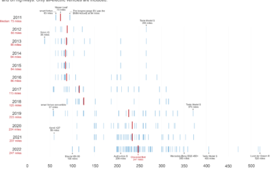
Excess Kia and Hyundai car thefts
In the middle of 2022, a popular video on TikTok, since taken down,…
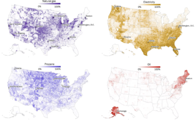
Maps of home heating sources in the United States
For The Washington Post, John Muyskens, Shannon Osaka, and Naema Ahmed mapped the…
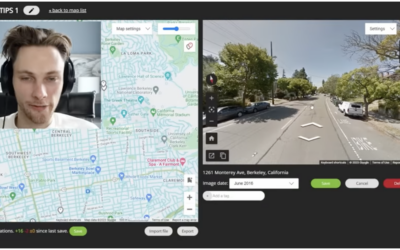
Finding the physical location in an online video via Google Maps clues
GeoGuessr player rainbolt is next-level good at reading Google Maps. Given a short…
Hypothetical map that shows how access changes if more states ban abortion
Based on analysis by economics professor Caitlin Myers, FiveThirtyEight provides a hypothetical map…
Increasing range of electric vehicles
Hannah Ritchie compared electric vehicle range over the years:
The median range of…
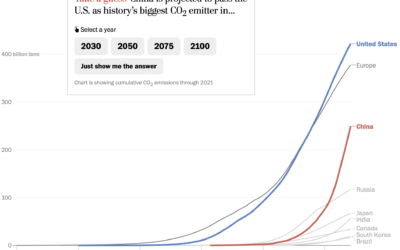
Line chart race to show emissions
For The Washington Post, Harry Stevens used the line chart equivalent of a…

Asian representation at the Oscars
Asian characters in American films are historically less integral to the stories and…