Visualization
Showing the stories in data through statistics, design, aesthetics, and code.

Eurovision winners past and present
The 2023 Eurovision Song Contest finished up this past weekend with the winning…

A visual story about kimchi and family
Alvin Chang, for The Pudding, illustrated the search for his kimchi, which is…
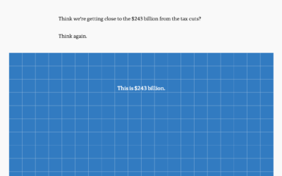
Scale of billions of dollars in Australia’s budget
To show the scale of tax cuts and Australia’s budget, ABC News takes…

Population surrounded by interstate highways
Filed under random but fun calculations, Alasdair Rae estimated the number of people…
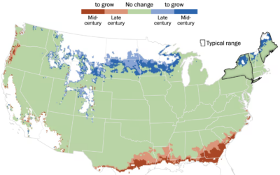
Mapping where trees will grow
As the climate changes, the places that different types of trees will grow…

Quantum computing visual explainer
Quantum computing promises a higher level of processing power over current computers, but…
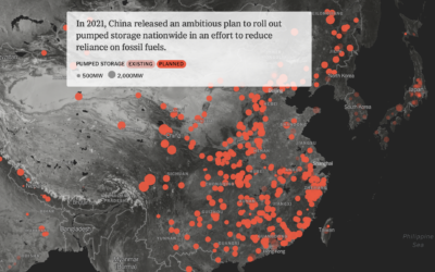
When you cross hydropower and a battery
Mira Rojanasakul and Max Bearak for The New York Times highlight the rise…

Non-abstract Curry shot chart
Stephen Curry of the Golden State Warriors scored 50 points in game 7…


Switching to electric school buses
For Bloomberg, Zahra Hirji and Denise Lu on the electrification of the national…
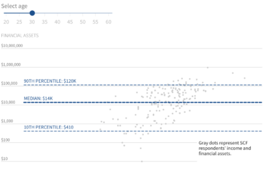
How little we save for retirement
Saving for retirement is a slow process with an end goal that can…
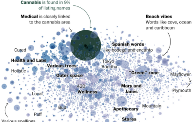
Words used in cannabis business names
Daniel Wolfe for The Washington Post looked at the similar word choices across…
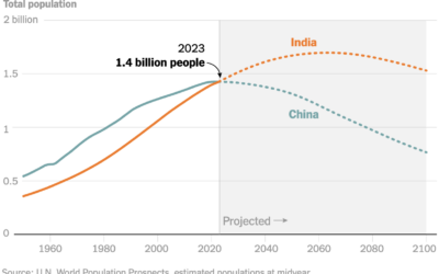
India estimated to pass China in population
Based on the United Nations’ world population report, it is estimated that India’s…

An illustrated tour of the skies in an elevator
Neal Agarwal is up to his wonderful ridiculousness again. Imagining an elevator that…
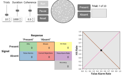
Explorable explanation for signal detection theory
When you have a lot of noisy data, it can be helpful to…

Scale of flying animals
A straightforward lineup of animals that fly provide a sense of scale, from…