Visualization
Showing the stories in data through statistics, design, aesthetics, and code.

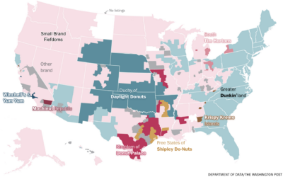
Competitive hot dog eating requirements
Nathan’s Famous hot dog eating contest, so gross to watch but impossible to…

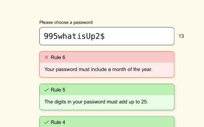
Password game requires more ridiculous rules as you play
Password rules seem to get more strict and weird over time. Neal Agarwal…
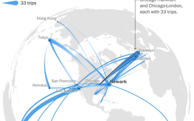
A year of flight paths, for someone with an unlimited pass
United Airlines sold a lifetime unlimited pass in 1990 for $290,000. Tom Stuker…
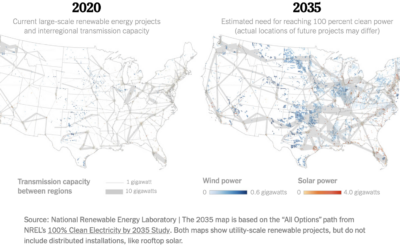
Map of electric grid required for cleaner energy
To power the United States with more clean energy, you might think it’s…

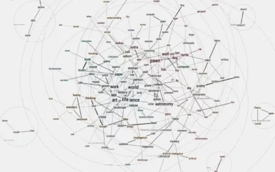
Friend simulation system, with ChatGPT
Philippe Vandenbroeck and Santiago Ortiz were curious about a system that incorporated knowledge…

To make electric vehicle batteries, China must be involved
For The New York Times, Agnes Chang and Keith Bradsher ask if it’s…
Where people are moving in the U.S.
Based on migration data recently released by the IRS, Nami Sumida for the…
Objectiveness distributions
Putting this joke chart up for posterity, because it deserves it. The earliest…
Using gaps in location data to track illegal fishing
Speaking of non-location in the seas, researchers at the University of California at…

Fake location signals from oil tankers avoiding oversight
The New York Times tracked oil tankers faking their location as they ignore…
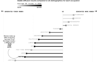
Generative AI exaggerates stereotypes
Perhaps to no one’s surprise, generative artificial intelligence models contain bias rooted in…

Smoke from Canada wildfires over the U.S.
Wildfires in one area means smoke and pollution travels to surrounding areas, even…
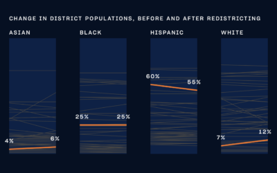
NYC city council district voting guide
With New York 2023 elections coming up, The City and NY1 put together…
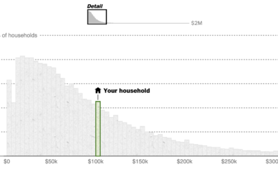
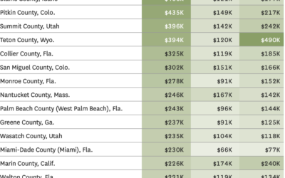
See if you are middle class
What counts as middle class depends on who and where you’re asking. Even…
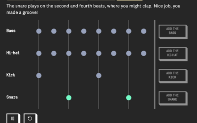
A moving drumbeat, explained visually
When you first learn to play music, a lot of the instruction is…