Visualization
Showing the stories in data through statistics, design, aesthetics, and code.

Evolution of race categories in U.S. Census forms
For The New York Times, K.K. Rebecca Lai and Jennifer Medina show the…
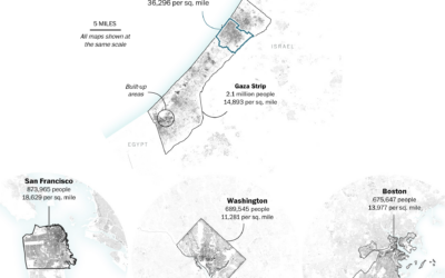
Gaza Strip size compared to U.S. cities
One of the most straightforward ways to help others better understand the scale…
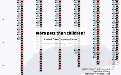
More pets than children in Taiwan
Julia Janicki, Daisy Chung, and Joyce Chou explore Taiwan’s aging population, where in…

Realistic rendering of Canada’s wildfires
Peter Atwood used NASA data to depict the wildfires in Canada this year.…
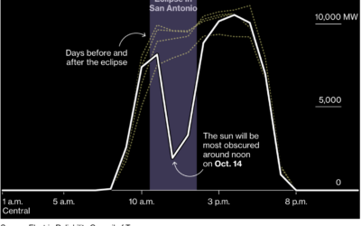
Dip in solar generation during the solar eclipse
Solar power is clean and all, but what happens when the sun is…
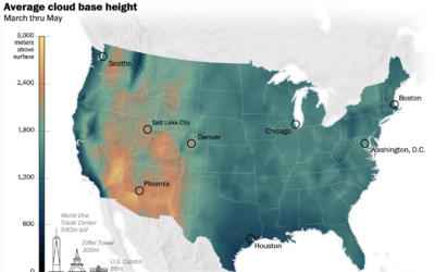
Where the clouds are the highest
Cloud formation depends on temperature and moisture levels, so in places of high…
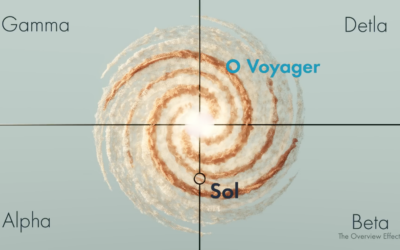
Real space location of Star Trek and other science fiction
[arve url=”https://www.youtube.com/watch?v=tso5pSzBRDo” /]
Star Trek and related might be fictional, but they usually…

Mapping Israel and Gaza attacks
The New York Times is mapping rocket strikes, attacks, and ongoing conflict in…
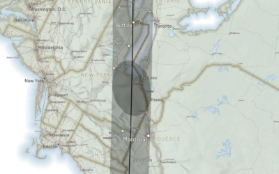
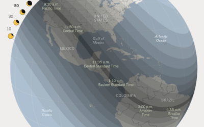
Following the path of the 2024 solar eclipse
There is going to be a solar eclipse on April 8, 2024. The…
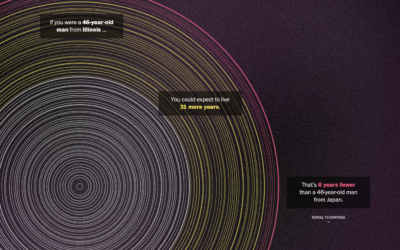
Tree rings to compare life expectancy in your state
The Washington Post goes with a tree ring metaphor to compare life expectancy…
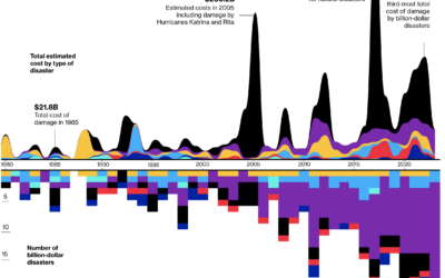
Billion dollar natural disasters
For Bloomberg, Rachael Dottle and Leslie Kaufman go with the combo stacked area…
Visual explanation of menstrual cycle length and variability
For the Apple Women’s Health Study, which uses cycle tracking data from iPhones…

Search the text in historical maps
The David Rumsey Map Collection has been home to tens of thousands of…

Loneliness, life satisfaction, and time
For The Pudding, Alvin Chang examines loneliness through the lens of individual responses…

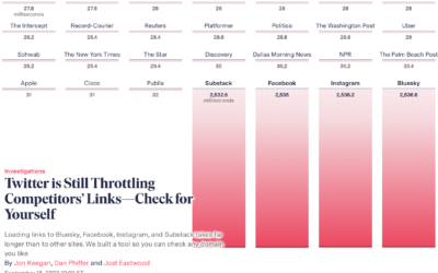
Twitter slows competitor links
When you click a link on Twitter, you go through a Twitter shortlink…