Visualization
Showing the stories in data through statistics, design, aesthetics, and code.
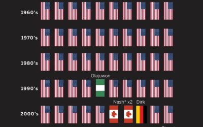
MVP honors dominated by international NBA players
Kirk Goldsberry plotted MVP winners in the NBA, by nationality. Shai Gilgeous-Alexander from…
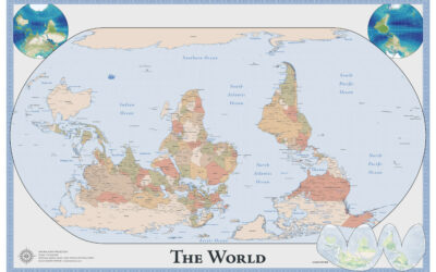
Map of an upside down world
While we’re on maps oriented in unfamiliar ways, Robert Simmon made an upside…
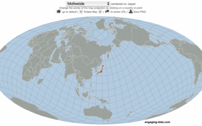
Center the map on the country you want
Speaking of maps centered on specific countries, Engaging Data made an interactive map…

World map with south on top and Brazil in center
The Brazilian Institute of Geography and Statistics (IBGE), Brazil’s agency for statistics and…
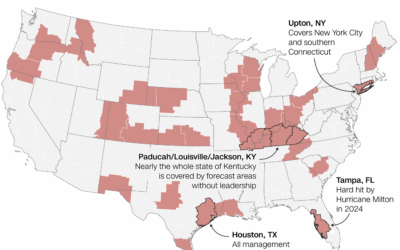
National weather forecasting in jeopardy
For CNN, Andrew Freedman reports:
Of the hundreds of vacancies, the 30 open…
Limited surveying of the deep sea, a tiny 0.001%
Researchers from the Ocean Discovery League estimated how little we know about the…
Lawsuits against executive orders
For Bloomberg, Zoe Tillman and Christopher Cannon break down the lawsuits against the…

Met Gala dress silhouettes over the years
This is outside my wheelhouse, but it seems like Met Gala dresses grow…
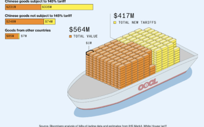
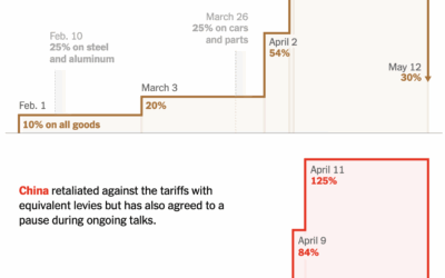
Value of Chinese goods vs. tariffs
Bloomberg, leaning in to a shipping container metaphor, shows the value of goods…

Internet Roadtrip, where the community votes where to go at each step
What if you were on a roadtrip and every ten seconds a large…
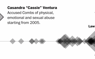
All the lawsuits against Sean Combs
The Sean “Diddy” Combs trial started. There have been 78 lawsuits filed against…
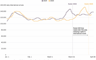
Europeans still traveling to the United States
For the New York Times, Josh Holder, Niraj Chokshi, and Samuel Granados use…
ICE detainees shuttled to further away facilities
As more people are detained, they are sent to detention centers in the…
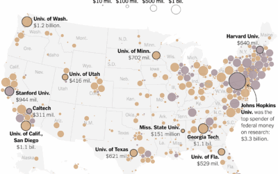
Universities that received federal funding for research
Big universities more often make the news, but the freeze in federal funding…
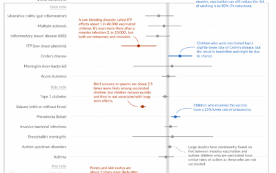
Measles vaccine effectiveness
Despite what some say, the measles vaccine saves lives and is not associated…
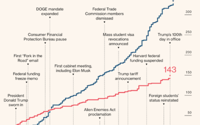
Charts for Trump’s first 100 days
News outlets tend to highlight the first 100 days of a new administration,…