Visualization
Showing the stories in data through statistics, design, aesthetics, and code.
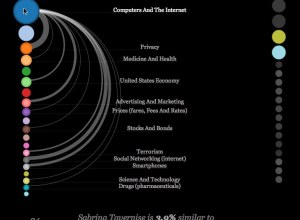
Exploring NYT news and its authors
The IBM Visual Communication Lab published their first of what I hope many…
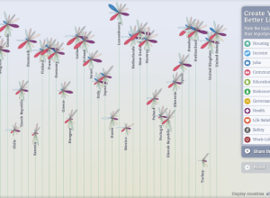
Better Life Index measures well-being across countries
OECD, with the help of Moritz Stefaner and Raureif, promote a well-being index…
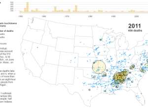
A deadly year of tornadoes
As reported by The New York Times, the tornado in Joplin, Missouri, known…
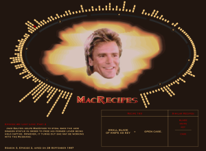
MacGyver recipe book – All 7 seasons of diversions and mischief
Oh. My. God. Fathom Information Design compiles every recipe from the show MacGyver:…
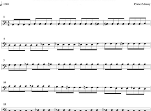
U.S. home prices as opera
Planet Money, a radio show on NPR covering the global economy, loves data,…

Art reproduction incongruencies
When you think art reproduction, you probably think of something that looks almost…
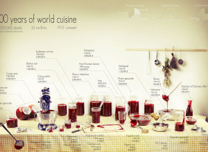
A century of deaths and a lot of fake blood
Rather than bars, bubbles, and dots, Clara Kayser-Bril, Nicolas Kayser-Bril, and Marion Kotlarski…
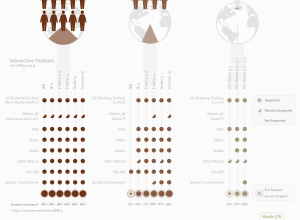
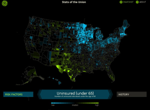
Stats of the Union tells health stories in America
Stats of the Union, the new Fathom-produced iPad app, maps the status of…

Where the water resources are and where they go
Designer David Wicks compares rainfall against water consumption in his thesis project Drawing…
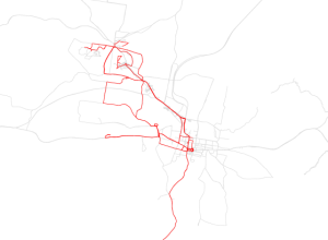
One man’s travel patterns – Atlas of the Habitual
FInding himself in a new town, with a new job, Tim Clark started…
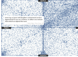
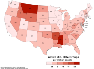
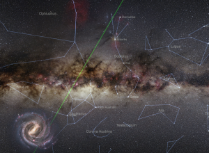
Reactions to the death of a terrorist
On the announcement of Osama Bin Laden’s death, there was a mixed reaction…

Oil spill amounts in perspective
On the one-year anniversary of the Deepwater Horizon oil spill, designer Chris Harmon…
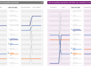
Perceived vs. actual country rankings
Lisa Strausfeld, in collaboration with GE, compares perceived country rankings and actual ones.…