Visualization
Showing the stories in data through statistics, design, aesthetics, and code.
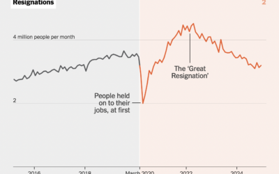
Everyday life changes after Covid
In almost every dataset about life and people that stretches back past March…
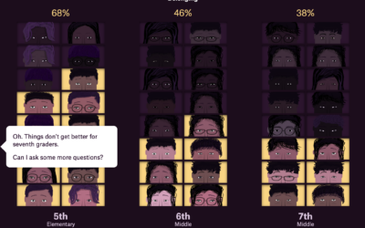
Less sense of belonging, in middle school
Alvin Chang, for the Pudding, highlights education research on the awkwardness of middle…
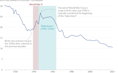
Charted history of the baby boom
For Our World in Data, Saloni Dattani and Lucas Rodés-Guirao analyzed the various…
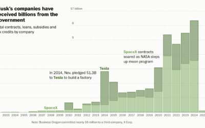
$38b of government money that funded Musk companies
Elon Musk has been critical of government spending, as he and DOGE fire…
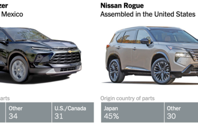
Ambiguity in what counts as American-made vehicles
Speaking of imported vehicle parts, June Kim and Neal Boudette, for The New…
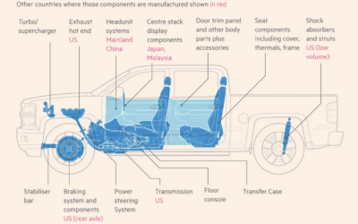
Imported parts on a Chevrolet Silverado
To demonstrate how tariffs can impact American products, Financial Times focuses on the…
Products affected by tariffs in the U.S.
Luis Melgar and Rachel Lerman, for the Washington Post, highlight the value of…
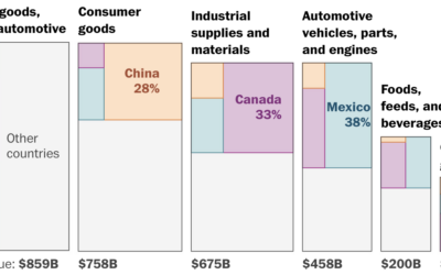
Imports that could be taxed
We’ve mostly heard about tariffs as they apply further down the supply chain…
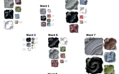
House colors as an indicator for gentrification
It appears that gray and neutral tones on houses are a sign of…
Reality of organ transplant waiting lists
One might hope that people on a waiting list for an organ transplant…
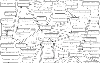
Network of statistical distributions
The network of 76 probability distributions show how they are connected:
Solid lines…

Wikipedia as a walkable, virtual museum
Imagine everything on Wikipedia in an infinite museum of galleries. That’s what Maya…
Visualizing all the books in the world
To show a catalog of almost 100 million books in one view, phiresky…
Rail transit and population density
In some cities, a large percentage of the population has access to public…
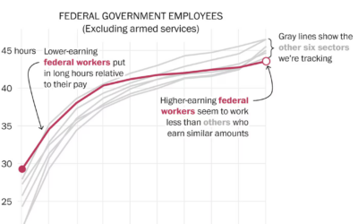
Estimating the ‘laziness’ of federal workers
Some might have you believe that federal employees don’t put in the work.…
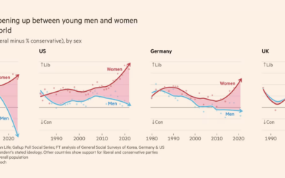
Growing gender gap in ideology
For Financial Times, John Burn-Murdoch shows the gap between men and women in…
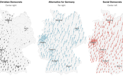
Shifts in German election
German voters shifted away from the left in their general election this past…
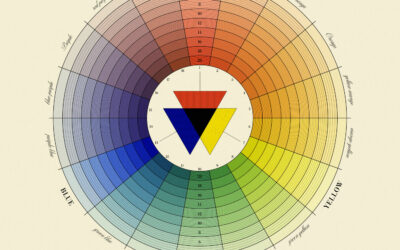
Natural System of Colours, a recreation of 18th century color wheels
In 1766, Moses Harris published The Natural System of Colours to demonstrate that…