Visualization
Showing the stories in data through statistics, design, aesthetics, and code.

Fashion color counting
As fashion changes, so do the colors used each season. Sarah Constantin likes…

Bird migration flight paths, shifting with climate
For those who can’t get enough of bird migrations, the Guardian shows the…

Too soon to declare inflation victory
Declarations have been made, but there’s not enough data yet to make such…

Historical (lack of) change in home prices in major cities
For the Washington Post’s Department of Data, Andrew Van Dam looks at historical…

Cartography of generative AI
It’s very easy to ignore what happens before and behind-the-scenes when you enter…

50 Cent adjusted for inflation
The rapper Curtis Jackson became 50 Cent a couple of decades ago, but…

Canceled $28B grants during government shutdown
There’s been a lot going on and we almost forget that the federal…

Fraudulent disability claims through Veterans Affairs
For the Washington Post, Craig Whitlock, Lisa Rein, and Caitlin Gilbert examine court…

Using mega batteries to power the evening
When there is an excess of solar energy during the day, it can…

Cost of driving an electric vehicle vs. gas car
The cost of driving an electric vehicle varies by where you charge and…

Circular deals among AI companies
The big AI companies are making deals with each other, promising and distributing…
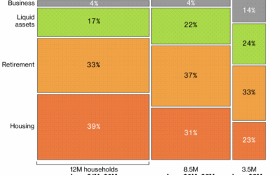
Cash-poor millionaire households
Everyone loves reading about millionaires who don’t have enough liquidity to buy things,…
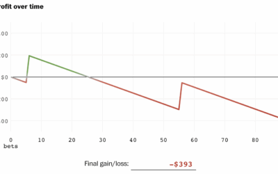
Odds against you in sports parlays, advantage house
Parlays in sports betting are booming and people are losing billions of dollars…
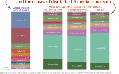
Mortality in the news vs. what we usually die from
Our World in Data compared causes of death in the United States against…
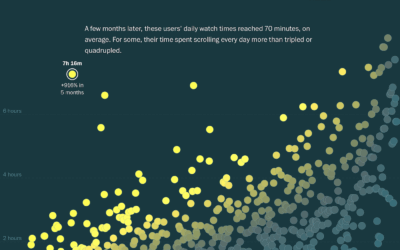
Analysis of TikTok usage, transforming new users to power users
As many of us have learned first-hand, TikTok (and its scrolling video ilk)…
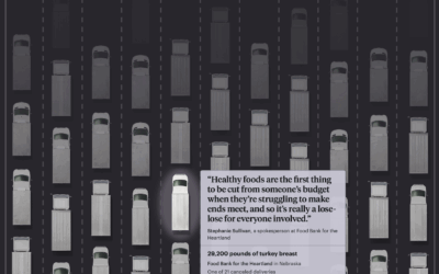
Millions of pounds of canceled food aid in the US
The administration cut $500 million of aid to U.S. food banks earlier this…
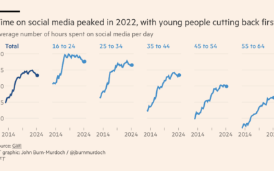
Passed peak social media, maybe
As we descend towards slop-based social media, where the videos are fake and…
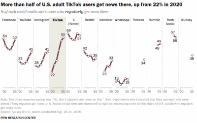
Getting more news from the TikTok
Pew Research surveyed U.S. adults about news consumption on social media and found…