
Visualization
Showing the stories in data through statistics, design, aesthetics, and code.
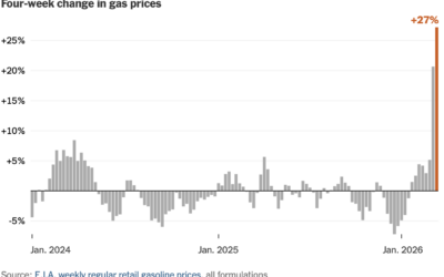
Gas price jump feels like a lot because it is
For NYT’s the Upshot, Francesca Paris gives context to the recent spike in…
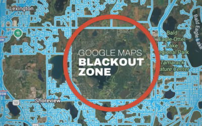
Mapping the unmapped Google Maps city
[arve url=”https://www.youtube.com/watch?v=gtiiHXsnsrY” /]
In most places, property lines stop at the street, but…

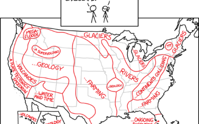
What if you floated upwards one foot every second
xkcd continues to answer the important questions.…
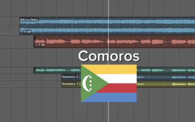
Africa by Toto with the lyrics switched out for the countries
[arve url=”https://www.youtube.com/watch?v=nhmdDjatyRY” /]
You’re probably familiar with the song “Africa” by Toto. This…
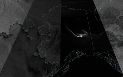
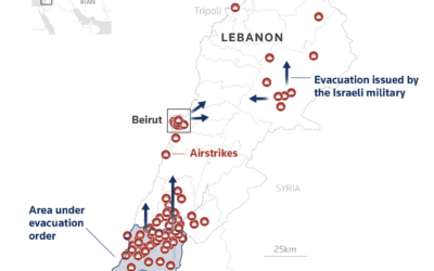
Maps and charts for what is happening in Iran
Reuters Graphics has a feed of maps and charts for updates on Iran.…
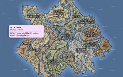
Mapping what makes us happy
In 2017, researchers asked study participants via MTurk to list three happy moments…
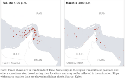
Oil supply chain slowdown
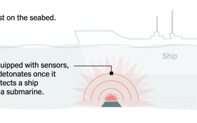
The New York Times mapped the traffic difference at the Strait of Hormuz,…
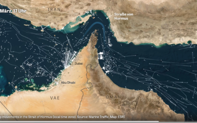
Marine traffic through the Strait of Hormus
Normally there is a steady flow of ships through the strait, but when…
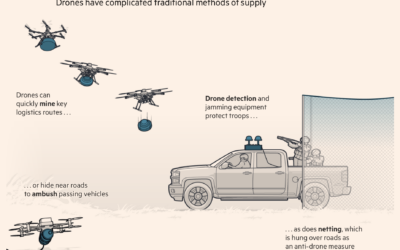
Drones and modern warfare in Ukraine
With hundreds of thousands of Ukrainian drone flights every month, countries have had…

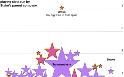
Unusual luck for streamers in the crypto casino Stake
For Businessweek, Cecilia D’Anastasio, Olivia Solon, and Leon Yin analyzed the unusual luck…

Famous chess matches visualized as 3-D wireframes
Imagine points for each piece on a chessboard. They move to x-y positions…
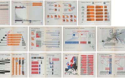
Visual catalog of Isotype examples
Isotype, or International System of Typographic Picture Education, is a picture language used…
