Members Only

If you’re trying to learn how to work with data, make time to fiddle with the toys in your growing toolbox. Otherwise, you just have a bunch of bookmarks and no new skills.
A weekly newsletter for members about how we visualize data and the tools we use.
If you’re trying to learn how to work with data, make time to fiddle with the toys in your growing toolbox. Otherwise, you just have a bunch of bookmarks and no new skills.
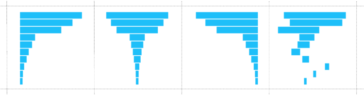
Break the visualization into its basic pieces to make it easier to make, edit, and reuse.
Google released Dataset Search to the world last week. Here are my first impressions.
Visualization as template-filling content is lazy visualization that no one draws benefit from. Give people a reason to care.
Defaults are generalizations to fit many datasets, which means you usually get barebone charts. For analysis, all well and good. However, data graphics for presentation require more care after the initial output.

It can feel like there’s so many rules of visualization that it’s impossible to make a proper visualization. The key: Nothing is absolute.

Made-by-hand visualization has been making a mini comeback as of late, and it’s been fun to see what people do with data away from the computer.
Of course, we don’t have the time to draw every chart and map by hand, but there are some parts of the practice we can use in our own work.
The New York Times published an election map. A lot of people did not like the map, arguing that it was an inaccurate representation. Those who did like the map argued that one must consider intent before throwing a map to the flames.
What happens when intended use and actual use do not match up?

Welcome to the new members-only newsletter: The Process. In this first update, a certain data graphics expert seems to really dislike R, which prompts a look into the visualization tools we use and what one might get out of a bigger toolbox.
 Visualize This: The FlowingData Guide to Design, Visualization, and Statistics (2nd Edition)
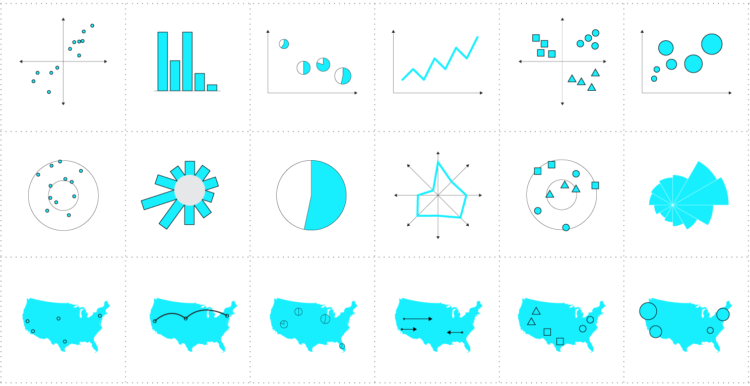
New tools, refined process.


