Projects
Graphics by Nathan Yau, borne out of everyday curiosities, learning experiments, and mild insomnia.
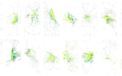
How Airbnb Visitors Rate Location in Major US Cities
This is how Airbnb visitors judge location, which provides a view into where city centers begin and end.
Working on Tips, by State
What percentage of a waiter and waitress's income comes from tips and what comes from salary? The calculation isn't straightforward but we can try.

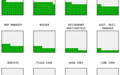
Divorce and Occupation, in 2015
Some jobs tend towards higher divorce rates. Some towards lower. Salary also probably plays a role.
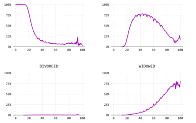
Marrying Later, Staying Single Longer
Using a century of data, we watch the shift of marital status in the United States.
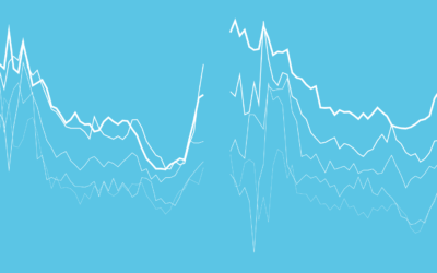
Summary Statistics Tell You Little About the Big Picture
Mean, median, and mode. These are the first things you learn about in…

Married People Have More Sex
The relationship and dynamics change. Less lust, more companionship. Is that really how it works?
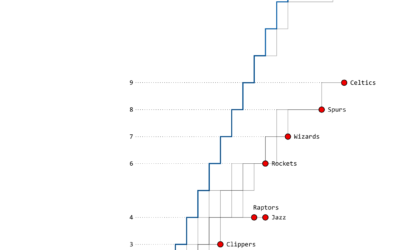
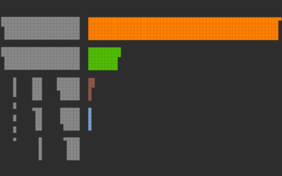
The Warriors’ Championship Path
As expected, this time, the Golden State Warriors won the championship last night.…

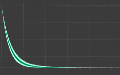
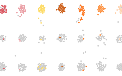
Chances it’s a Friend’s Birthday Every Single Day of the Year
If it seems like every day you log in to Facebook, it’s someone’s birthday, you're probably not that far off.
Giving Up Time as a Parent
There is a fixed number of minutes during the day. Where do parents usually draw the time from?
A Day in the Life: Work and Home
I simulated a day for employed Americans to see when and where they work.
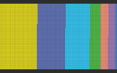
How the Average Working Adult Spends Days
This is what you get when you add up all the days the average American adult spends sleeping, eating, commuting, and doing other activities.
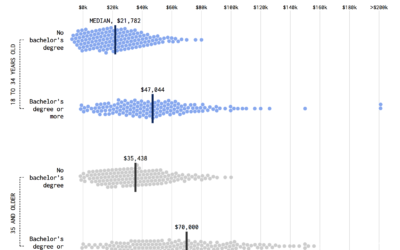
Shifting Incomes for Young People
Compare incomes for young people from the Millennial generation and the baby boomer generation.