This graphic shows average debt categorized by email provider. Average age for Gmail…
Infographics
Telling stories with data and graphics.
-
What your email says about your finances
-
The Growing Plague that is Spam
Spam sucks. We all hate it, but no matter how good the filter,…
-
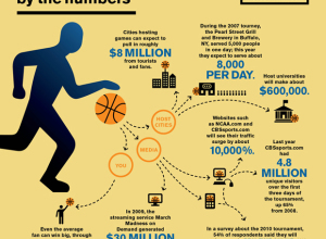
March Madness by the numbers
I didn’t fill out my bracket this year, so it’s not nearly as…
-
Notes from Interactive Infographics #interinfo #sxsw
Yesterday was the Interactive Infographics panel at South by Southwest, and if Twitter…
-
Use your skills to help others
Designer Christopher Harrell talks about, with a dose of various embedded graphics, pointing…
-
The State of the Internet
From JESS3 is this video on the state of the internet. It’s essentially…
-
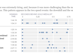
Olympic musical – how fractions of second make all the difference
Like everyone, I’ve been watching the Olympics, and it continues to amaze me…
-
Evolution of Olympic Pictograms
Every Olympics since 1936 has had a series of pictograms (i.e. icons that look like restroom signs) that represents the events.
-
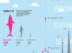
How a Giant Shark Took Down an Airplane
This graphic from designer Stephen Taubman is entertaining in so many ways. It…
-
Review: The Wall Street Journal Guide to Information Graphics
Add another book to the growing library of guides on how to make information graphics the right way. Dona M. Wong provides the dos and don’ts of data presentation.
-
Watching the Pulse of the Olympics on Twitter
The Olympics are in full swing, so of course Twitter is abuzz with…
-
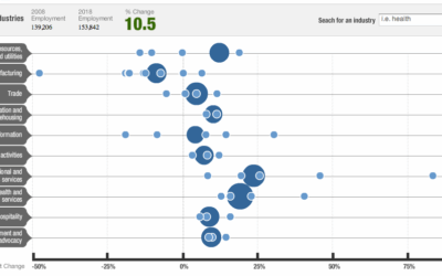
Future of Employment in the Decade Ahead
NPR shows projected employment changes from 2008 to 2018. Large circles represent major…
-
Beatles Music in Infographics
I’m sure a lot of you love The Beatles. I’m not a huge…
-
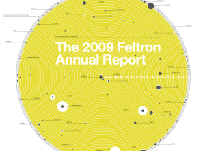
The 2009 Feltron Annual Report – OCD Made Sexy
Nicholas Felton’s personal annual report on his life is now up. For those…
-
Engineer’s Guide to Drinks
Seeing as the weekend is just about here, I’m sure many of you…
-
Crayola Crayon Colors Multiply Like Rabbits
In 1903, Crayola had eight colors in its standard package. Today, there are…
-
Need to Escape Jupiter’s Gravitational Pull? Good Luck
Randall of xkcd has been having fun with data visualization lately. In his…
-
Even Older Infographics from the 19th Century
Old graphics are awesome. We saw some from the 1930s already. These are…







 Visualize This: The FlowingData Guide to Design, Visualization, and Statistics (2nd Edition)


