After yesterday’s weirdness, I’m in the mood for something light.
The show about…
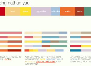
Nathan Yau
-

The World of Seinfeld
-
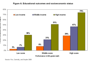
Low Income Hinders College Attendance, Even for Top Students
What if you were a good student but knew you weren’t going to…
-
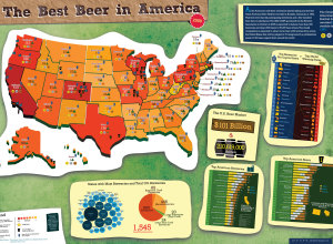
Best Beer in America 2009
Following up from last year’s beer graphic, Mike Wirth looks at medal winners…
-
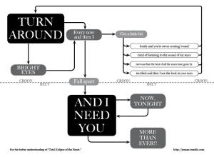
Total Eclipse of the Heart (Flowchart)
Jeannie Harrell takes Total Eclipse of the Heart by Bonnie Tyler, and puts…
-
your.flowingdata Gets an Upgrade + Free iPhone App
It’s been fun to see your.flowingdata evolve the past few weeks, and it’s…
-
How Does the Internet See You? – Personas From MIT Media
I Google myself every now and then. Everyone does. I don’t know why…
-
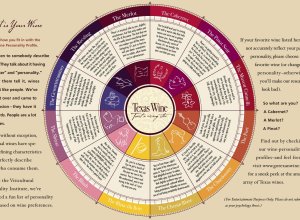
What is Your Wine Personality Profile?
The Texas in a Bottle guide to Texas Wine [pdf] reads:
Ever listen… -
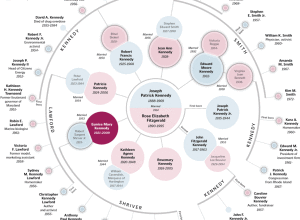
Detailed View of the Kennedy Family Tree
As far back as I can remember there’s always been a mystique around…
-
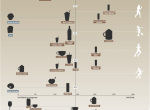
Caffeine vs Calories – Buzz vs Bulge
David McCandless from Information is Beautiful plots the calories in popular beverages versus…
-
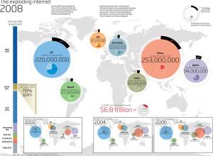
Mapping the Growth of the Internet – What Do You Think?
I, uh, well. Hmm. Yeah. New Scientist recently compiled a list of visualizations…
-
Map/Territory Shows Augmented Reality of the Future
Map/Territory, by designer Timo Arnall, is a concept video of what it might…
-
Thanks to Our FlowingData Sponsors
As many of you know I’m just one graduate student maintaining FlowingData. Needless…
-

What DC Metro Routes are Most Common?
Greater Greater Washington maps rider flow for the DC Metro. As you might…
-
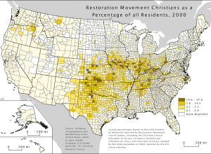
Religious Geography of the United States
The U.S. Census Bureau doesn’t ask questions about religion because of political issues…
-

Balance Life With the Media Diet Pyramid
In the August issue of Wired are the New Rules for Highly Evolved…
-
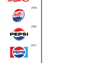
Pepsi and Coca-Cola Logo Design Over the Past Hundred Years
There have actually been some subtle changes in the Coca-Cola logo but not…
-
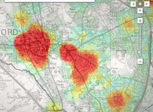
Mapping Crime in Oxford Over Time
Mentorn Media and Cimex Media, on behalf of BBC, explore crime patterns in…
-

Choose Your Own Adventure – Most Likely You’ll Die
Remember those choose your own adventure books that you used to read as…
-
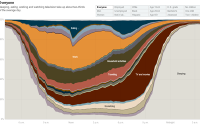
How People in America Spend Their Day
From Shan Carter, Amanda Cox, Kevin Quealy, and Amy Schoenfeld of The New…
-

Data is the New Hot, Drop-dead Gorgeous Field
We all know this already, but it’s nice to get some backing from…
Recently for Members
Second Edition
 Visualize This: The FlowingData Guide to Design, Visualization, and Statistics (2nd Edition)
 Visualize This: The FlowingData Guide to Design, Visualization, and Statistics (2nd Edition)
New tools, refined process.
Browse by Chart Type See All →


