The World Cup is an event where countries from all over the world…
Nathan Yau
-
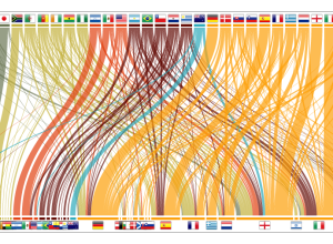
Imported World Cup players
-
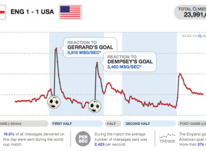
Texting volume during World Cup matches
I love how major sporting events can captivate an entire country or region,…
-

Education crisis explained in motion graphics
Buck, in collaboration with TakePart and An Inconvenient Truth director, Davis Guggenheim, describe…
-
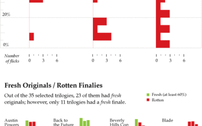
Do Movie Sequels Live Up to Their Originals?
The third installment of Pixar’s Toy Story is making a killing at the…
-
Happy birthday, FlowingData. You’re three today
Can you believe it? FlowingData is three years old today. I’m in the…
-

Music animation machine
Anyone can listen to music, but how can you see it? The Music…
-

Wireless networks in the physical world
For the most part, you go about your day-to-day with little knowledge of…
-

Graph site Verifiable closes shop
After a few years of fighting the good fight, charting and data site…
-
How to beat Mario Brothers 3 in 11 minutes
I think it took me a few months to beat Super Mario Brothers…
-

Taxonomy of the iPhone
Ben Millen diagrams the reach of the iPhone in our everyday lives:
These… -
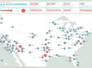
What America spends on gas and auto
In a follow-up to their graphic on what America spends on food and…
-
Quantified Nerds
The quantified self sounds great on paper. The task: keep track of important…
-
Graphical data fiction
We like to talk about the stories in data. They are the information…
-
Comment to win a copy of ‘Beautiful Visualization’ – winner announced!
Continuing with the ‘Beautiful’ series, O’Reilly has released their newest one, Beautiful Visualization.…
-

Free kick mechanics explained
I know next to nothing about soccer (a.k.a. football), but I gotta admit…
-
Dabble DB acquired by Twitter
Smallthought Systems, the group behind Dabble DB, the easy-to-use online database system and…
-
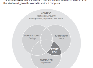
Profitable sweet spot for startups
Gosh, it’s so easy. I’m going to be rich. Get the strategic sweet…
-
Maps and data score big grants from Knight News Challenge
Since 2007, the Knight News Foundation has awarded millions of dollars in grants…
-
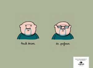
Glasses: the ultimate image changer
This is hilarious and uber creative advertising. If I wore glasses, I’d totally…
-

FlowingData stickers!
I love the Apple logo and all, but my Macbook really needed some…
Recently for Members
Second Edition
 Visualize This: The FlowingData Guide to Design, Visualization, and Statistics (2nd Edition)
 Visualize This: The FlowingData Guide to Design, Visualization, and Statistics (2nd Edition)
New tools, refined process.
Browse by Chart Type See All →


