Lovely imagery showing sugar consumption for day through lifetime. The average American consumes…
Nathan Yau
-
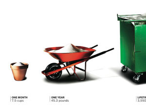
Sugar consumption buckets
-
Challenge: Spot the mistakes in the figures
During production of the 2011 USAID annual letter from Rajiv Shah, someone said…
-

Rings of population change by block
You’ve seen population changes at the state and county level, but with Census…
-

Recession and rise in antidepressant prescriptions
Over the past four years there was a 43 percent increase in prescriptions…
-
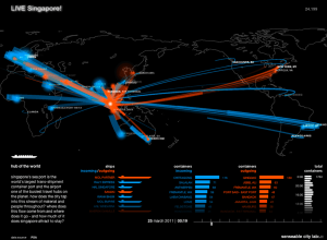
The city in real-time
The MIT SENSEable City Lab presents five different perspectives of the ebb and…
-

Statistical significance on xkcd
It’s xkcd on statistical significance. I need to stop eating all those green…
-
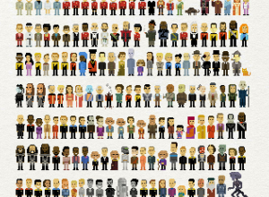
Star Trek characters in pixel form
John Martz, in collaboration with Koyama Press, pixelates 235 Star Trek characters in…
-

Statistics is the sexiest subject around. And information design.
Natasha Singer for The New York Times starts the article on visualization and…
-
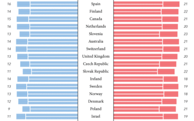
Who spends the most years in retirement?
Early retirement. That’s what most people want, unless you’re lucky enough to love…
-

Beauty of Maps available in its entirety
Almost a year ago, the BBC aired the Beauty of Maps, but we…
-

Movies with multiple Harry Potter wizards
I feel like whenever I watch a British film, I see a Harry…
-
Thoughts on end of Data.gov
In a guest post for the guardian.co.uk Datablog, I thought out loud about…
-

Physically climb over budget data with Kinect
As an entry to the Eyebeam DataVizChallenge to visualize your taxes, Budget Climb…
-
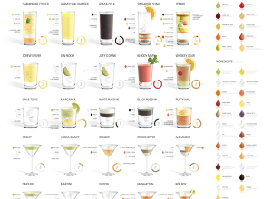
More proportions and cocktails
Designers’ current obsession with cocktails and proportions continues with Konstantin Datz’ recent poster.…
-
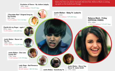
In land of YouTube dislikes, Justin Bieber rules
Happy Friday, everyone. If you’ll allow me, I’d like to take a moment…
-

Taming the breath of a wok
I found this on Serious Eats, but it looks like it’s from a…
-

Data.gov and other transparency sites to be shut down due to budget cuts
Last week, there were rumblings over the end of the Statistical Abstract, and…
-
FlowingData is brought to you by…
My many thanks to the FlowingData sponsors. Without them, this blog would probably…
-
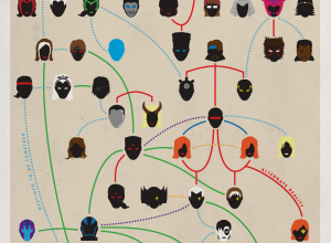
X-Men family tree
Amusing from graphic designer Joe Stone, although not as good as the crazy-detailed…
-

Tell-all telephone reveals politician’s life
Not many people understand the importance of data privacy. They don’t get out…
Recently for Members
Second Edition
 Visualize This: The FlowingData Guide to Design, Visualization, and Statistics (2nd Edition)
 Visualize This: The FlowingData Guide to Design, Visualization, and Statistics (2nd Edition)
New tools, refined process.
Browse by Chart Type See All →


